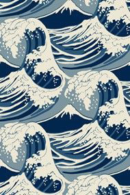
The task was to create a new image for an established beer brand, Pacific Pilsner, while appealing to a younger market. I wanted an artwork inspired by The Great Wave by Japanese artist Hokusai. I liked the clean lines and pattern elements.

I noticed that some of the more successful beer brands had animals that they were associated with. I created different sketches and used various animals like squid, whales and nautilus shells related to water to carry the brand. I found it challenging to think of a new animal.
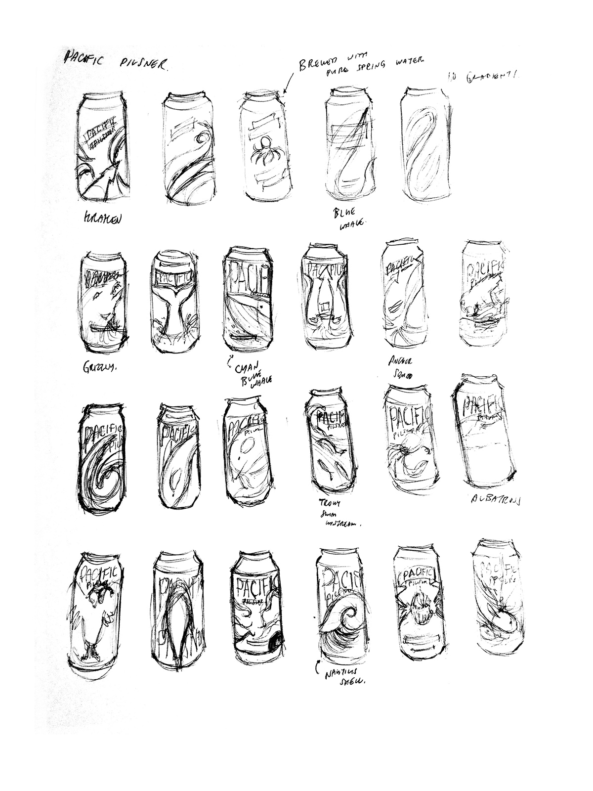
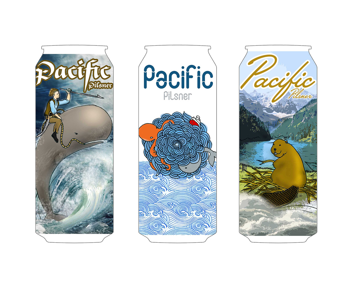
From my sketches I came up with three different directions. The first was an adventurous take on beer, the second was stylized utilizing that japanese illustration look, and the third was something very Canadian and the Canadian national animal.
I proceeded with the second idea: The Sphere of Waves. I wanted to bring that same illustrated look so I took the idea to my sketchbook with good pen and ink. I played with wave patterns to recreate designs reminiscent of The Great Wave.

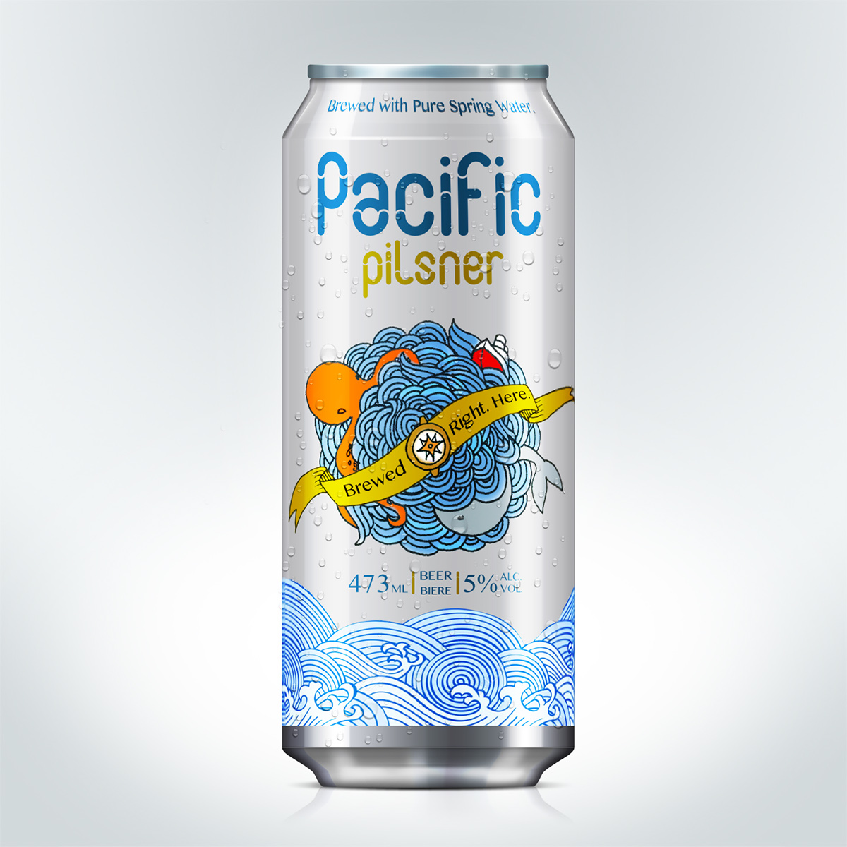
From there I played around with the elements. I wanted to communicate fresheness so I kept the can white and i played aroudn with how the elements interacted with each other.

This is the final design. This design playes with a lot of symbolism. The sphere of waves symbolizes the Pacific Ocean and all the creatures it has in it. Our drinker loves adventure and the sphere brings that whole experience into a visual. Centering the visual is our Pacific Compass device to remind drinkers that they are navigating their journey through countless adventures every time they open a can.