Black River F.C. Corporate Identity
Finding the link between soccer and advertising
Finding the link between soccer and advertising
Black River F.C. is an ad agency, named after a football club. We needed an identity that reflected both what we are named after, but also what we do.
We used the analogy of creativity in football - that it is game millions of people play, but only few are remembered. The people who stand out are renowned for their skill, but maybe more importantly, their flair.
Advertising is similar in many ways.
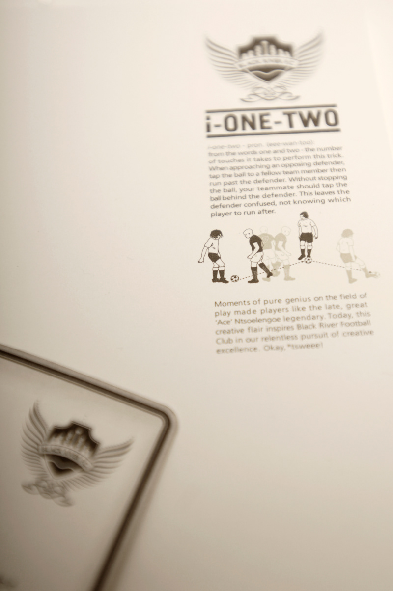
We researched the various famous South African soccer tricks and moves that have made people like Jomo Sono and Ace Ntsolengoe famous and matched them with their relevant piece of stationery.


Mjike-jo: CD Packaging - Means to turn in a circle while playing the ball

Each staff member received an illustrated player card.

Tsamaya: Envelope - Meaning to send your opponent away in another direction.

Show Me Your Number: Job Bags