


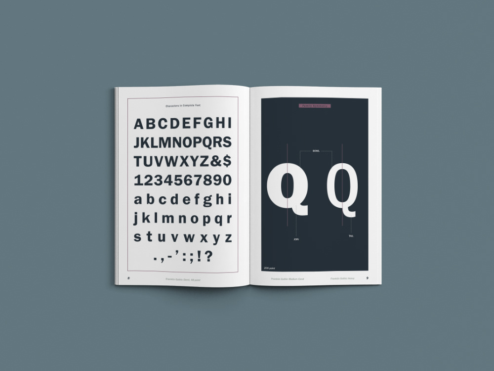
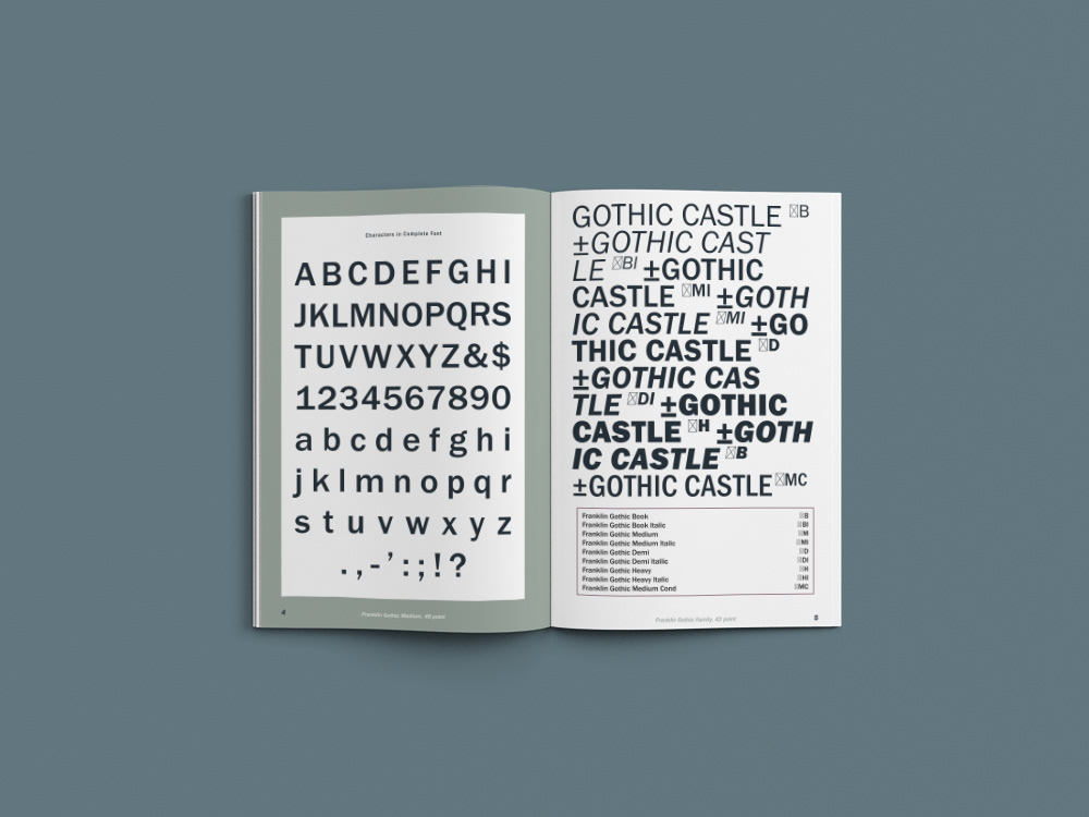
Franklin Gothic and its related faces are realist sans-serif typefaces originated by Morris Fuller Benton (1872–1948) in 1902. “Gothic” was a contemporary term (now little used except to describe period designs) meaning sans-serif. Franklin Gothic has been used in many advertisements and headlines in newspapers. The typeface continues to maintain a high profile, appearing in a variety of media from books to billboards. Despite a period of eclipse in the 1930s, after the introduction of European faces like Kabel and Futura, they were re-discovered by American designers in the 1940s and have remained popular ever since.
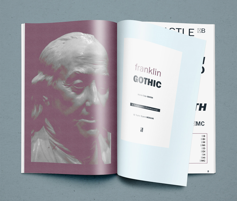
Franklin Gothic itself is an extra-bold sans-serif type. It draws upon earlier, nineteenth-century models, from many of the twenty-three foundries consolidated into American Type Founders in 1892. Historian Alexander Lawson speculated that Franklin Gothic was influenced by Berthold’s Akzidenz-Grotesk types but offered no evidence to support this theory which was later presented as fact by Philip Meggs and Rob Carter. It was named in honor of a prolific American printer, Benjamin Franklin. The faces were issued over a period of ten years, all of which were designed by Benton and issued by A.T.F.


A class-initiated project focusing on layout and typography at UCLAx Adv. DCA program.
Adobe Illustrator CC, Indesign CC, Photoshop CC. 2015
Ben Franklin portrait - Graphite and Digital
Thanks for looking!
Adobe Illustrator CC, Indesign CC, Photoshop CC. 2015
Ben Franklin portrait - Graphite and Digital
Thanks for looking!