Web & SEO
Series of papers on Usability, Credibility, and Search Engine Optimization for multiple websites
Usability Testing for New York Times Website
Usability Testing
Through one-on-one testing I have come to determine the usability of the New York Times website. The site was tested by a potential user who was rather unfamiliar with site, but through the completion of various usability tasks it has been made clear that NYTimes.com is a rather user-friendly website, but still could use a few updates to make their user experience more satisfactory. The tester was able to navigate the website to complete the tasks, however there were instances of confusion experienced in some aspects of each required task. This can be proved through the documented details of the one-on-one testing that took place.The tester was asked to complete a set of tasks on NYTimes.com in the environment they would usually take the time to browse the internet. The tester used his personal laptop computer on his couch, in a well-lit area, with no other distractions but music playing in the background; which he claimed to be his normal surroundings and was given each individual task starting at the homepage of the website.
The tester tabbed down the homepage at first appearing to check to see if there was any possible link to take him to his destination, with a slight look of confusion he tabbed back up the page to type “Netflix programming contest” into the search area in the top left area of the screen. The website took him to a screen which listed all the news stories having to deal with the company Netflix and the programming contest they had sponsored.
The only slight issue the tester experienced was when he tabbed to the bottom of the page to make sure there was nothing else on the homepage that was already in place to help complete his search and task.
The tester scanned the homepage while slowly tabbing down toward the bottom, slightly squinting while faintly moving his lips (obviously reading to himself). After reaching the bottom of the page the tester’s facial expression was that of uncertainty, and tabbed back to the top of the page only to tab back down rescanning the homepage once again. Once finished for the second time he tabbed back to to top of the homepage where he realized, with a surprised look, a “Today’s Paper” tab located in the very top left. After clicking the link he was redirected to a page where it listed the stories that were found on the front page of the print edition of that particular day’s newspaper, thus completing the task at hand.
The tester experienced some confusing having to tab down and scan the page multiple times before finding the link to take him to his destination; he obviously had to read a lot of what he might consider to be unnecessary information located onthe homepage during his search for what he really wanted. After all the tasks were completed the tester even mentioned that “Today’s Paper” tab was almost too small to notice, and that he usually might have left to find another source since he passed over it so many times.
Without tabbing anywhere on the homepage, the tester began to enter “cross” into the seach area before it recognized his request and he arrowed down to the option of “crossword puzzle” and pressed enter. He was brought to a page containing a list of options for crossword puzzles on the website, the tester clicked the first option “NYTimes.com Section Crossword/Games” where he was directed to another page filled with more options regarding crossword puzzles and games. The tester tabbed through the page clicking on multiple links, each time having to return back to the list on the previous page. The tester began to look confused and frustrated since he was having trouble finding where he could fill in a crossword puzzle without having to first print it off or subscribe to the website for a fee. The user finally found the “Classic Puzzle” from NYC Archieve link which took him to a page where he spent some time attempting to fill in the crossword puzzle answers.
This task seemed to cause the tester the most stress out of all the others, he had to search through multiple pages in attempts to complete the task. After the entire testing was complete he mentioned that he was near giving up on the task that that the link he finally found was probably the only one on the entire site that could be filled out for free. Any other time he would have probably grown discouraged with the amount of time it was taking, the longest he spent on any of the tasks, and moved onto another website to fill out a different, more easily accessible crossword puzzle.
Without having to tab down on the homepage the user clicked the “Video” tab which directed him to the corresponding page. The tester clicked in the search area appearing to get ready to type in what he was looking for when he glanced to the left and noticed a “Podcast” link. The tester gave a small smirk, knowing he has further narrowed his search, and clicked the link where he tabbed down a few times and clicked the “Subscribe” button located under the “Ethicist” image. He was then linked Apple.com to download iTunes which was not already on the tester’s personal computer.
The tester seemed to complete this task rather quickly, and claimed it to be the easiest of them all, taking little time click through pages of the website to arrive at the desired destination. It seemed to help that the tester was now aware of the linked tabs at the top of the page, which he experienced in Task 2. This learnability factor of the NYTimes website allowed him to find the video link in a timely manner.
As evidence shows according to this particular one-on-one usability testing, the NYTimes.com website could use some work on making their site slightly easier to use. These few, minor changes like making the tabs at the top of the page larger, more legible, and easier recognized as well as more effective ways of accessing information and games, particularly free crossword puzzles, without users having to constantly search and return will allow their users to become more efficient, gain a greater learnability with the website, cut down on errors that may occur during the visit, and add to the overall satisfaction and pleasant user experience NYTimes has to offer.
Comparison to Standards
· Links that don’t change colors when visited: This really didn’t cause the tester much of a problem as he seemed to knew where he had previously visited. However, I did notice that this was something that the website was not doing and could pose a problem to other users.
· Breaking the Back Button: The tester did not use the homepage or any other link toget back to the previous pages throughout his searching to find the destination that would complete the tasks. Instead,he clicked the back button the allotted number of times to get back to whichever page he felt he need to get to.
· Violating Web-Wide Conventions: This was definitely a problem for the tester when it came to the tabs at the top left area of the page where the “Today’s Paper” and “Video” tabs were located for the usability tasks. They were much too small, hard to read, and didn’t stand out like many other websites’ tabs do. The tester was obviously not used the NYTimes.com layout, which led to additional confusion during testing.
· Registration: Registration also posed a problem for the user on the New York Times’ website. When the tester was attempting to find a free crossword to fill out online, the goal of Task 3, there were many links that took him to pages where he was required to sign up and register as a member before he was allowed to view any crossword puzzle. It wasn’t until an extensive search that the tester finally found the destination where this was not the case and instead offered for free.
· Inconsistency within a website: This was another problem that existed, but didn’t seem to bother the tester as he was still able to complete the task with little confusion. It was, however, noticed that the “Video” page on NYTimes.com used a different color pallet than any of the other pages visited by the user. Instead of the standard black type on a white background as found throughout the rest of the website, the “Video” page is a dark grey background with both white and lighter grey text. The difference between pages on the website kind of makes it seem like the “Video” does not belong to the rest of the New York Times website.
Credibility Factorsof a Website:
Yahoo! Inc. –History/Longevity and URLs
Profile
Yahoo! Inc. is a leading internet brand that is used across the globe; it is one of the most visited destinations on the web today offering online products and service that are necessary in the lives of the many users. There are several tools and marketing solutions that can be utilized for businesses to connect with internet users around the world. Yahoo! Inc. strives to be the main destination on the web for consumers and marketers using four core components or “pillars” to their business approach: 1.) Content: access it, personalize it, and contribute it; 2.) Search and Marketplace: locate and display anything and everything; 3.) Community: empower users to express and connect, enable people and information to interact with one another; and 4.) Personalization: what, how, when, and where users want to access and use Yahoo! The entire company follows these pillars in everything they do and through these values they continually attempt to reach their goals of excellence, innovation, customer fixation, teamwork, community,and most importantly fun.
History
Yahoo! Inc. was founded inFebruary 1994 by two Stanford PhD students and candidates in Electrical Engineering, David Filo and Jerry Yang. The website first started out as nothing more than a hobby; a way to keep track of personal interest located on the internet. Since its creation it Yahoo! has evolved into one of the world’s leading global brands. As the two creators began spending more time on the project the lists they were compiling grew longer and it was soon realized that they needed to break it down into a series of categories and subcategories, which is the basic concept of Yahoo.com. The original website started out named “Jerry and David’s Guide to the World Wide Web” and eventually blossomed into Yahoo! an acronym standing for “Yet Another Hierarchical Officious Oracle” and definition of “rude, unsophisticated,uncouth.” The website received its firstone million hit day in the fall of 1994 calculating into nearly 100,000 unique visitors; soon after Yahoo! became incorporated in March 1995 and received an initial investment of $2 million from Sequoia Capital a month later. With the company beginning to grow Filo and Yang hired Tim Koogle, a graduate of Stanford’s Engineering Department and veteran within the Motorola Company as Chief Executive Officer, and Jeffery Mallett, founder of Novell’s WordPerfect consumer division as Chief Operating Officer. The second round of funding came in fall of 1995 from Reuters Led. and Softbank which allowed Yahoo! Inc. to launch a highly successful IPO (Initial Public Stock Offering) in April 1996 with only 49 employees. Now over 10 years later Yahoo! Inc. is still growing talent and an audience with over12,000 workers and 500 million unique visitors making it the world’s largest global online network of integrated services with a presence in 20 markets and regions around the earth. Yahoo! Inc.’s head office is located in Sunnyville, California and has changed the way people communicate with each other, conduct transactions, and access, share, and create information.
Partnerships
Yahoo! Inc. has managed to partner with many companies over the years, which have in turn helped them reach the heights of their success. Flickr, The Weather Channel, and Yellow Pages all have designated areas within the website that allow users with additional interactivity and information gathering, from sharing pictures, to checking the forecast, or even looking up a phone number and address; through these partnerships Yahoo! has given users access to multiple different categories all conveniently located in one place online. Many other companies are tied to Yahoo! Inc. through Investor Relations, for example; many members of the Board of Direcots are connected to other companies besides Yahoo! Inc. Businesses including: Delta AirLines, Inc., The Partnership for a Drug-Free America, Hawkeye Investments LLC, Starfire Holding Corporation, Icahan Capital LP, American Media Management, Inc., WaterView Advisors LLC, The Yucaipa Companies, HuffingtonPost.com Inc., Imagining and Printing Group, Hewlett-Packard Company, Frontier Communications Company, and other private investors. Yahoo! has also recently started a new partnership with non-profit organizations such as Green Global, Network for Good, and DonersChoice. These along with the generosity of employees through the Yahoo! Employee Foundation are bringing millions of dollars ingrants to organizations around the world in the efforts to inspire people tomake a positive impact on their communities through Yahoo! Inc.’s new program Yahoo! for Good, which is simply a way to focus on the environment, live greener, help launch green campaigns, and reducing the impact of our carbon footprint – all important elements to many user’s lives.
Major Holders & Key Executives
Yahoo! began its time on the stock market rather successfully, as many websites did during the internet boom on the late 1990’s, in the Internet Information Provider industry, quickly moving up the ladder until the 2000 internet stock market crash. Unlike many websites, that were forced to shut down due to insufficient funds, Yahoo! was able to rebuild and maintained many of its shareholders 68% of shares are owned by Institutional and Mutual Fund Owners, 79% coming from floats owned by Insiders and 5% by company owners. The company itself has 557 institutions holding Yahoo! Inc. shares including Capital Research Global Investors (148,801,200 shares), Capital WorldInvestors (132,387,200 shares), and Icahn Capital Management LP (60,542,099shares) just to name a few. The top Mutual Fund Holders include Growth Fund of America (90,621,100 shares), Investment Company of America (35,732,100 shares), and Fundamental Investors,Inc. (32,160,000 shares). Some of Yahoo!’s key executives include David Filo, Co-Founder and Chief Yahoo; Jerry Yang, Co-Founder, Chief Yahoo, and Executive Director; Michael J. Callahan, Executive Vice President, General Counsel and Secretary ($562K); Aristotle Balogh, Chief Technical Officer and Executive Vice President of Products($850K); and Carol A. Bartz, Chief Executive Officer.
URL Outline
Yahoo! Inc. has obviously understood that it is very important to their company’s success that they have a good URL. They have achieved just that with the domain name Yahoo.com, its short, logical, and a memorable web address that is spelled exactly how it sounds. The company was privileged to be around early enough to land the “.com” serial port interface making the website that much more common. They also very wisely bought up circles around the URL to redirect any misspellings or misinterpretations people may use when trying to reach Yahoo.com. The first URL to be used for Yahoo! Inc. was www.yahoo.com created January 18, 1995, from then the company added similar domain names to keep their website set apart from anything similar. www.yahoo.net (11/4/1996), www.yaho.com (2/26/1997), www.yhoo.com (9/29/1997), www.yahoo.org (1/28/1999), and www.yahooinc.com (11/6/2000) are just a few examples of website that are owned by Yahoo! Inc. which will redirect you tothe true online location.
Conclusion
Based on Yahoo! Inc.’s past and success it has reached it can easily be easily determined that Yahoo! Inc. is in fact a credible website when being judged based on its history and longevity of the website. Yahoo! has been around for over 15 years, surviving the boom and bust of the internet in 2000, changing the way people use websites, carving a path for future sites to followand still all the while managing to keep up with current trends, and continuing to look toward the future of what is to come. They have successfully created one of the most memorable URLs out there on the world wide web, with a simple and catch idea for a name. As far as the credibility factor of history/longevity and URLs for a website are concerned Yahoo! Inc. has definitely passed the test with “yahoo.com”.
Search Engine Optimization for Hunter-Ed.com
Keyword Analysis
· Keyword Location Analysis
Like all websites,hunter-ed.com has many key locations to place keywords in which search
engines will view. Sincehunter-ed.com has used the concept of placing good keywords in these important locations they have helped raise their popularity and have moved up towards the top of the search engine results lists, which in return has helped drive more traffic to their website, thus reaching their overall goal. Examples of keywords that hunter-ed.com has chosen to use can be easily found in the important locations of every website, some instances of this include: “Hunting Safety Courses”, “Hunting License Tests Online”, and “Today’s Hunter” all of which are located in the title bar of the website. “Hunter Ed” could be used as a keyword which is found in the URL. “Today’s Hunter” is found again in the top left of the homepage used as both the logo and as the alternate text for that image. There are other important keywords located in the alternate text for the images below the “Today’s Hunter” logo which include “Online Hunter Education” and just “Hunter Education.” In what is used as the navigation area on the right side of the webpage “Online Hunter Safety Courses” is being used as yet another keyword. There are also keywords located in the text which are marked for search engines by larger, bold, or even colored text and are placed near the front of the sentences they are located in, examples of these include “Hunting Safety Classes”, “Hunting Certification Tests Online”, “Today’s Hunter” (which is being used in another location), and “Online Hunting Safety Certification.” All of these keywords have been placed in the key locations located above the fold which is very important for search engines to determine how to rank the site based on the particular keyword used. However, this is not the only place where hunter-ed.com has taken advantage of the position of good keywords; within the meta tags is also a significant location of keywords. An example such as “Hunting Safety Course Material” can be found in the html source code of the hunter-ed.com homepage.
· Keyword Density Analysis
Hunter-ed.com understands that having good keywords placed in prime locations of their
webpage is a very important aspect for their website to be successful with search engine optimization. They have also seemed to use the concept of placing the keywords they have chosen multiple times throughout their homepage. By increasing the frequency of their keywords in these key locations hunter-ed.com has become successful in the keyword density aspect of SEO as well. To understand what keywords have been used the most often and which ones search engines ultimately see the most, keyword density tools can become very helpful and handy. After using these tools, understanding the keyword density of hunter-ed.com becomes clear and after eliminating uncommon phrases a list of three-word phrases is found. “Hunter education course” appears 27 times with a 1.77% density, “online hunter education” shows up 26 times with 1.70% density, and “course hunting agency”, “education course hunting” and “official online hunter” all appear 24 times with a 1.57% density within the website. Two-word keyword phrases also help gain a better understanding of hunter-ed’s keyword density; those include: “hunter education” with the highest rank placed 84 times with a 5.54% density, “hunting agency” counted 50 times with a 3.30% density, “online hunter” and “education course” both appear 27 times with a 1.78% density, and “hunting course” at 25 times with 1.65% density. Although they are not as specific as three- and two-word keyword phrases, it is also very important to take a look at which one-word keywords appear most often on the hunter-ed.com homepage as well. “Hunter” is 117 times at 9.50% density, “hunting” is 106 times with 8.61% density, and “agency” is 55 times at 4.47% density. The only real significant problem that occurs with the one word keywords is that users of search engines may use the keyword not necessarily looking for hunter-ed.com or anything else that could be considered related material thus leaving them to be rather generic. I found it interesting that some of the keywords that are located in the website’s prime real-estate did not have the highest density; for instance, “hunter safety” only appears 16 times with a 1.06% density, “Today’s Hunter” is 9 times with a 0.59% density, and “hunter ed” only appears 4 times with a 0.26% density. All of these keywords seem to be rather important based on where they are located, however the keyword density does not agree and seems to really lower their overall significance.
Important Keywords
· Hunter Education – This seemed like an obvious keyword choice since it is the most frequently used keyword phrase on the website and has been place in multiple key locations, it is also something that I believe a user searching for the type of information hunter-ed.com has to offer would plug into a search engine if they are interested in learning more about hunting in general.
· Hunting Course – This is another keyword choice that I feel users would probably use more often than not when searching for available hunting courses offered online. Hunter-ed.com has this as one of their keywords with the highest density as well as placement within important key locations.
· Hunter Safety – Again this is a very common and specific keyword phrase that I believe users would most likely use on a search engine when trying to obtain more information regarding safety tips and rules involved in hunting. Although this is not a very frequently used phrase throughout their site according to the keyword density tools, the placement of the keyword in all of the important locations is enough to help drive significant traffic to the website.
· Hunting Safety Course – This keyword phrase is very similar to those previously listed but I believe it is another common possibility of search topic. This is also a keyword phrase with a low density percentage but has been strategically placed in prime locations which is again enough to help bring users into the website from search engines.
· Today’s Hunter – I view this keyword as something that could be searched by users with limited exposure to hunting. Since the art of hunting has drastically changed over the years, as well as the required courses and licenses needed I can definitely imagine people utilizing this keyword phrase to get more information on hunting in the present day. Since this has also been placed in key locations on the hunter-ed.com homepage, it should be responsible to direct a significant number of users to the site.
Keyword Trend Analysis
By using trend analysis tools, the above list of important keywords I have chosen and believe will help drive traffic to the website when used in search engines, can help determine which ones will be the most used and therefore the best choices.
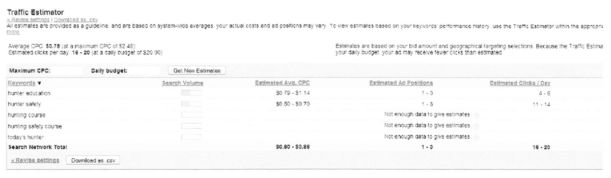
Based on the chart above it can be seen that both keywords “Hunter Education” and “Hunter Safety” have a higher search volume than the others that have been selected. Due to this fact it is estimated that more users will search these keywords allowing more traffic to in-turn be drive to hunter-ed.com. “Hunter Safety” appears to be the keyword with the highest estimated clicks per day with nearly 11-14 clicks. “Hunter Education” is not far behind with an estimated 4-6. Unfortunately, “Hunting Course”, “Hunting Safety Course”, and “Today’s Hunter” do not have enough data to provide estimates meaning they are probably not popular keywords and are much less likely to be used than I had originally predicted. So to put it simply, according to the chart above, “Hunter Safety” has the highest potential to drive the most traffic to the hunter-ed.com homepage, while contributions can definitely be made from“Hunter Education” and “Hunting Course”, “Hunting Safety Course” and “Today’s Hunter” are all keyword phrases that will most likely remain unused and thus unhelpful in driving traffic to the website.
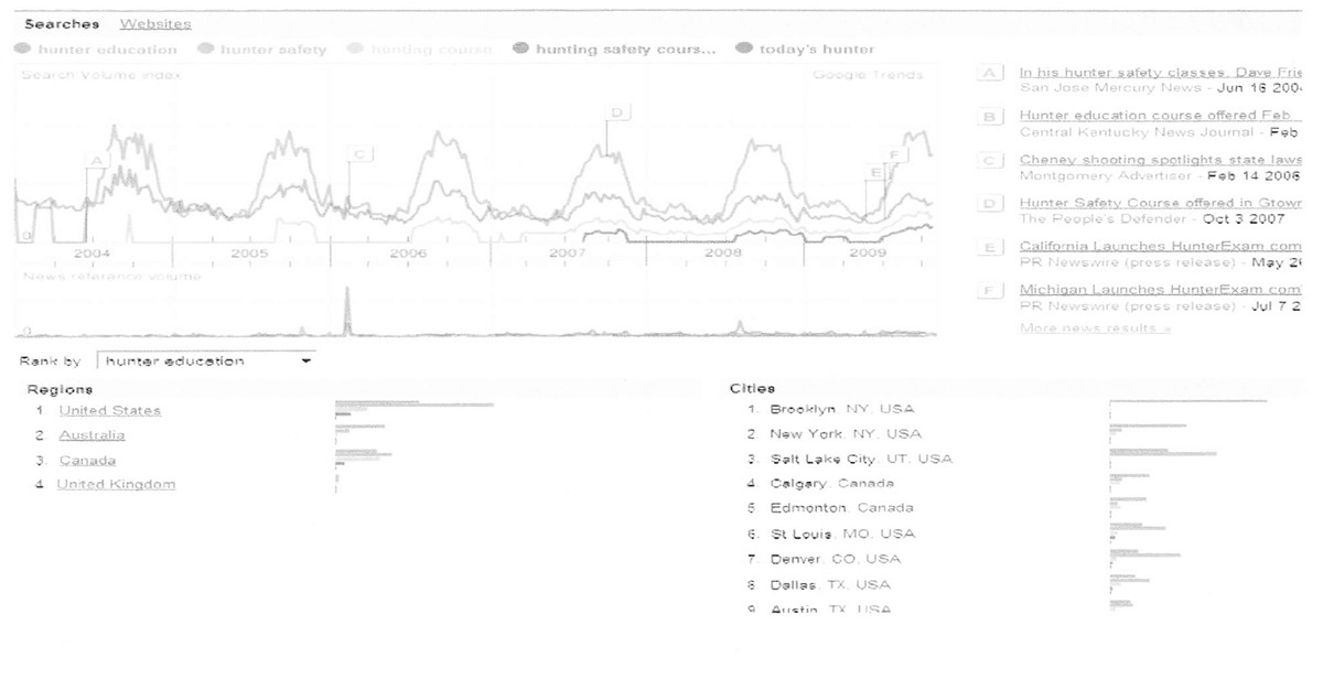
To determine geographically and what times of the year seasonally the important keywords are usually searched is represented on the graph above. As found “Hunter Safety” is the most searched keyword and drives the most traffic to hunter-ed.com, “Hunter Education” comes in second, “Hunting Course” third, “Hunting Safety Course” in fourth, and “Today’s Hunter” not even registering on the chart. According to geographic trends the United States is, as expected, the leading region that searches the important keywords. I found it surprising that Brooklyn, NY, New York, NY, Salt Lake City, UT, Calgary, CA, and Edmonton, CA were all top cities that search the chosen list of keywords. Instead I had expected to see more from the following cities, which surprisingly were found ranked towards the bottom of the list: St. Louis and Kansas City, MO, Denver, CO, Dallas, TX, Austin, TX,and Houston, TX.
The same chart above can be used to determine seasonal trends of the important keywords; it seems evident that each of the chosen keywords appears to increase in the number of times searched towards the end of every year. This increase in popularity of search is easily explained because the majority of the big hunting seasons occur towards the end of the calendar year.
Search Results in Major SearchEngines
Single Best Keyword Choice
The single best keyword choice that can be used to drive traffic to the hunter-ed.com’s homepage in my opinion would have to be “Hunter Safety.” Through the above steps in determining search engine optimization I believe “Hunter Safety” ranks well in all of the necessary categories. It has been placed in all the key locations that are designated areas search engines look directly into, as well as its decent keyword density percentage and location frequency. Looking at the trends of the keywords it has been determined that “Hunter Safety” is also estimated to have the largest click rate per day, is one of the already more heavily searched keyword phrases in top regions and cities, and like the other keywords relates directly back to hunter-ed.com while increasing in its popularity towards the end of each year. “Hunter Safety” ranks rather high throughout all major search engines as well, proving that the high number of users searing this keyword should be eventually driven to the hunter-ed.com homepage. Although “Hunter Safety” is not the highest ranked in every aspect of the SEO process, it is towards the top of each list and from top to bottom is consistently high enough to be considered the best single keyword choice.
The single best keyword choice that can be used to drive traffic to the hunter-ed.com’s homepage in my opinion would have to be “Hunter Safety.” Through the above steps in determining search engine optimization I believe “Hunter Safety” ranks well in all of the necessary categories. It has been placed in all the key locations that are designated areas search engines look directly into, as well as its decent keyword density percentage and location frequency. Looking at the trends of the keywords it has been determined that “Hunter Safety” is also estimated to have the largest click rate per day, is one of the already more heavily searched keyword phrases in top regions and cities, and like the other keywords relates directly back to hunter-ed.com while increasing in its popularity towards the end of each year. “Hunter Safety” ranks rather high throughout all major search engines as well, proving that the high number of users searing this keyword should be eventually driven to the hunter-ed.com homepage. Although “Hunter Safety” is not the highest ranked in every aspect of the SEO process, it is towards the top of each list and from top to bottom is consistently high enough to be considered the best single keyword choice.
