
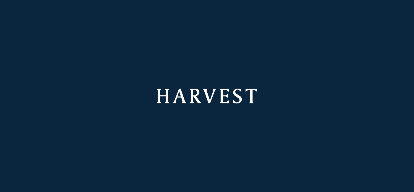
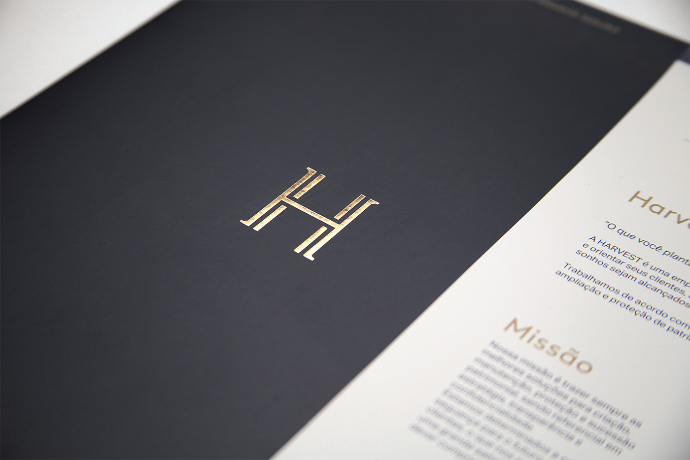
HARVEST
Harvest is a brazilian planning and financial company. The company is focused in developing safe and comfortable plans for clients to live in harmony with their financial lives, offering the best solutions to criation, maintenance, protection and patrimonial succession.
Harvest is a brazilian planning and financial company. The company is focused in developing safe and comfortable plans for clients to live in harmony with their financial lives, offering the best solutions to criation, maintenance, protection and patrimonial succession.
NAMING
As a company that develops financial plans, the credibility perception, respect and trust are our aims for a company that develops financial plans. The first step to build the brand's identity was the name. We analyzed and categorized different types of perception for chosing one that conveyed the desired perception. Among diversified paths to take, the metaforic approach allowed us to achieve better extensions, have autenticity and get to a name that called upon the company's essence. Our guide for getting to the name was based on 3 main factors:
- The company acts worldwide: the name has to behave well in different languages. We opted for English for its characteristic of "lingua franca" and for responding effectively to phonetics, graphics and sonority.
- Through perception tests (audible and visual) we analyzed how positive it would be to contact with different names. Our aim was to measure which choices had better insights with credibility, autenticity and safety.
- In the strategic field, the brand's communication along with the meaning of the words was decisive for the name's choice. Although working with financial solutions that represents the rational thought, the emotional idea of tranquility and safety convert in vital aspects.
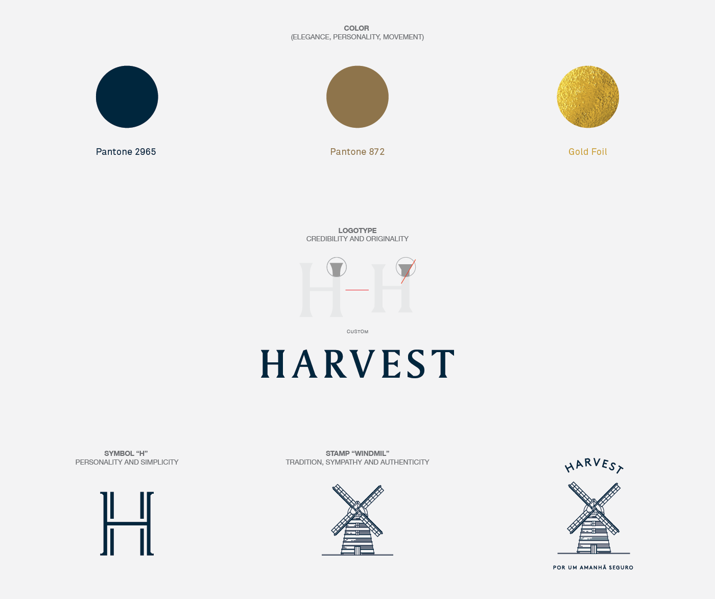
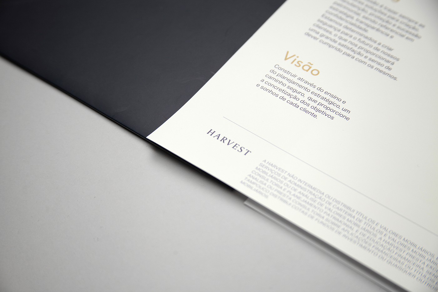
Harvest was chosen for answering effectively to the 3 factors, being well perceived and received with adjectives like: education, power, respect, knowledge. In Brazil, even the ones who didn't know the translation had a good perception of the name. "Harvest" connects to the ideal of planting to collect, in the sense of development and wealth planning, and, for the ones who didn't know, it was associated to education, economy, knowledge, positive imposition of respect. To conclude the semantic sphere and build the verbal identity, the tagline closes metaforically with the emotional aims for the ones who work in Harvest: For a safe tomorrow.
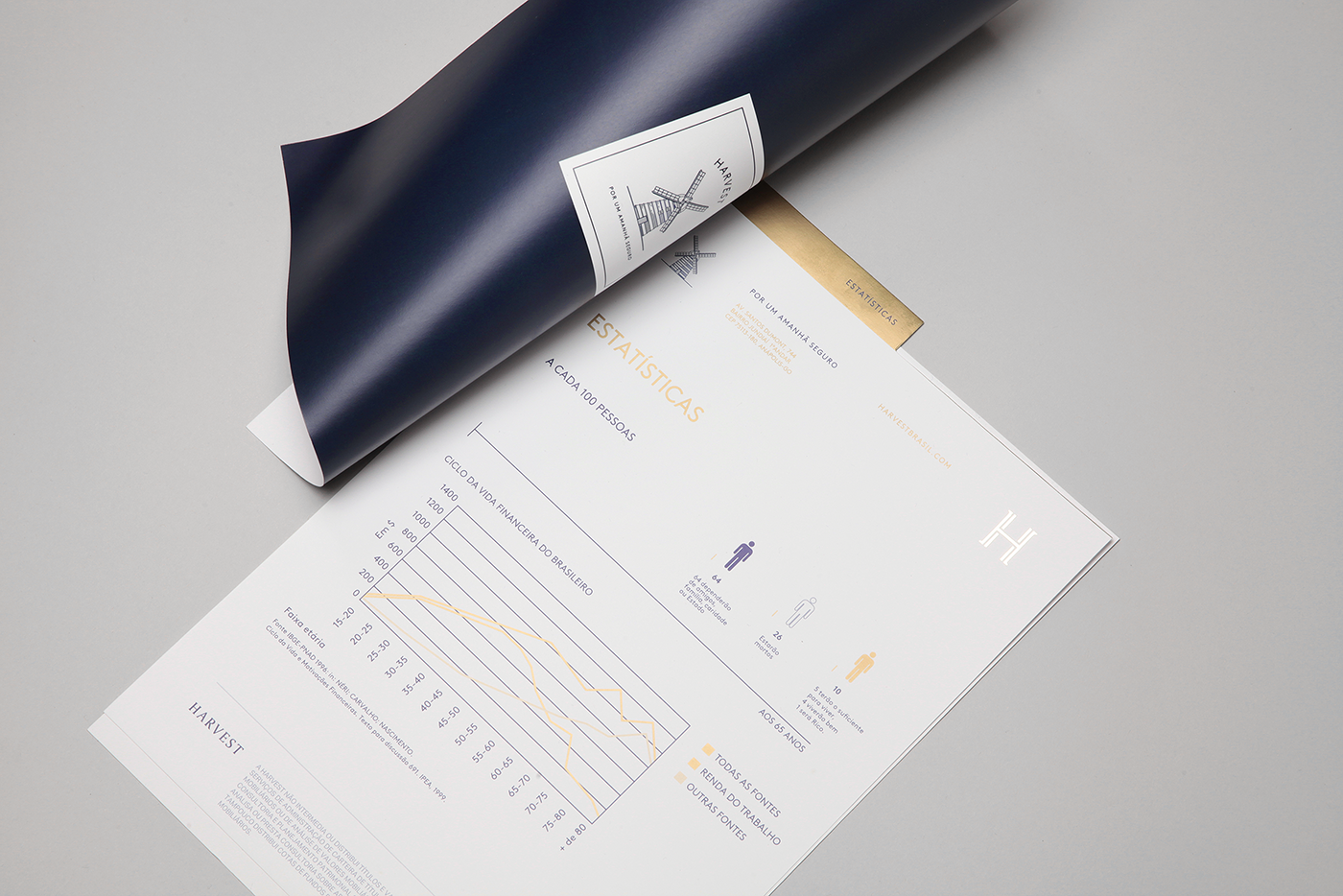
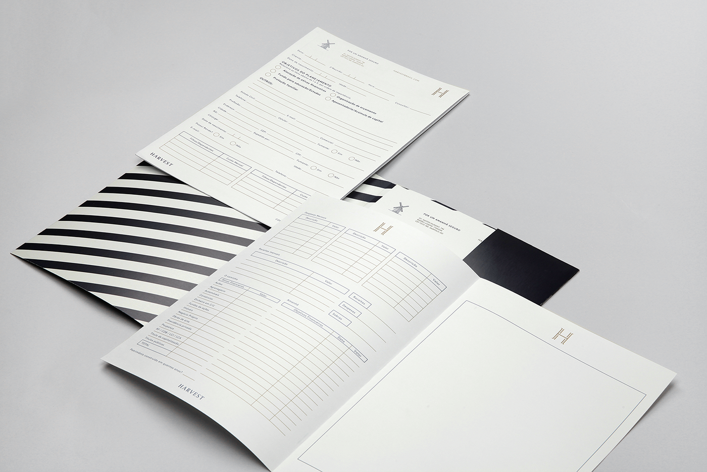
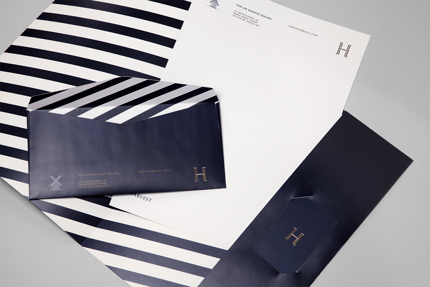
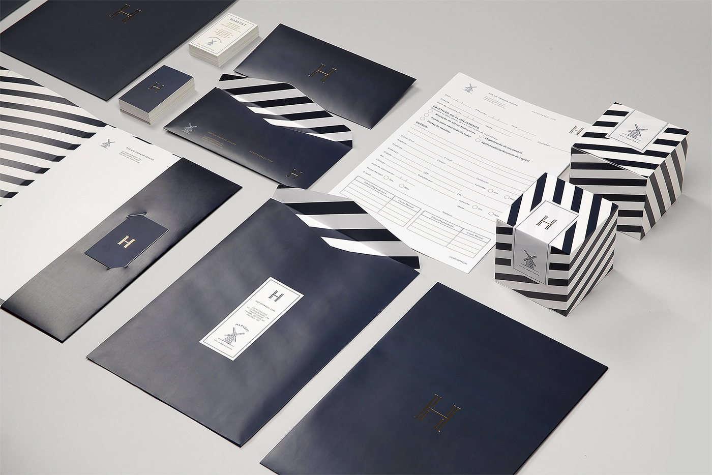
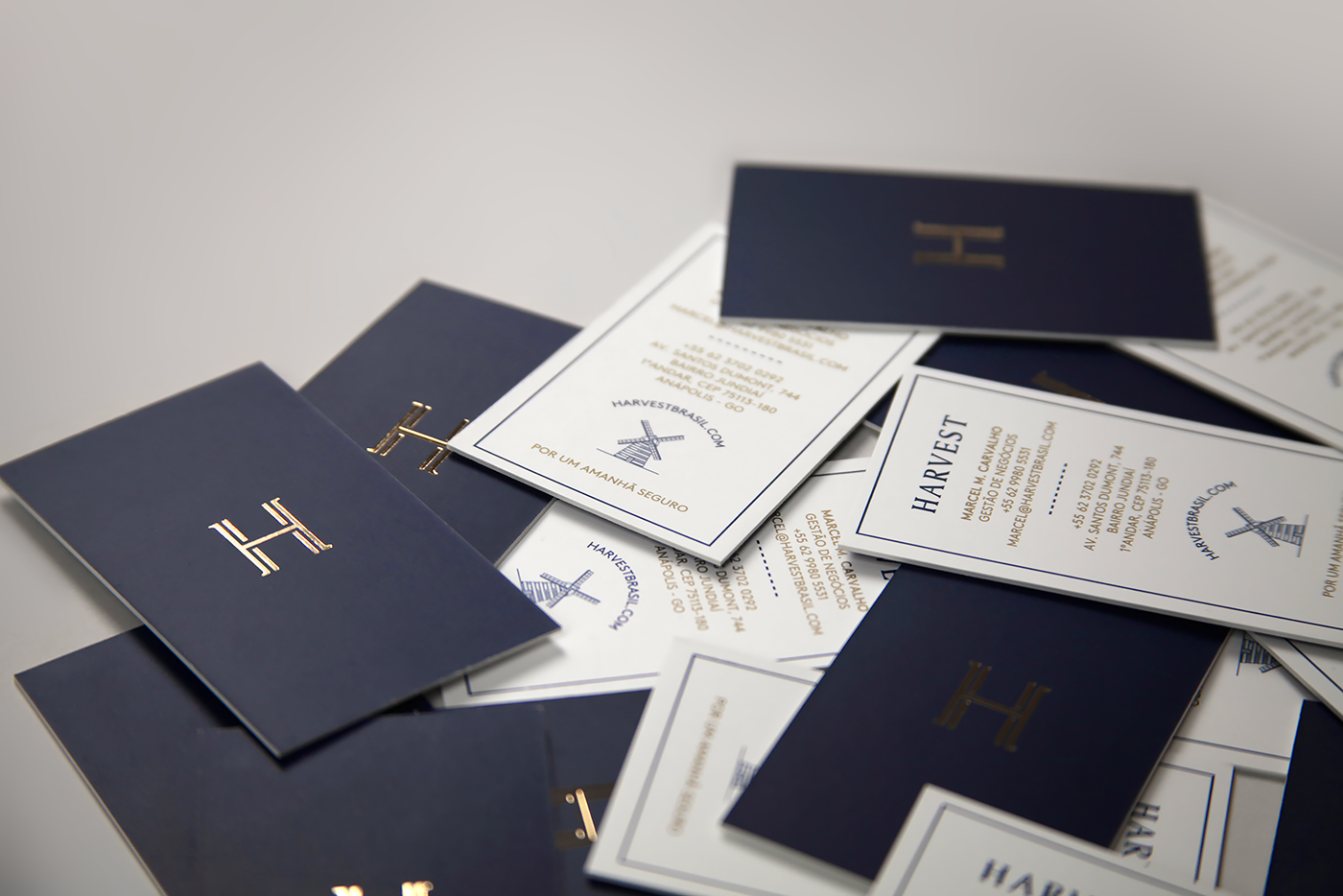
VISUAL IDENTITY
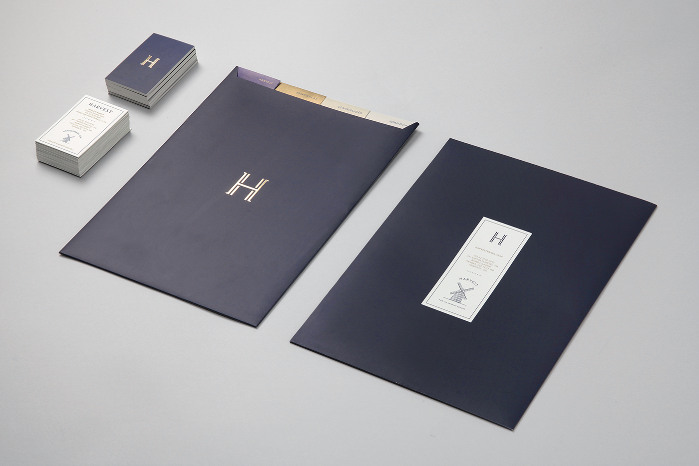
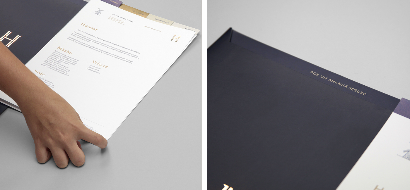
Through the visual identity, we wanted to build the perception of trust to the clients being friendly, elegant, strong and authentic. To bring all these atributes together, we developed different brand elements to transmit several
sensorial assimilations.
Harvest has its atributes reflected through the brand's actives (name, identity) and, along with that, a strong capacity to achieve and act internationally, with a positive perception and a value percieved for the work
in the brand.
in the brand.


FOLLOW US:
Facebook: www.facebook.com/brbauen
Instagram: www.instagram.com/brbauen
Twitter: www.twitter.com/BRBAUEN
CREDITS
Creative Direction / Design: Braz de Pina & Rodrigo Francisco
Brand Strategist: Luís Feitoza
Design Development: Verônica Sauthier & Murilo Pascoal
Product Photography: BR/BAUEN
Social Strategist: Frank Michael
Copywriter: Ana L. Machado
Print Production: Cirgráfica


