
These Badges were created for Class Two of the Adobe Education Exchange course for Graphics & Illustration.
When deciding on what movie to pick for this task I couldn't get my favourite movie saga out of my head. It's also the most obvious movie in the history of movies. So in order to test myself I decided to do that one (4_images_Colour_01.png) and another classic film saga (4_images_Colour_02.png).

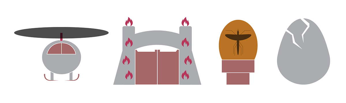
First of all, I wanted to think of the journeys that the viewer is taken on in each of the movies. Once I had that concept I then went on to do rough storyboards of the films from my memory. I then slowly removed parts of the storyboard until I was left with 4 iconic sections of the films. Once I’d decided on the 4 storyboard pictures I tried to visualise how these could be represented using just simple icons. This was definitely the part I struggled with the most and hadn’t realized how much time this part of the process would take would take.
Due to the fact that icons are supposed to be a set of simplistic imagery as shown in the class literature, I wanted to make sure that my icons could actually be printed in just black and white as well as colour. I found it very difficult to not go overboard and draw little details on the icons in order to fit into the universal language set out on “The Noun Project”.


I actually sketched the images out several times, removing a layer of detail each time until I got to a point where I was happy with outcome. I then took a picture using my iPhone and then vectorised them using Illustrator. I only used the shape tools and the pen tool using black and white. This way if the icons didn’t make sense then they were either too detailed or not detailed enough.
Once I felt happy with the vector icons I decided to use a very simple colour palette just to add 3-4 colours to each of the images. I made sure that the colours were consistent in order to join the imagery together and show them off as a set of icons.


During this class, I have learned how simple imagery can be clearer than complex imagery and that simple shapes can be an integral tool for an illustrator to get his design across to a wide range of people and cultures around the globe.
Having looked over the Lecture again i felt that my icons didn't quite meet the 7 Principles of Effective Icon Design outlined in the powerpoint so i thought i would tidy up my icons yet again (4_images_Icon_01.png and 4_images_Icon_01.png).
I also thought i would share my Artwork layout to show that i tried to be neat :)


