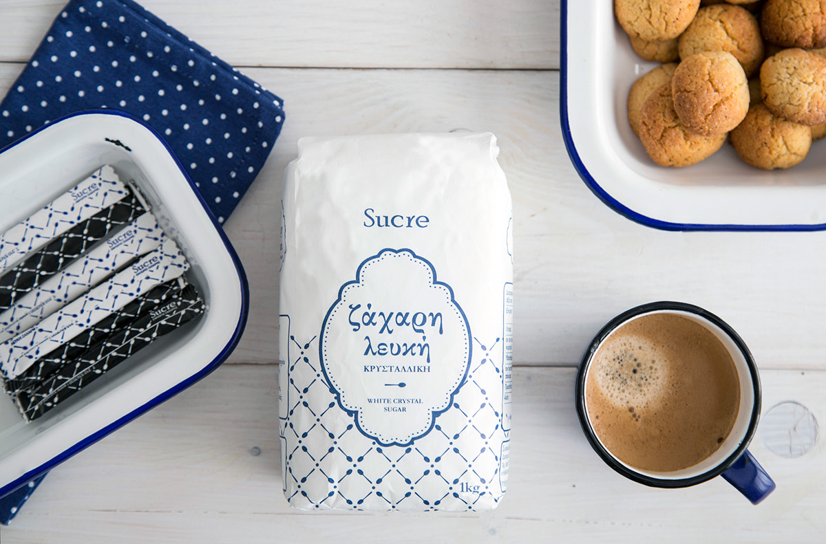
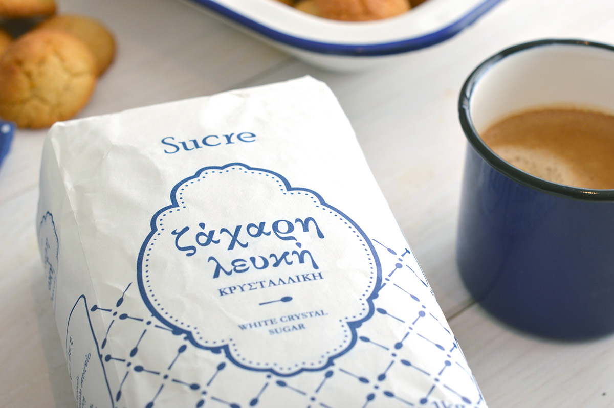
Η ανάγκη για το σχεδιασμό αυτής της συσκευασίας προέκυψε από το ίδιο το μεράκι του πελάτη. Εμπορεύεται ένα άριστο προιόν το οποίο ήθελε να πάει ένα βήμα μπροστά βάζοντας την δική του πινελιά. Οι λέξεις κλειδιά ήταν ποιότητα, παράδοση και ελληνικότητα και ένας περιορισμός … 1 χρώμα, κι αυτό έπρεπε να είναι το μπλε.
Το σύνολο του σχεδιασμού και τα μέσα που χρησιμοποιήθηκαν (γραμματοσειρές, πλαίσια κλπ) κινήθηκε σύμφωνα με τις λέξεις κλειδιά. Για να πλαισιωθεί η συσκευασία δημιουργήθηκε ένα μοτίβο από κουταλάκια, αντικείμενο που όπως έδειξε η έρευνα είναι άμεσα συνδεδεμένο στη σκέψη του καταναλωτή με τη χρήση της ζάχαρης σε διάφορες στιγμές της ημέρας (από τον καφέ έως το μαγείρεμα).
Το ίδιο μοτίβο χρησιμοποιήθηκε και για τα sticks ζάχαρης.
The need for the design of this packaging resulted from the customer's own passion. He trades an excellent product for which he wanted to make a step further by putting his own mark on it. The keywords were quality, tradition and Greek origin. A limitation ... 1 colour, and it had to be blue.
The whole design and the tools used (fonts, frames, etc.) were in line with the keywords. A pattern of spoons was created to accompany the packaging design. The research has shown that the spoon is an object, directly connected to the consumers’ mind with the use of sugar at different times of the day (from coffee to baking).
The same pattern was used for the sugar sticks.