Coco & Co Brand Identity and Packaging
Coco & Co is a fictional pet care and accessories company created as my final degree project.
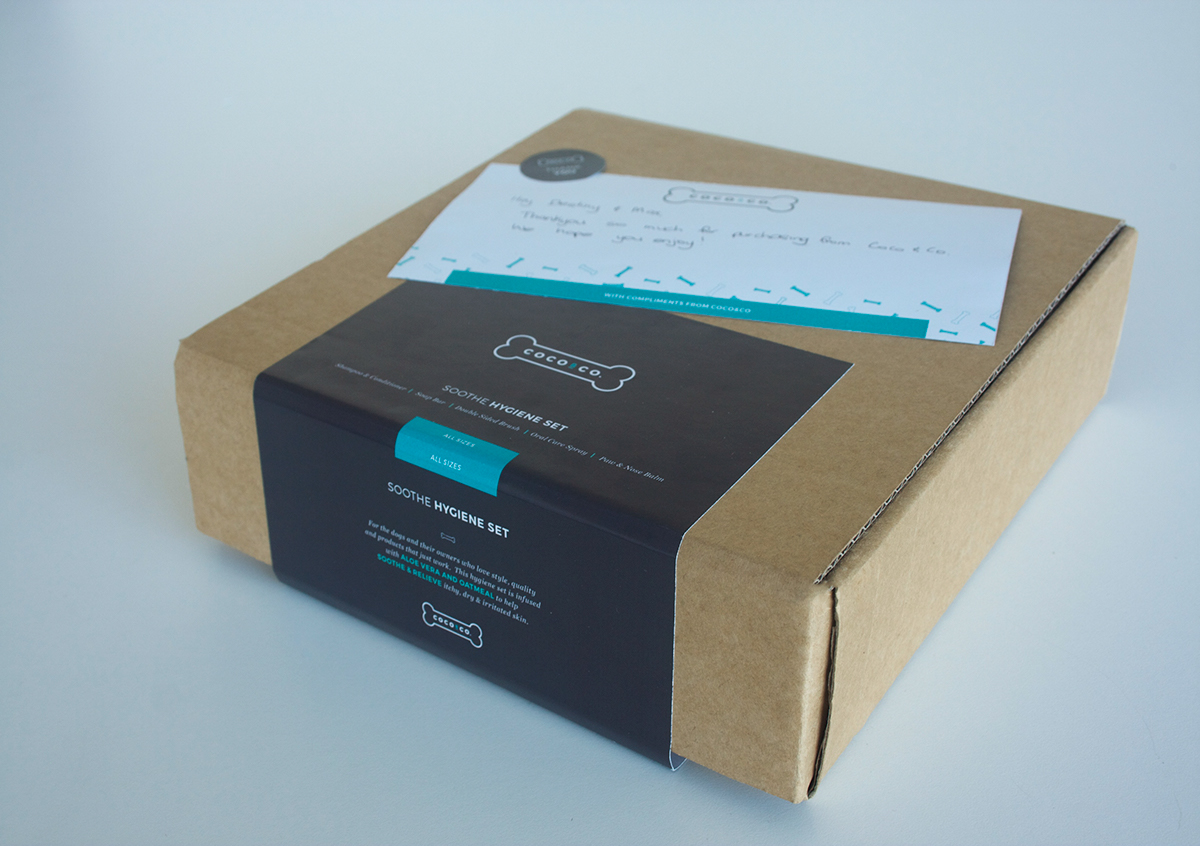
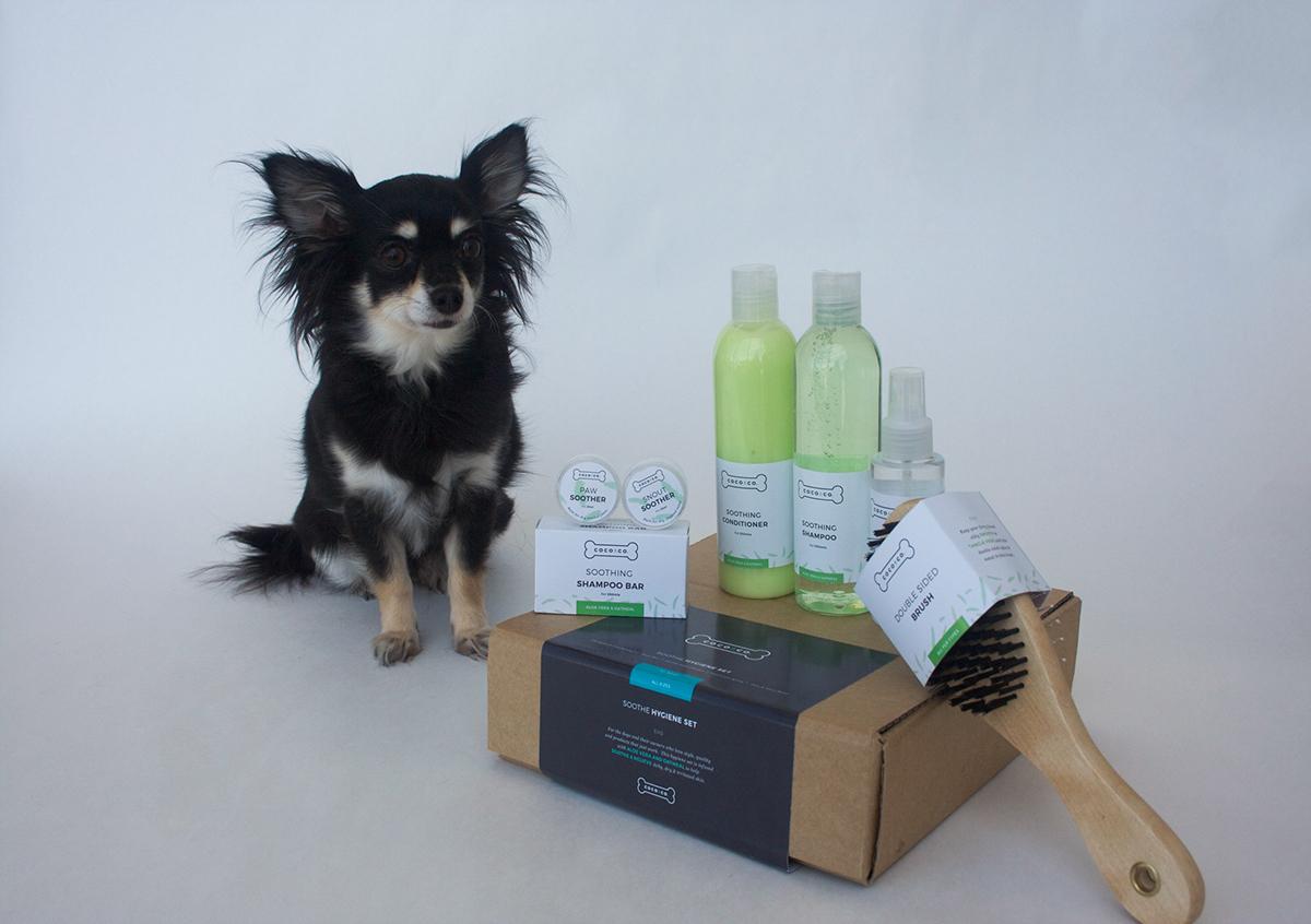
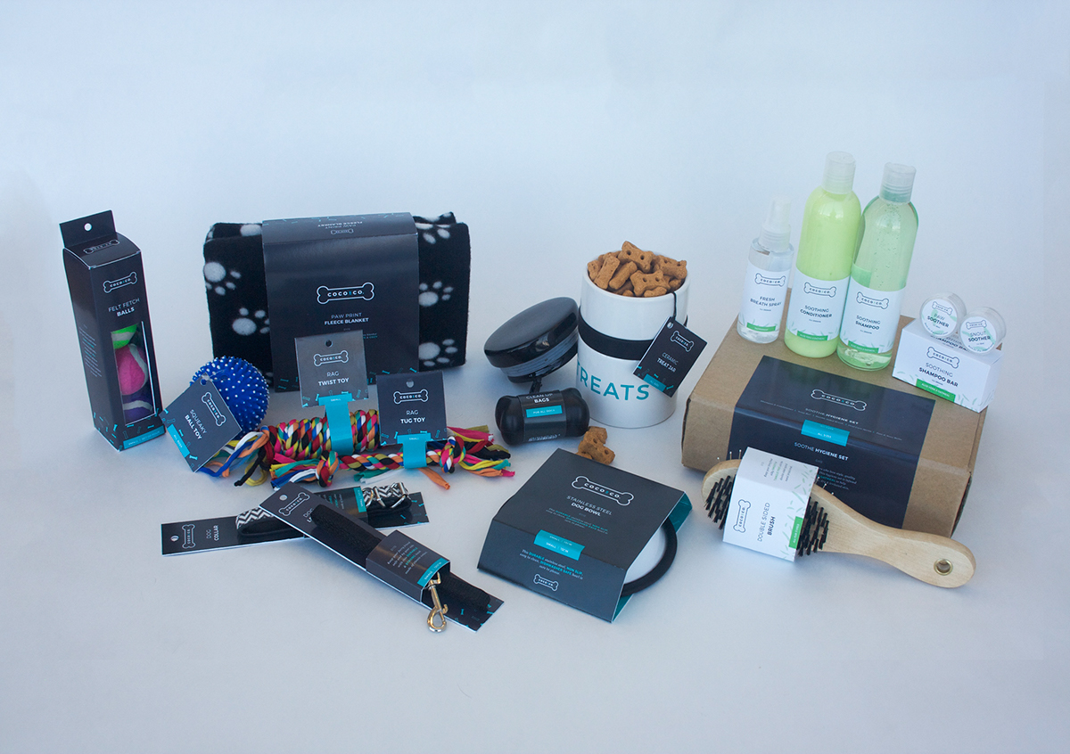
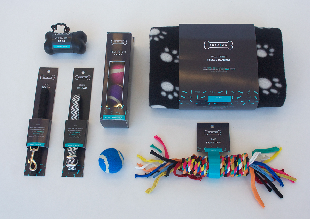
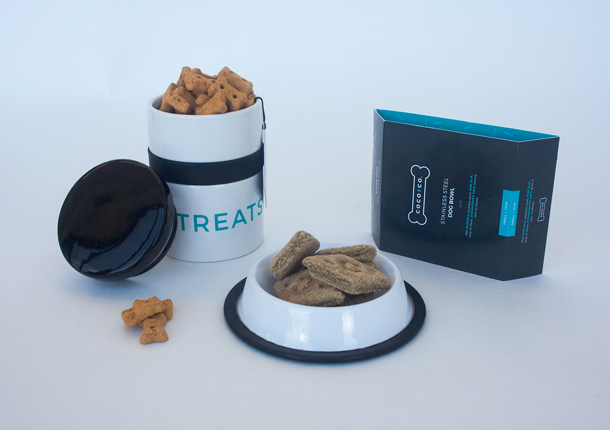
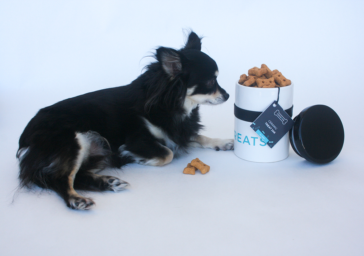
As a massive pet lover and owner of two dogs, I have found it hard to find stylish and well designed products in the pet industry in New Zealand and this is how Coco & Co was born. Coco & Co is focussed on bringing joy and style to the dog world, while promoting a happy and healthy dog. It aims to create a product range that doesn’t need to be hidden away due to the packaging.
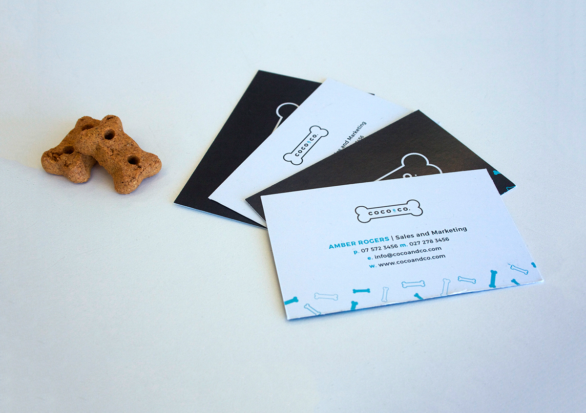
The name Coco & Co is not only a common dog name but also introduces some humour as it is the same syllable repeated and makes the brand more memorable when being sold. The name which is aimed purely towards Coco includes more than just her by adding the & Co. This stands for everybody else, from Coco’s doggy friends, to dog owners, to all those who love dogs and to all those who work at Coco & Co.
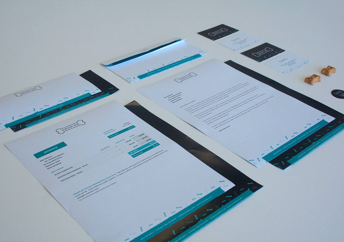
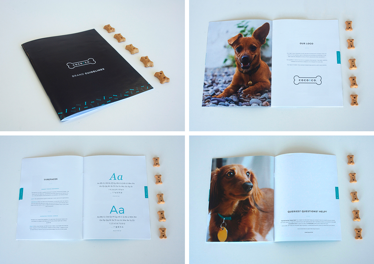
For the main brand I used a limited colour palette of blue and blue grey drawn from the theory that dogs can only see different saturations of yellow to blue grey. I used two typefaces, one sans serif, Montserrat and one serif, Georgia and played with different weights and styles to add hierarchy and interest. A bone and bone pattern was used throughout the brand to link all collateral together and create consistency over the brand. This pattern, along with the colours will become an indicator of the brand in stores.
*Note: This was a student project even though I wish it was real! Some images used are creative commons sourced.