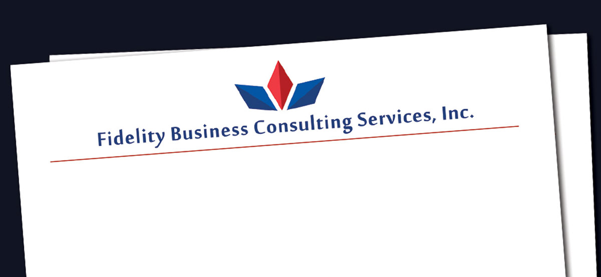
Fidelity Business Consulting Services, Inc. needed a logo, letterhead, envelopes, and business cards.
I chose scarlet/navy blue in keeping with the owner's Marine Corps service - he identifies very strongly with the Marine Corps principles, and his service is a great source of pride. Specifically, the white on either side of the red symbolizes his combat pant stripe.
To determine the shape and look, I utilized geometry to give it a clean, professional feel but gave it a bit of dimension by suggesting shadows. I chose to use three diamonds to symbolize the pillars of his business - integrity, responsiveness, and accuracy. I also feel that it symbolizes growth (a very geometric flower), which is a major theme of a financial consultancy. Also, the diamond shape suggests gems and therefore the gaining of wealth. Finally, I spread out the spacing of the letters in the fonts to open up the name and give the entire logo a lighter, airy feel.
This logo utilizes a sans serif font (without feet) and I like that the diamond shape is repeated in the dot of the i and the period. This font gives the logo a more contemporary, modern feel yet preserves the seriousness and professionalism of the business.

Business logo.

Identity package: business cards, letterhead, and envelopes.

Business card sample.

Letterhead closeup.


