Bold Users Conference 2012
And a little bit of the process to get there
And a little bit of the process to get there
I designed and developed the strategy behind our 2012 Users Conference this year. After viewing the look and feel of the hotel we would be using for our event, I thought to myself - this is a very traditional, elegant venue. How can I incorporate this into our conference?
Inspired by the friendly competition from the Harry Potter books, I pitched the idea of branding the entire conference with one symbol, but then splitting up our customers into teams and designing personalized team mascots and workbooks, and implementing a point system.
(Ten points from Hufflepuff! Only our classes are about security monitoring and not potions...)
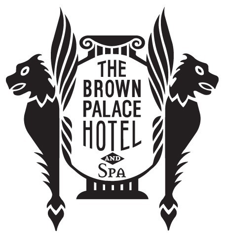
This is the logo for the Hotel we're using, so I wanted to incorporate some of that elegance in the logo, while still keeping the logo modern and sleek - we are a software company, after all!

After fiddling with a few concepts, I found I really liked the gravity of the heraldic lion. But I needed to create a sense of a software company - technologically capable, futuristic, modern. I was inspired by the depth of icons on the iphone - you can have any design but it still matches the look and feel of the iproducts. So I created the "gem" look as a vector in illustrator.

So we had an overall look for the conference. Now - onto the "Team" designs!
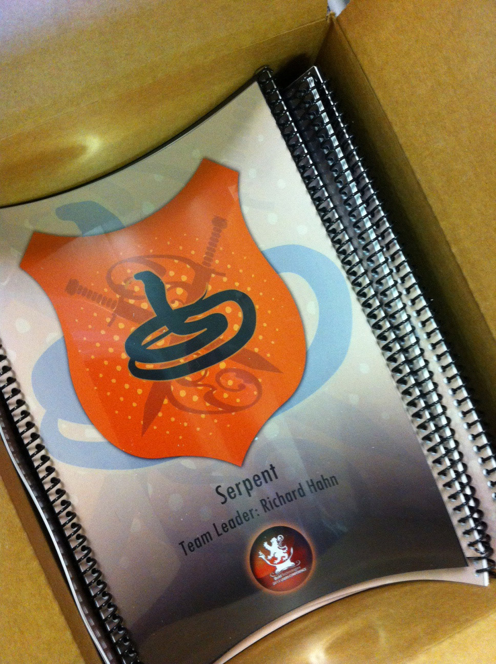
I went through about 20 different colors, animals and shield shapes - never the color red, or a lion, so our customers wouldn't get confused.
In in the end we chose these six.

While I designed the Lion from scratch, these guys I bought online (the vectors) to save time on the project.
At one point I threw a bunny on there, and my CEO laughed - "All these ferocious animals, and then a bunny?" To which I really wanted to do a spoof line of angry demon vampire bunnies for the staff, but we ended up in crunch, and no dice. Next time!
Everyone received a booklet with their team's design on the cover. Inside were pages about our Taste of Denver, adverts, the schedule, vouchers, and more. I designed pages where our sponsors could "stamp" the booklet when a customer visited their table, and that's how we tallied the points for the teams.

The lanyards provided to be a bit of a challenge. You have six teams - plus a different design for staff and sponsors. You've got steering committee, speakers, sponsors, team leaders... how can I add all these modifiers to seven designs and keep it uniform? In the end, this is what I went with. I took off the sponsor and staff text by the gem for the final designs to keep the clutter down.

Then it was time to put it all together. Table toppers, drink tickets, posters...


Everyone really seemed to enjoy the team aspect of this year's conference. Team Eagle (lead by the CEO) and Team Wolf (Lead by our VP of Sales) battled it out for the spot of victor... and Eagle claimed it all!

It was a really fun project to design and develop. I'm so glad it was so successful this year at the Bold Users Conference 2012!


Photos by Caryn Morgan and Tiffany Coles. Work (c) Bold Technologies.

