


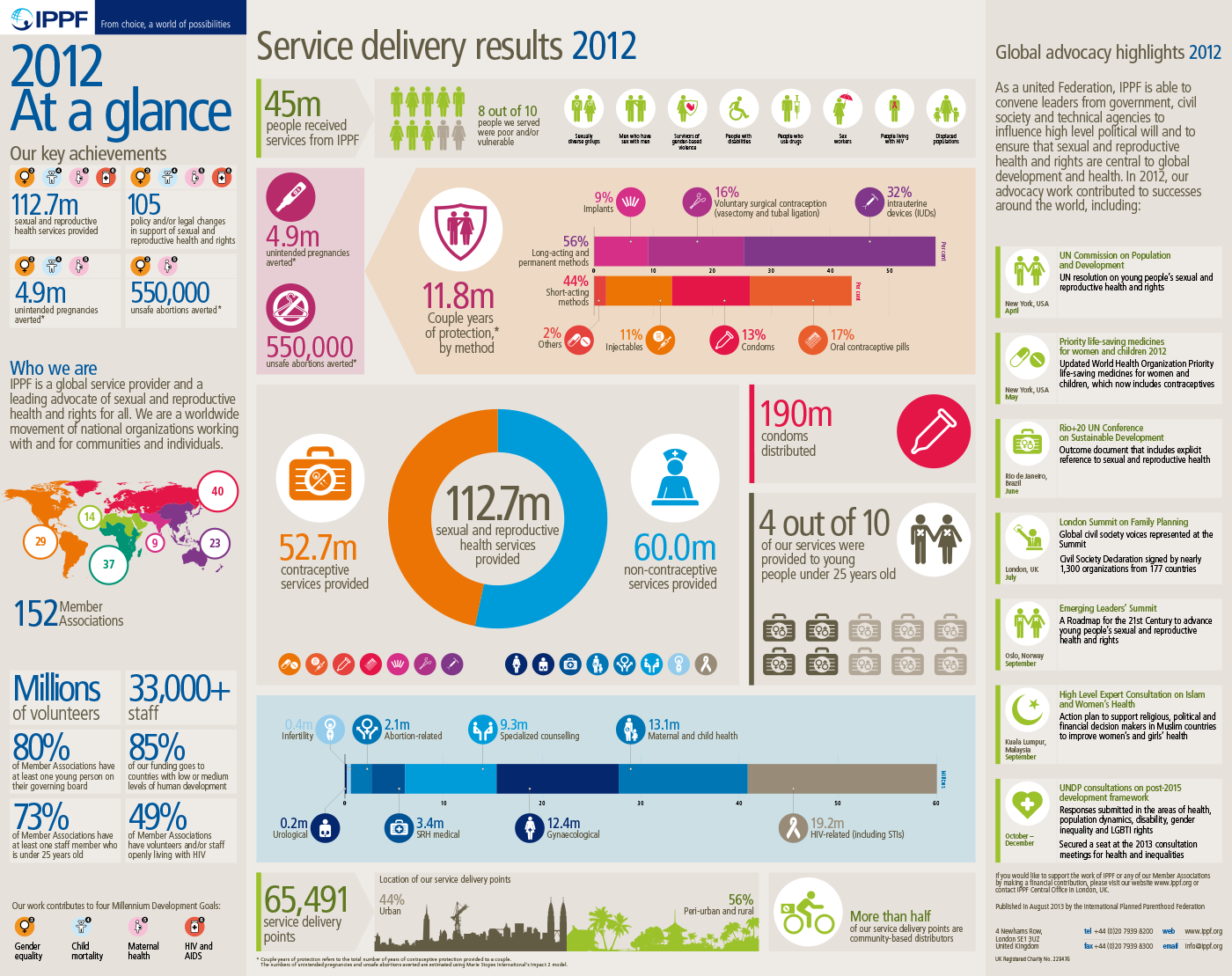
Every year, the International Planned Parenthood Federation release an Annual Performance Report (APR) – the most important document on the achievements of their 155+ national affiliate organisations. However, the APR is lengthy & complex. So, in 2006, IPPF also began publishing At A Glance – an executive summary of the APR as a small leaflet, slipped into the main report.
Over time, the design of At A Glance evolved until, in 2012, we arrived at this version – both a leaflet and wallchart. The unusual pocket-sized format was designed with the deliberate intention that our fundraising teams could quickly hand a copy to key individual advocacy targets. These would typically be Secretaries of State for Health, UN Ambassadors or other very senior officials who are all exceedingly busy people.
The strategy we devised involved our fundraising team suggesting the Minister or Official should pop their copy into their jacket pocket in order that they could then read it later in the comfort of their ministerial car.

Obviously, this limited form-factor meant space was very tight. So I devised a design grid and framework and used the pictographic toolkit I'd already developed for the Annual Report to achieve the maximum value from every square inch of paper available.
The front side of the At A Glance poster summarises the content of the main Annual Performance Report, broken down into key statistics on the lefthand column panels, the year's Service delivery results in the central panels and then highlighted Global advocacy achievements in a timeline.
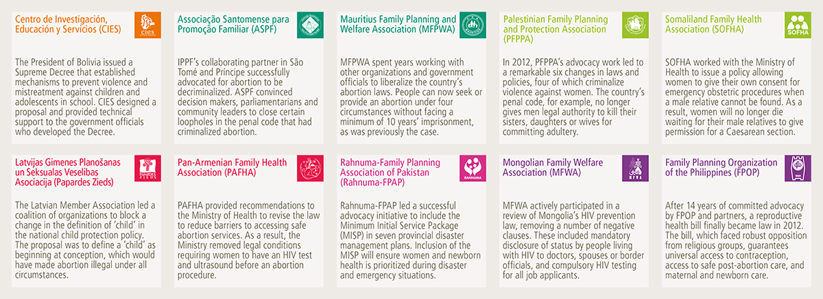
The reverse of the piece displays a more in-depth analysis of the affiliate's own improving national advocacy achievements – one of IPPF's core strategic goals. These are broken down by territory as well as by theme.

On the map itself, we displayed each affiliate's achievements as coloured concentric rings (the paler inner rings represent earlier years' successes). Each of the Federation's six global territories is identifiable by a different colour: Europe is red, the Arab World is grass green, South Asia is pink, etc.

We made as much use of the pictographic toolkit I'd devised for use across all IPPF's communications wherever possible. In the limited space available on the At A Glance leaflet, they helped quickly convey the meaning of some of the more complex issues.


We also made more use of arrow panels to both group the visual elements (statistics, text headings and other visual components) as well as lead the eye across each particular statistical statement. This approach made good use of space without overcrowding the piece.


Feedback on this refreshed version of At A Glance received extremely positive feedback from all our key target audiences, as well as by senior staff and volunteers themselves.
Chris Wells
Thank you – I really appreciate you looking over my work & value constructive feedback.
You can find more at Chris Wells Ltd – my digital & design consultancy.
You can find more at Chris Wells Ltd – my digital & design consultancy.
Get in touch to discuss branding, infographics & data visualisation, digital publishing design
& content management for mission-led brands
@chrisdwells_


