
Recently, I was given this project for a Vietnamese Buddhism organisation. And the founder is actually my root Guru (in Tibetan Buddhism, root Guru is considered as a person whom we received teachings directly). Since I have so much admiration for Him and He trusted me to hand me this job, I put a lot of efforts on this project and I think I succeeded somehow.

I used the smiling face as the main element because the key message of the organisation is "Live strong & Happily". I tried to bring the feel of calm and peaceful by the image and the colour as well.

In this design, I wanted to emphasise on the key message so I used the whole side of the front for it.
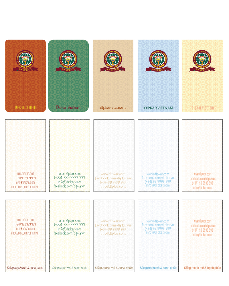
Personally, I love this design the most because I spent more time on it :P but sadly, it wasn't picked up. For the background, I combined the letter "D" as Dipkar - the name of the organisation, in order to make the pattern. I also had 2 options for this design, one with the slogan and one with the info only.
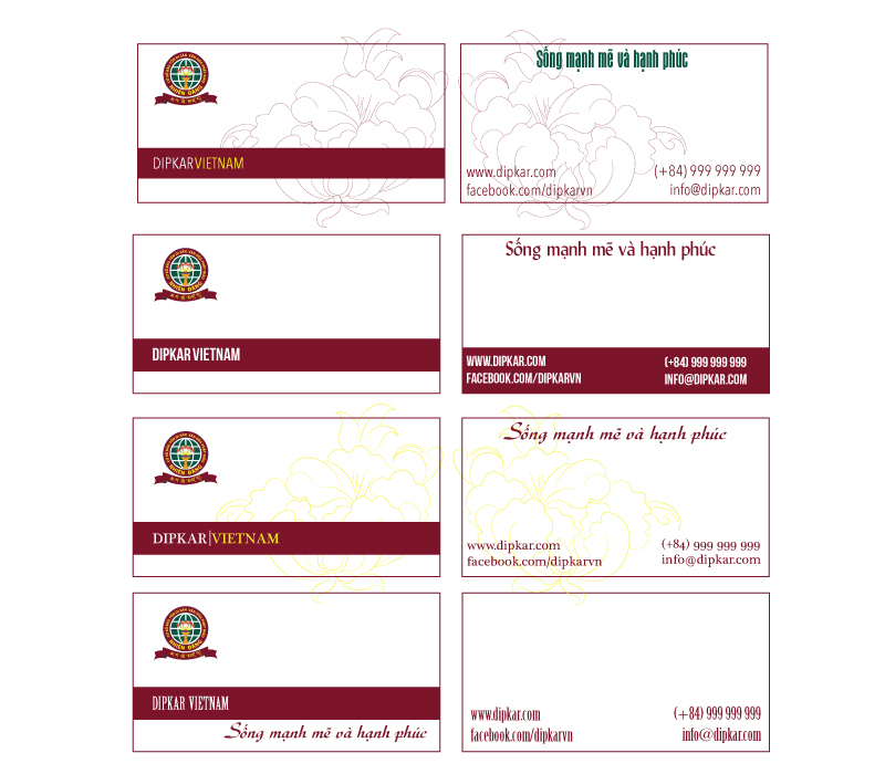
And yes, the winner of all. Simple is the best :) My Master is never wrong.

Handout 1

Handout 2


