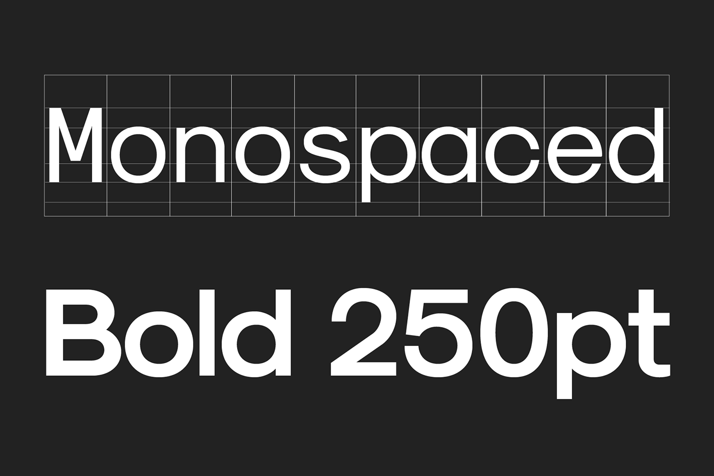

Sk-Modernist
Typeface, 2016
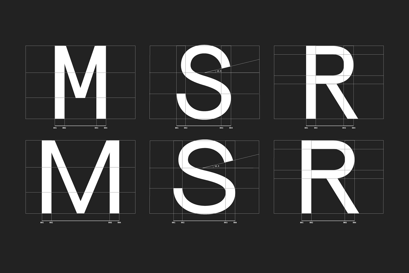
Sk-Modernist is a minimalist and clean typeface which eschews complicated forms. The aim of the typeface was to create an amalgamation of a modern Grotesk, like Helvetica, with a simpler geometric style, like Avant Garde.
Sk-Modernist has been designed specifically for the digital age, each letterform being optically adjusted using a mathematical system rather than the traditional typographers eye. This approach has resulted in a typeface that displays exceptionally well in digital mediums.
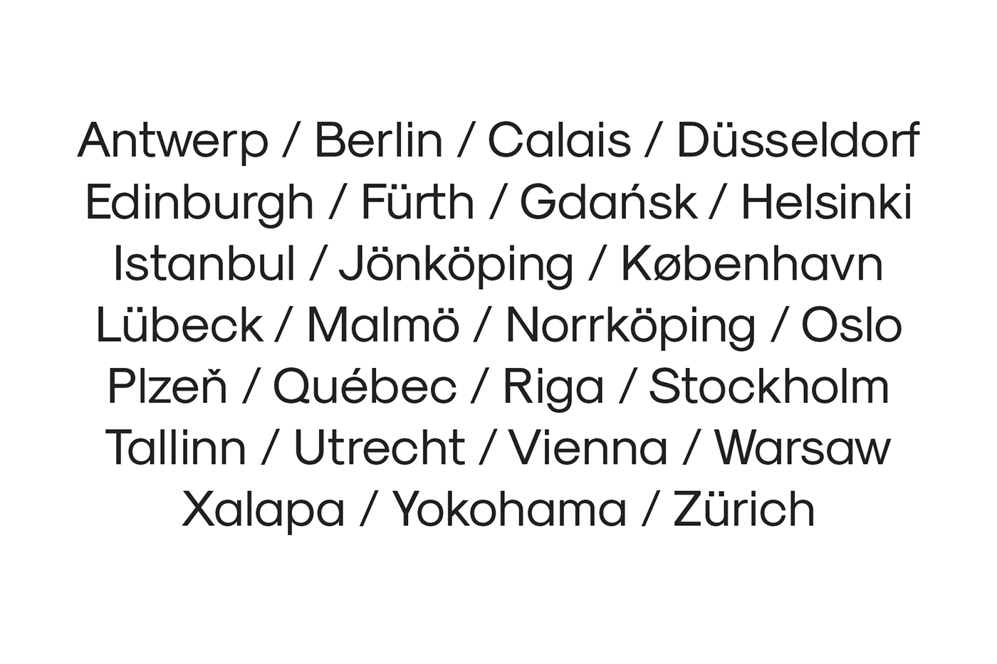
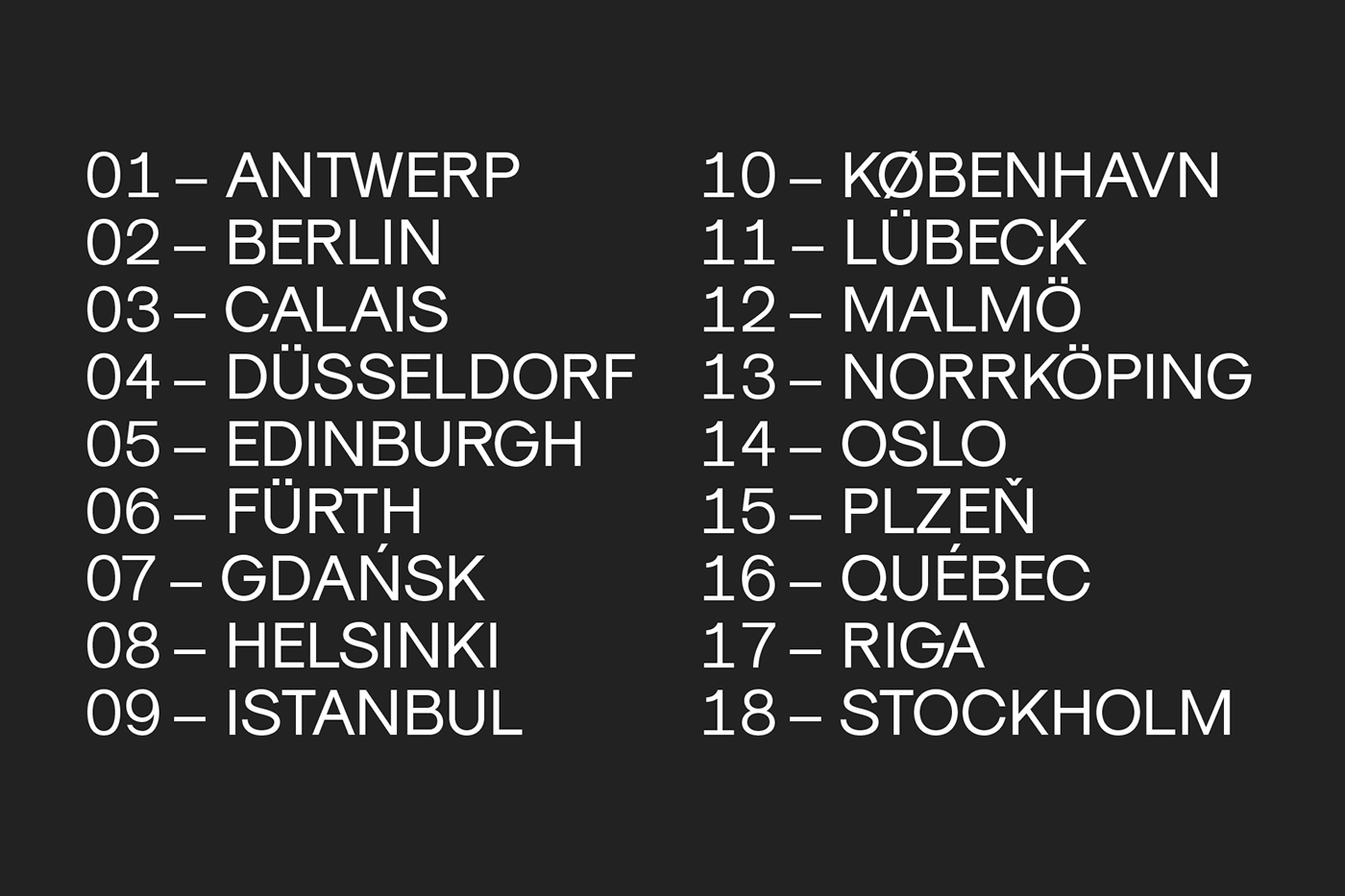
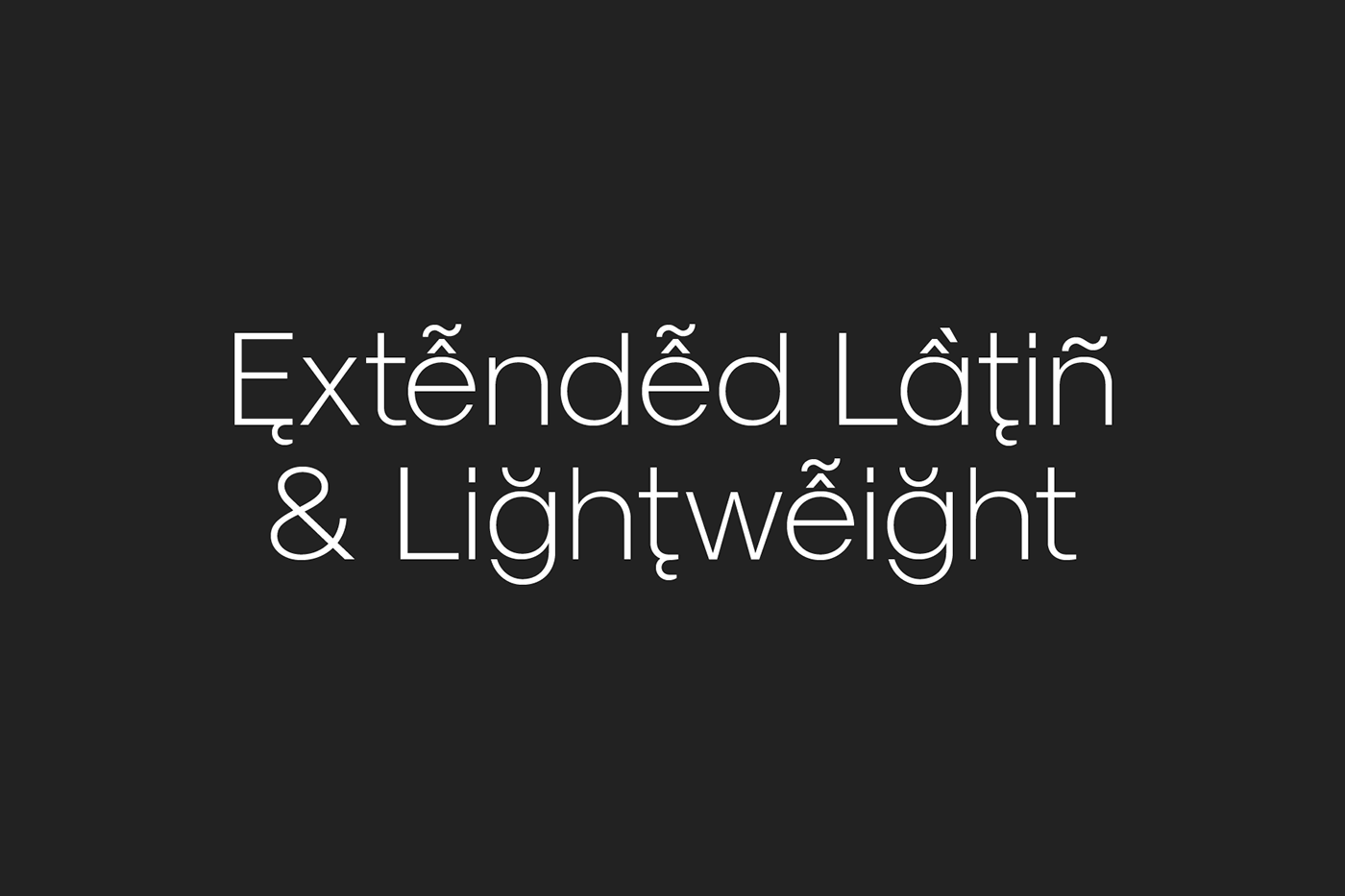
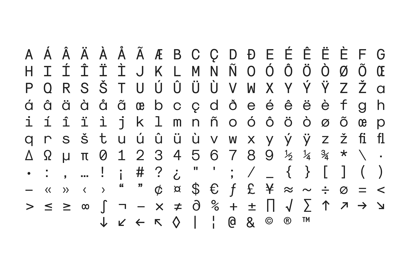
The font is the first to be released by Sean Kane Design and is currently available in Light, Regular, Bold and Monospaced weights. Features include multi language support, Extended Latin and Vietnamese character sets, ligatures and stylistic alternatives.