
Logos & Icons
Typewriter

Logo mark and icons created for Typewriter.
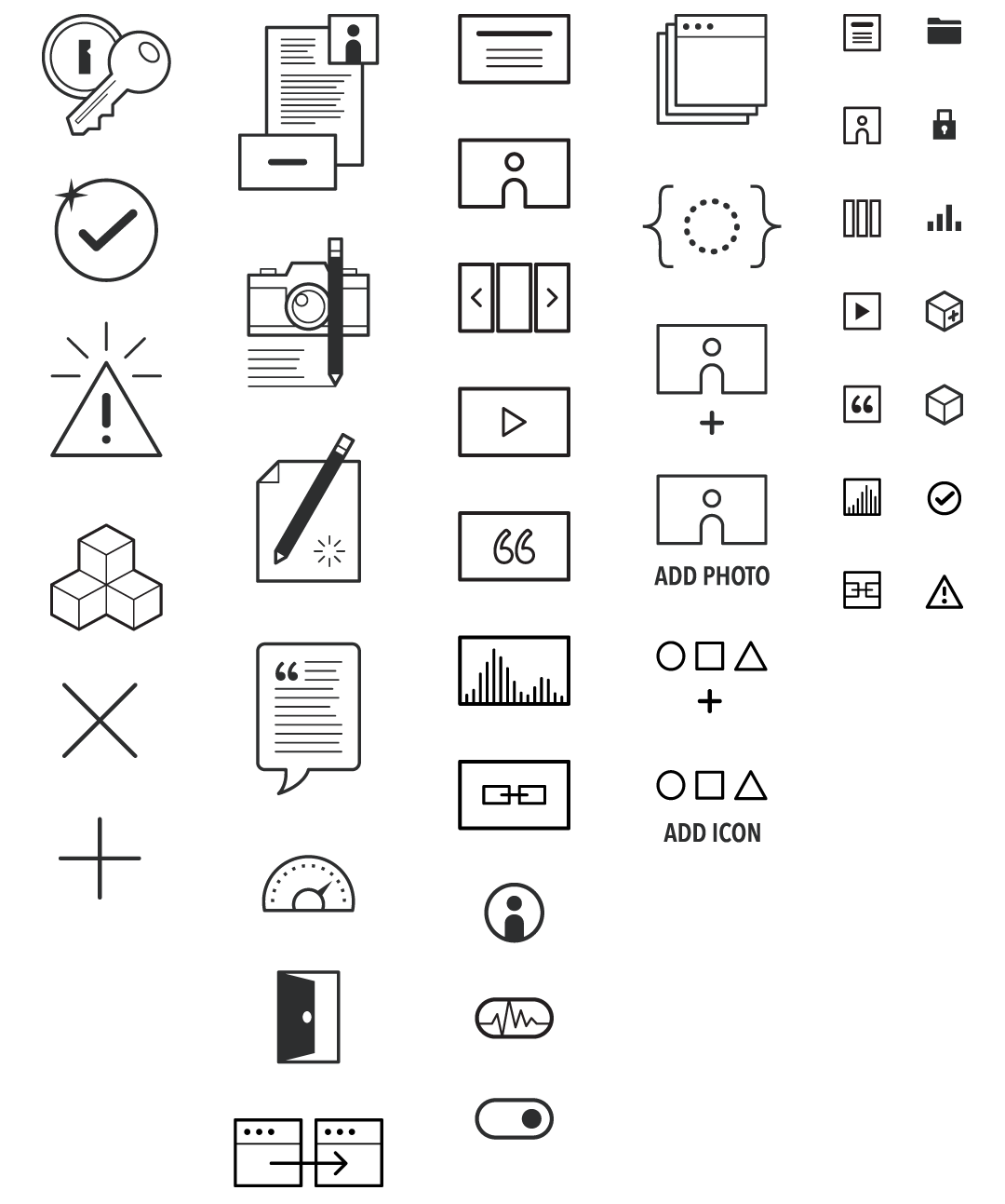
Custom icon set for the interface of Typewriter.
Camp Manitou
Like many summer camps, Manitou's branding has been inconsistent over their 70 years history and they had used a wide variety of logos, created by different artists for many different applications. They needed a clean, elegant mark that would look equally at home on a t-shirt, a gymnasium floor, or a website.
Initial sketches explored a wide variety of concepts, from Native American artifacts and weaponry suggested by the camp name to heraldic devices used in camp traditions to minimalist marks and symbols.

Sample of exploratory sketches created while researching the new logo and collaborating with the client. Pencil on paper.


Final logos.
Manitou wanted to convey a lot in a little space and their new logo is based on a left-to-right diagonal that translates well to a small, simplified version. The arrow conveys a sense of wonder, adventure, and achievement while the sails gives a nod to their desirable location on the lake.
WAIC 2014
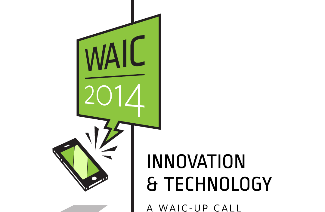
The Western Association of Independent Camps hosts an annual conference and my concept for the 2014 theme drew inspriation from Bill Watterson's Calvin & Hobbes. Whenever a telephone would ring in that comic strip, it would leap off the table top and demand attention by emitting angry squiggles and lines.
Camps Merri-Mac & Timberlake

The triangular shape of each was based on a old logo for the girls camp (the older of the two camps) and the silhouette of the girl drawing the bow was created to match the style of the boy holding the eagle, an old mark for the boys camp.
Custom icon set created for KenMont KenWood Camps
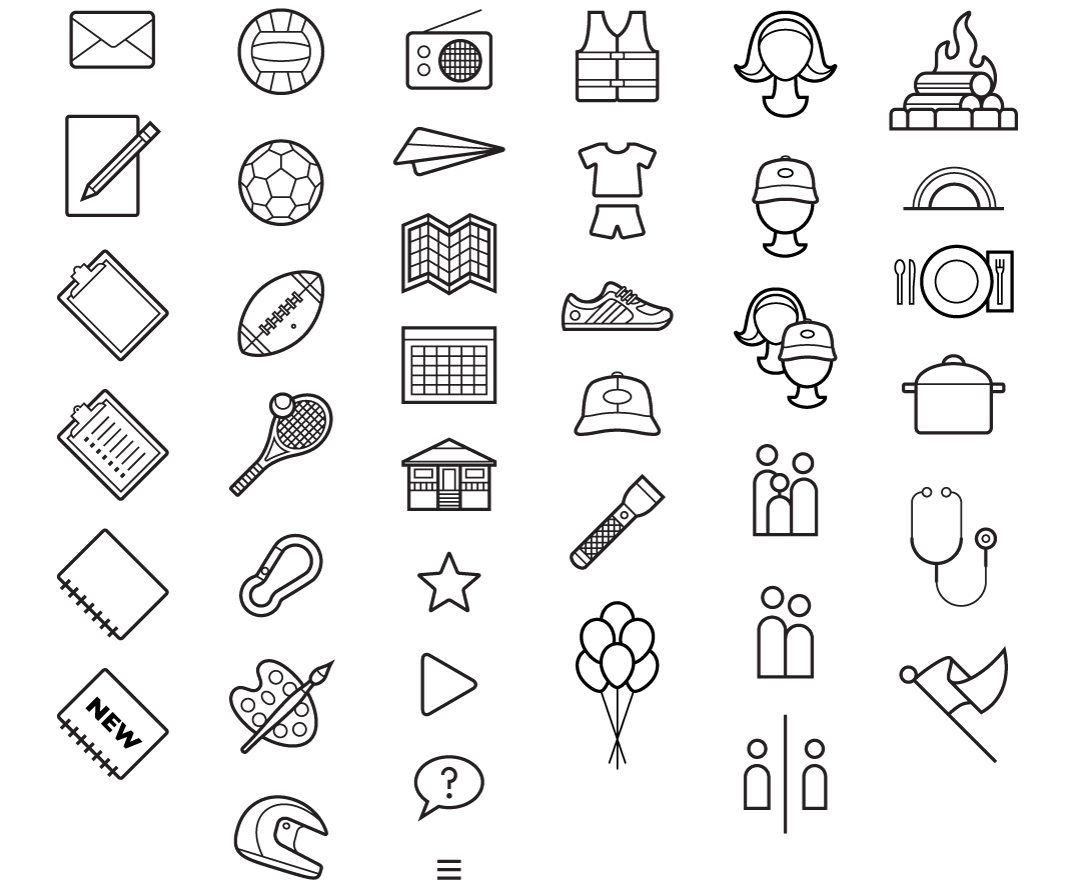
The variety of activities offered by the camp is extensive and the icons were created to represent such selection concisely and illustrate other important concepts central to the summer experience.
Logos for CampMinder Services

Used to promote their diverse services and a custom framework. The CampBot mascot even made his way onto a bottle of craft beer, as seen below.

In honor of one the conferences they host, the client brewed a batch of their own craft beer, which they named Web-Based Wheat, in honor of their web-based service. Source code from that service even made its way into the logo. This logo was printed on their bottles and a single-color variant was printed on pint glasses.
Camp Rockmont
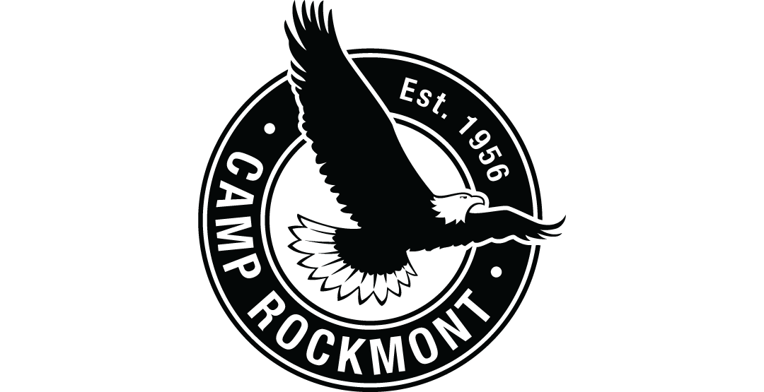
The eagle is a long-standing symbol of the boys' summer camp and the goal of this project was to refine and emphasize it.
Capitol Debate
This simple logo is used on the camp's Facebook page and other outreach services.
Alpine Camp — 50 Years

The logo was primarily used on their website and on a sticker sheet.

