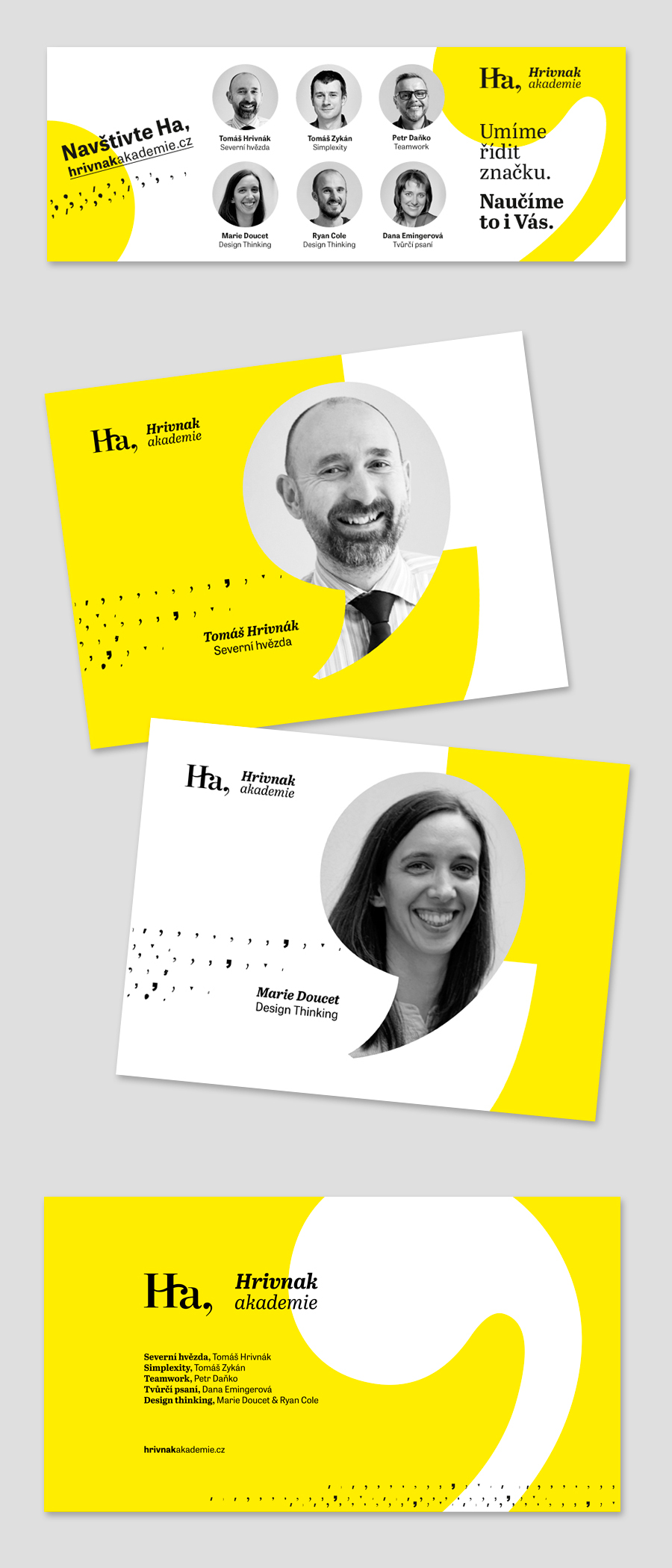
Hrivnak academy is an educational program of Hrivnak consulting company focused on brand. It is a set of interactive courses and workshops that take place at various interesting locations. The main aim is to open new horizons to the participants and teach them how to look at things differently.
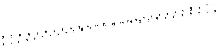
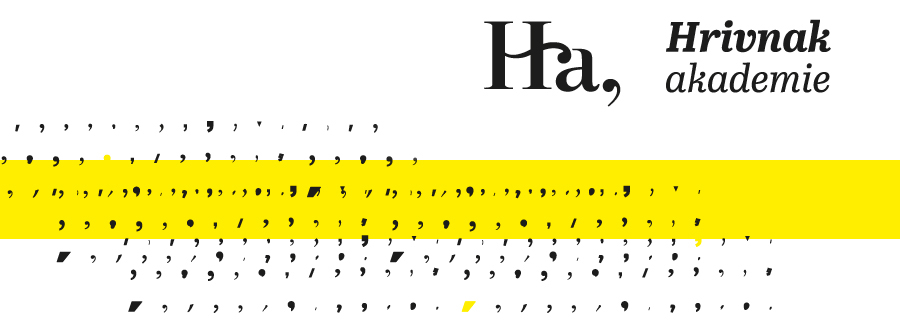
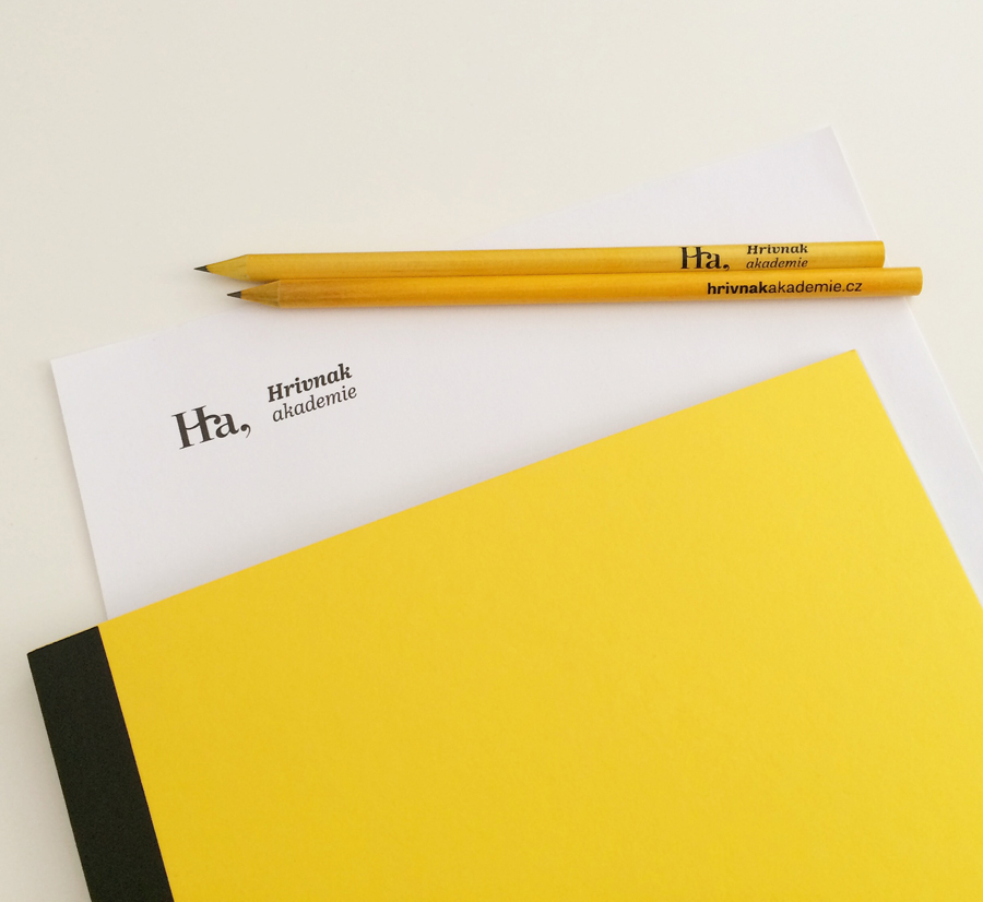
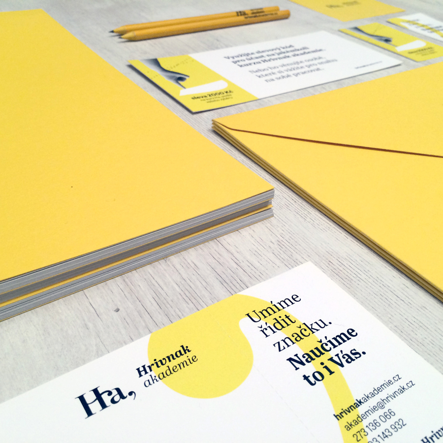
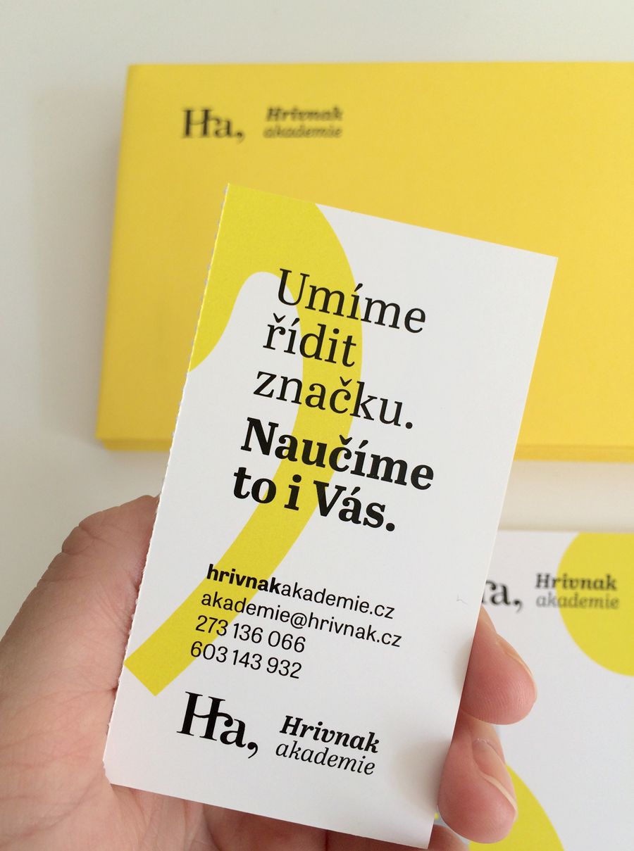
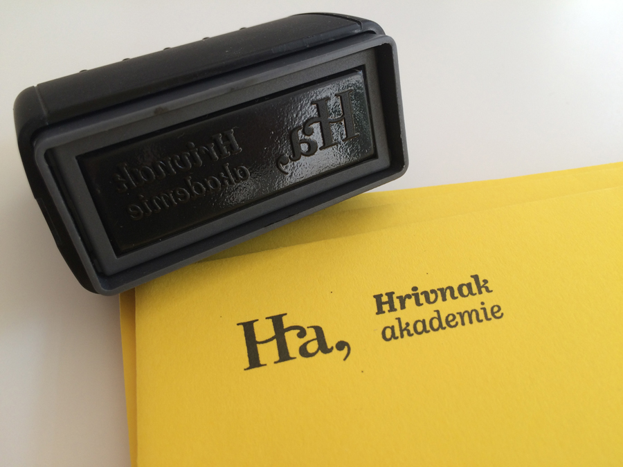
Ha, (as an abbreviation of Hrivnak academy) also stands for a moment of surprice when you find out new interesting information. The comma reflects beginning of something new, and a support to further develop the knowledge gained during the course. The corporate identity was created based on Hrivnak identity. The yellow colour in combination with patterns from different commas stands for freshness, positive thinking and enjoyable way of learning. It reflects progress and knowledge sharing.
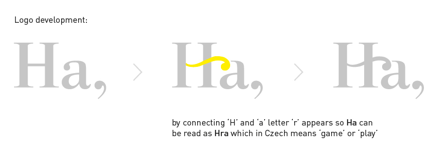
The connection of letters 'H' and 'a' doesn't read Ha only but in Czech language also Hra. It means 'game' or 'play' which is one of Hrivnak academy's learning approaches.
Graphic design: Tereza Hankova
Web coding: ManGoweb
Web coding: ManGoweb


Online banners: