
PROYECT INTRO • BEAUTY AND LUXURY COLLIDE
My client, a girl of a seemingly indomitable character portrayed the energy and self confidence of a person with wisdom and captivating essence which naturally made it easier for her to be admired and, on many occassions, being the center of attention. But her looks where just the start of this media relations dynamo who has an intuitive business mind, strong ethics, was loyal to her causes and had a clear vision.
When Mariela Gozalez hired me to create her own personal identity geared towards the luxury hospitality and lifestyle management markets I thought "this mesmerizing woman has wings". For it was her strong essence that allowed her to soar in the business arena where she belonged or wherever she was needed. If something was typical or mundane she would have the perfect solution to make it extraordinary.
Reflecting the inner complexities of a beautifully volatile and magnetic persona applied to a business who tends to be stuck on neutral imagery of luxury was the challenge I was about to meet.
••••••••••••••••••••••••••••••••••••••••••••••••••••••••••••••••••••••••••••••••••••••••••••••••••••••••••••••••••••••••••••••••••••••••••••••••••••••••••
As many of my projects, this one started with the unique freedom offered by drawing freehand on paper with my favorite tools. There is a body to mind connection achieved this way that it is not resembled by any other method. The digital development stages would soon be utilized so I enjoyed the brainstorming results that this "manual" stage always provides me.

TYPE STUDY
Moving away from the hand drawn concepts I wanted to perform an extensive type study to find the letterforms that would satisfy the criteria we have agreed upon, as well as having a chic look, a trendy disposition and, naturally, they should match the flowing lines from the sketches I created.
It was clear from the previous drafts that the client and I had began to favor the look of two symmetrical opening graphical elements extending on each side, which eventually evolved to become the wings.


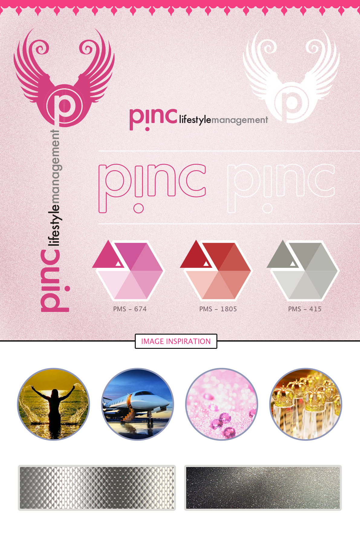
SELECTED LOGO CONCEPT
The selected logo can be appreciated in its different forms. Vertical and horizontal versions were provided in order to meet diverse layout standards. The color palette is also displayed, as well as inspirational imagery and textures that would be used on printed applications and online media.
The selected font didn't belong to those I previously proposed. Instead I used a more conventional, yet bold font. Nevertheless I added a twist to the letter "i" to create an admiration character.
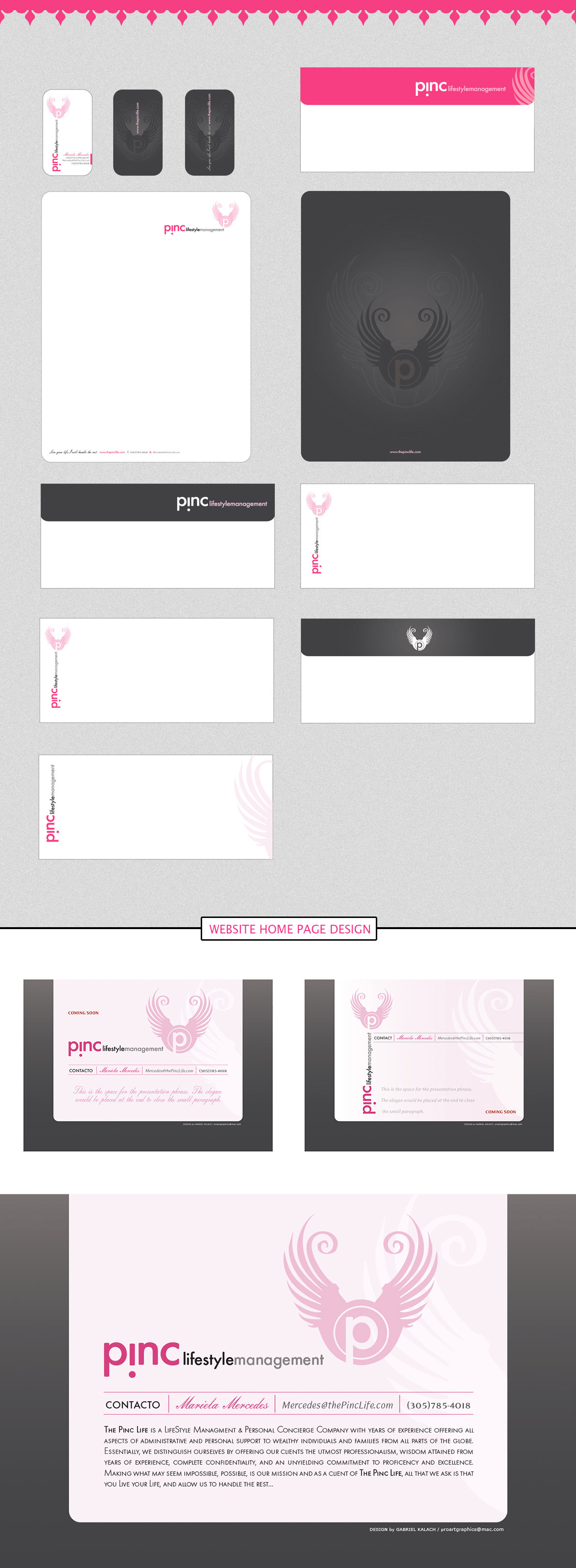
APPLICATIONS
As it is almost always the case the logo truly shines in its first application - the business cards! A double sided approach works best since the logo can be fullys displayed as a symbol and accompanied by the type.
Next you will see how the newly created identity peforms on the rest of the company's applications. The image is kept personalized . . . unique to the owner Mariela, yet it has a world-class touch.

THE SHOW WILL GO ON
The intial reactions to PINC's new identity were great. The general consensus was that the graphics styling reflected Mariela's personality . . . her swag, her mindset and strength as well as her trendy style.
But this new image also takes into account some of the industry's most celebrated features: elegance, beauty, commitment, passion to accomplish and freedom to do what is necessary for your client. Mission accomplished!