Momart is a UK based company providing specialist art transport, storage and art handling services for museums, galleries, artist and collectors worldwide. The company has been successfully operating on the fine art handling market for over 40 years and built their position mainly through referrals and word of mouth. Due to increasing competition Momart recognised the need for adopting a more proactive marketing approach and have asked me for help with defining their brand and visual identity.
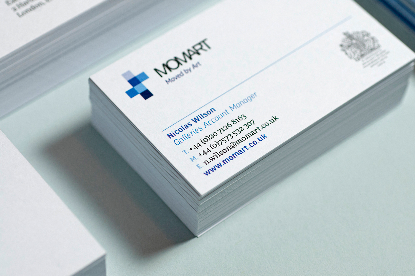
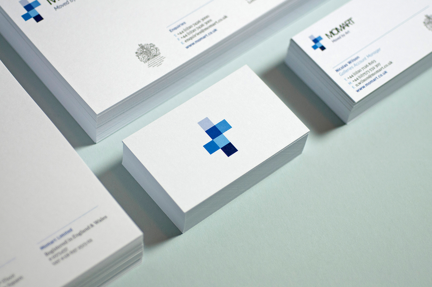
When we embarked on the project the only brand asset used by Momart was their logotype and its dark blue colour, originally designed as a stand alone signage. The objective was to develop a clear, recognisable brand identity which could be used for various communication channels and convey a consistent message, carefully targeted to relevant audience. The company advised that their logotype is well recognised in their industry and felt very strongly against applying major changes to it. We have worked around this specific requirement by keeping the original logotype and introducing a flexible element — the box symbol — which could be used as part of the logo as well as a stand alone mark. Basing this flexible element on the symbol of an opened up box felt like an obvious choice for a logistics company, which relies heavily on proper packaging and proudly produces one of the finest art transport crates on the market.
The intension behind the use of an adjustable symbol is primarily to demonstrate Momart's ability to adapt to any situation and space. The symbol represents at the same time an open box ready to protect and fold around a bespoke content, and an open space depicting an art exhibition. In some applications, such as the brochure cover, we decided to extend the symbol and use it in full bleed to create a versatile Swiss grid system, enabling a large amount of arrangements and layout possibilities.
We have used one of the largest font family available, FF Good and FF More, designed by the Warsaw based type designer Łukasz Dziedzic in 2008–2010. Łukasz Dziedzic built FF More serif to work alongside his FF Good sans serif typeface, resulting in a powerhouse superfamily, versatile in both its function and aesthetics.