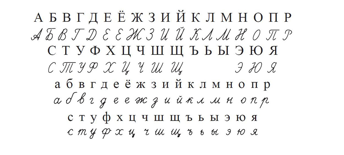
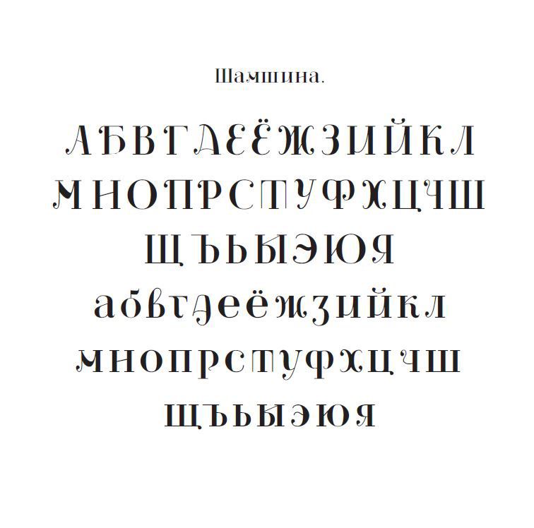
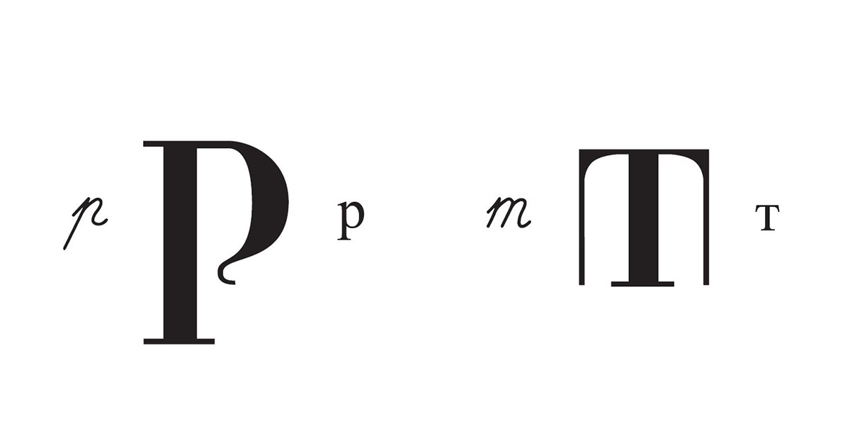
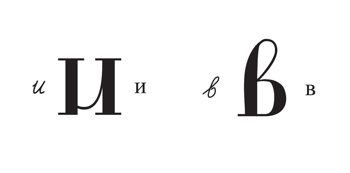
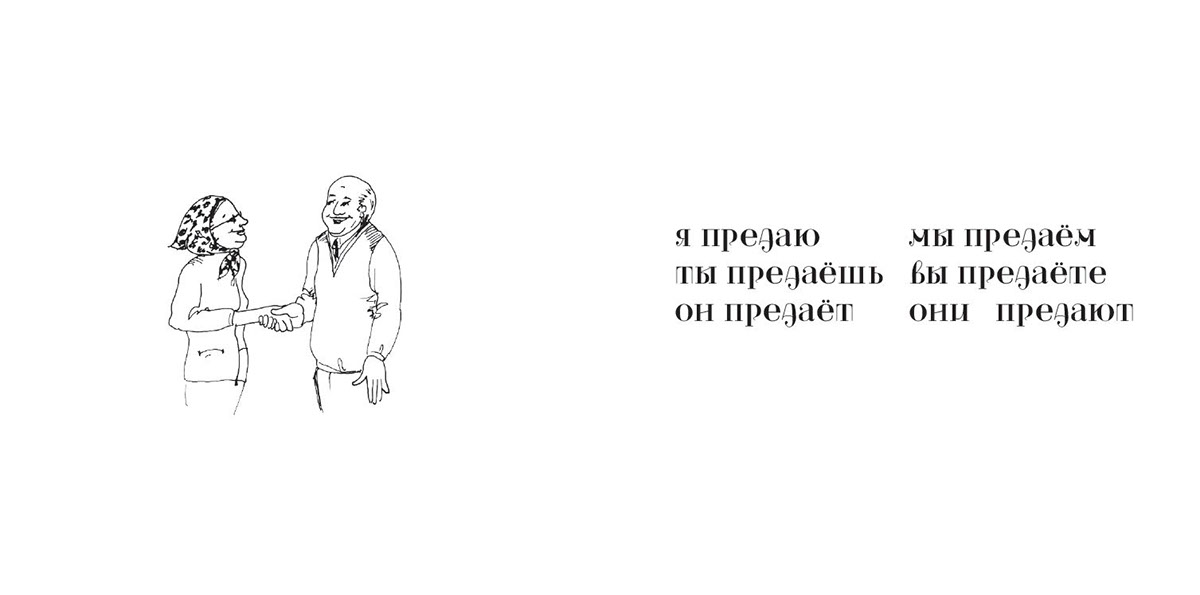
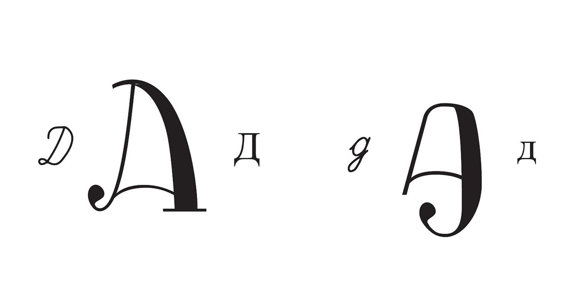
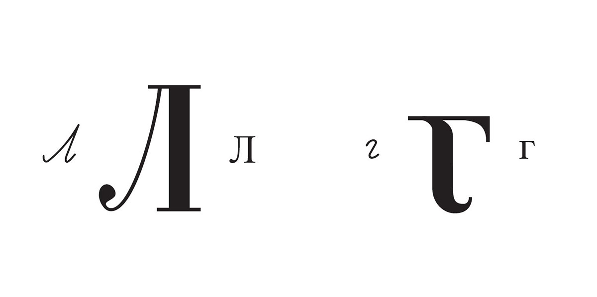
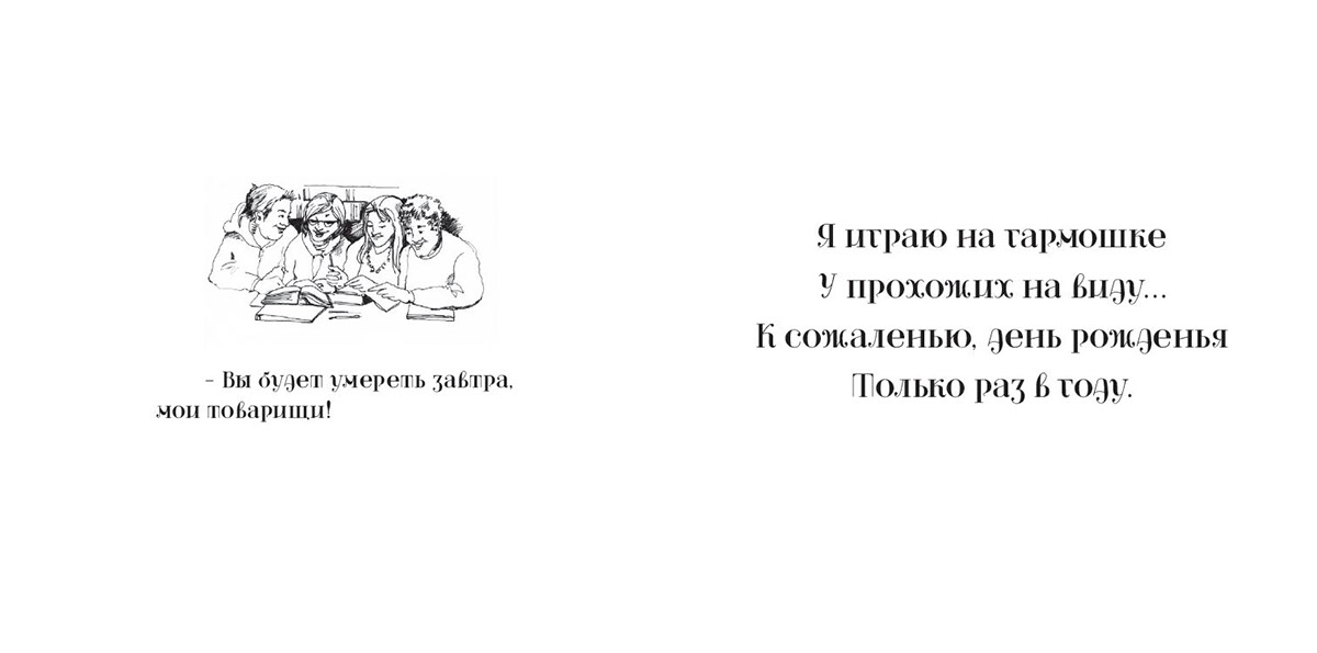
The Cyrillic alphabet in print looks markedly different from the alphabet written in cursive. Students of Cyrillic languages often have trouble making the transition to read cursive because many of the forms are so different from the print they learned to read. Shamshyna is a typeface that tries to bridge that gap with letterforms that are recognizably similar to print, but also introduce the cursive form.
Shamshyna’s namesake is my high school Russian teacher, who valiantly taught a group of suburban misfits to appreciate the Russian language and culture. It’s definitely not her fault that I still have trouble reading cursive.
