conceptual package design and rebranding for Eveready Batteries Co Ltd.


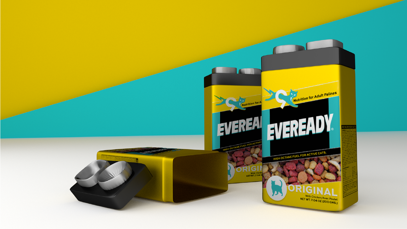
The new brand and package redesign steps away from the original color pallete of red and black to reduce confusion from the “Give me Red” campaign, thus putting forward their iconic Cat with it’s own color pallet of ultramarine blue and yellow. The new colors signify immensepower and energy that both products pack very eectively. The battery packaging tries to mimic a Cat-food tin, similar to a sardin tin-can, with a lever to open the package. The Cat-food packaging uses the shape of a 9 volt battery to it’s advantage by using the stainless steel power-outs to double up as a food and water bowl for cats. This packaging is one time purchase and the rell of the cat-food is placed inside the container in a plastic bag that can be purchased in the store .The graphics embody vivacity and motion on both packages. While the battery package undertakes a powerful redesign for existing packaging, the cat food packaging is a more function-based project.
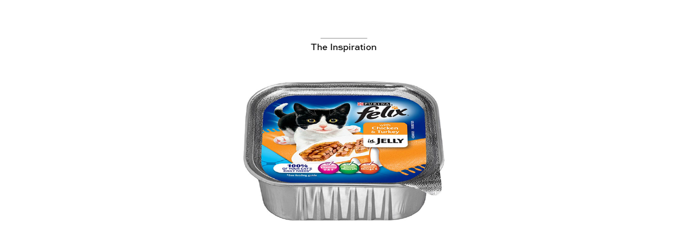
Eveready Batteries is an American manufacturer of batteries. The famous 9 Lives logo has been used by Eveready since the 20's or 30's to imply that the company's Zinc-carbon batteries were somehow better than those made by other companies. We decided to use this marketing exaggeration of the company to bring back the ever-famous Cat, back to their packaging. To create the conflict we chose Cat Food, simply to explain that the Batteries are powered by 9 lives and the Cat food ensures that Cats all around the world get the nutrition required to live their "9 lives".