Merlon Pub - Case study
The project task was branding and identity design for the pub. The pub is located in Tvrđa - the old baroque center of Osijek. Tvrđa is a baroque town-fortress built in the 18th century and built in a large baroque system of strategically fortified towns on the border with the Ottoman Empire.
Before the branding process we conducted a deep research of Tvrđa and discussed its several aspects: development, urbanism, architecture, content, and culture.
We believe that the name of the pub or any other offer must remain closely linked to the history of Tvrđa or its architectural style, so that the identity system can function well.
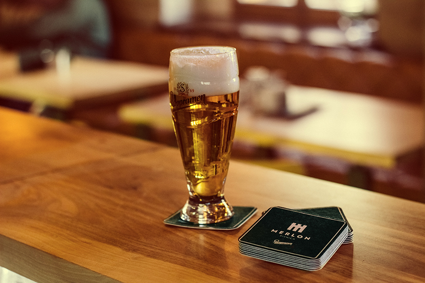
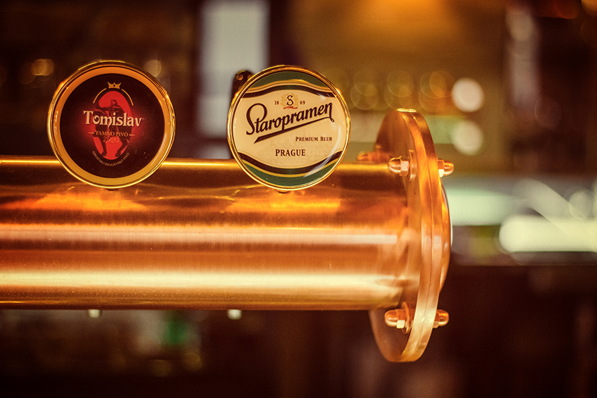
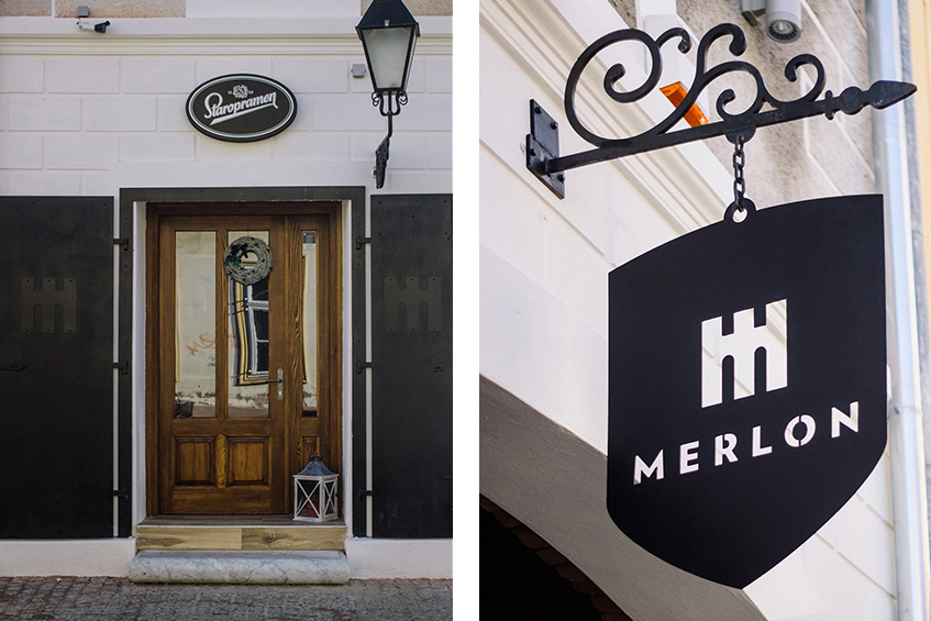
The logo of the pub must contain the logo of the Staropramen Brewery because the project was sponsored by the Staropramen Brewery (Zagreb Brewery/Molson Coors).
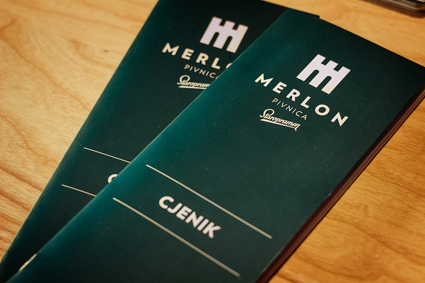
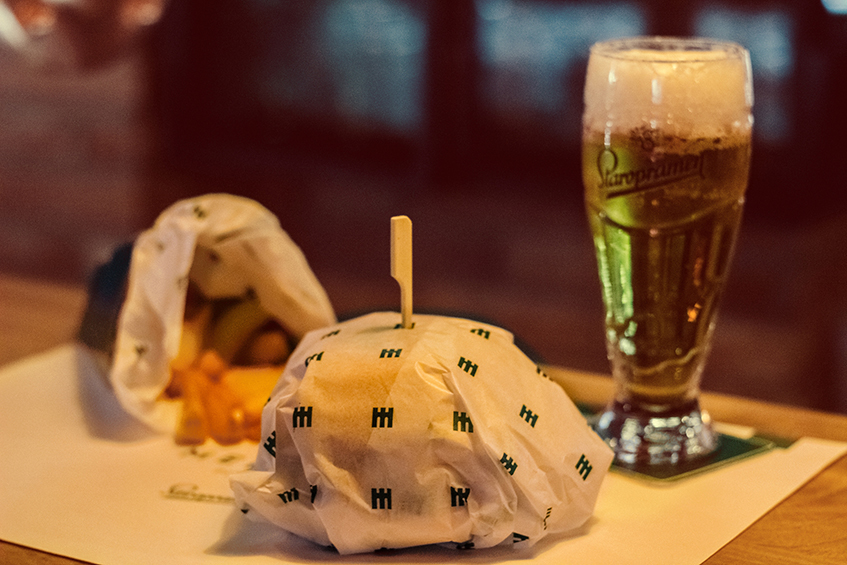
Disciplines : Art Directing, Branding + Identity, Sygnage, custom Merlon/Staropramen refrigerator design
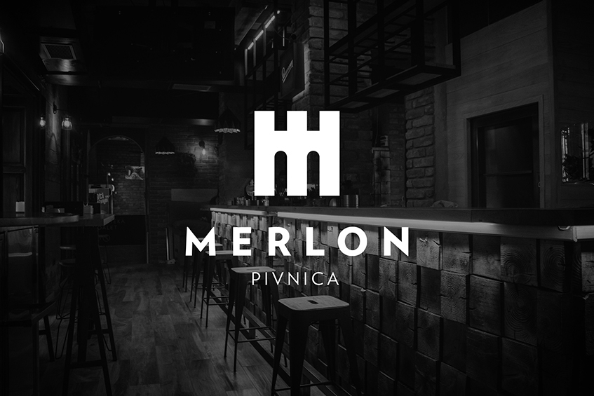
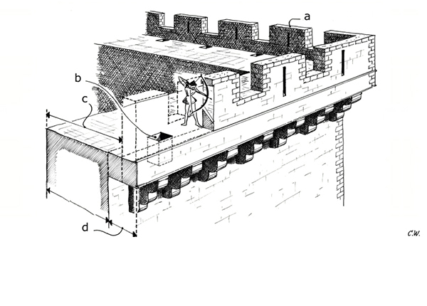
"Merlon" is a name for a solid upright section of a battlement or crenellated parapet in architecture or fortifications that serves as protection for the observers and the military at the top of the fort. Therefore, Merlon corresponds to the primary function of Tvrđa. Its goal is to create the authenticity that its guests will be able to relate to.
This simple and catchy name is quickly memorable, and thus will contribute to the rapid recognition of the brand.









Credits
Agency: Studio 33
Agency: Studio 33
Client: 2B d.o.o.
Design: Leo Vinkovic, Igor Penovic
Design: Leo Vinkovic, Igor Penovic
Interior: Ivana Kocsis
Photo: Josip Bilic
Photo: Josip Bilic
Published: December 2015
Awards:
Awards:
International Design Awards (Los Angeles) / 2016 / Bronze Winner / Print: Corporate identity
International Design Awards (Los Angeles) / 2016 / Bronze Winner / Print: Logos, Trademarks and Symbols


