


Visual Identity for Akiko Kikuta Ltd., rare vintage wine import/export company based in Paris and Tokyo.
Akiko Kikuta Ltd. is an independent wine and spirits import/export company specialized in great wines, collectables bottles and rare vintage wine from France.
The company needed a luxurious energy and a timeless image for their visual identity. Ultra light font emphasizes a high end aspect to the logo as well as a knowledge of the wine industry. Black on white color code helps to define the luxurious identity of the company.
LOGO ICON CONSTRUCTION AND SYMBOLISM
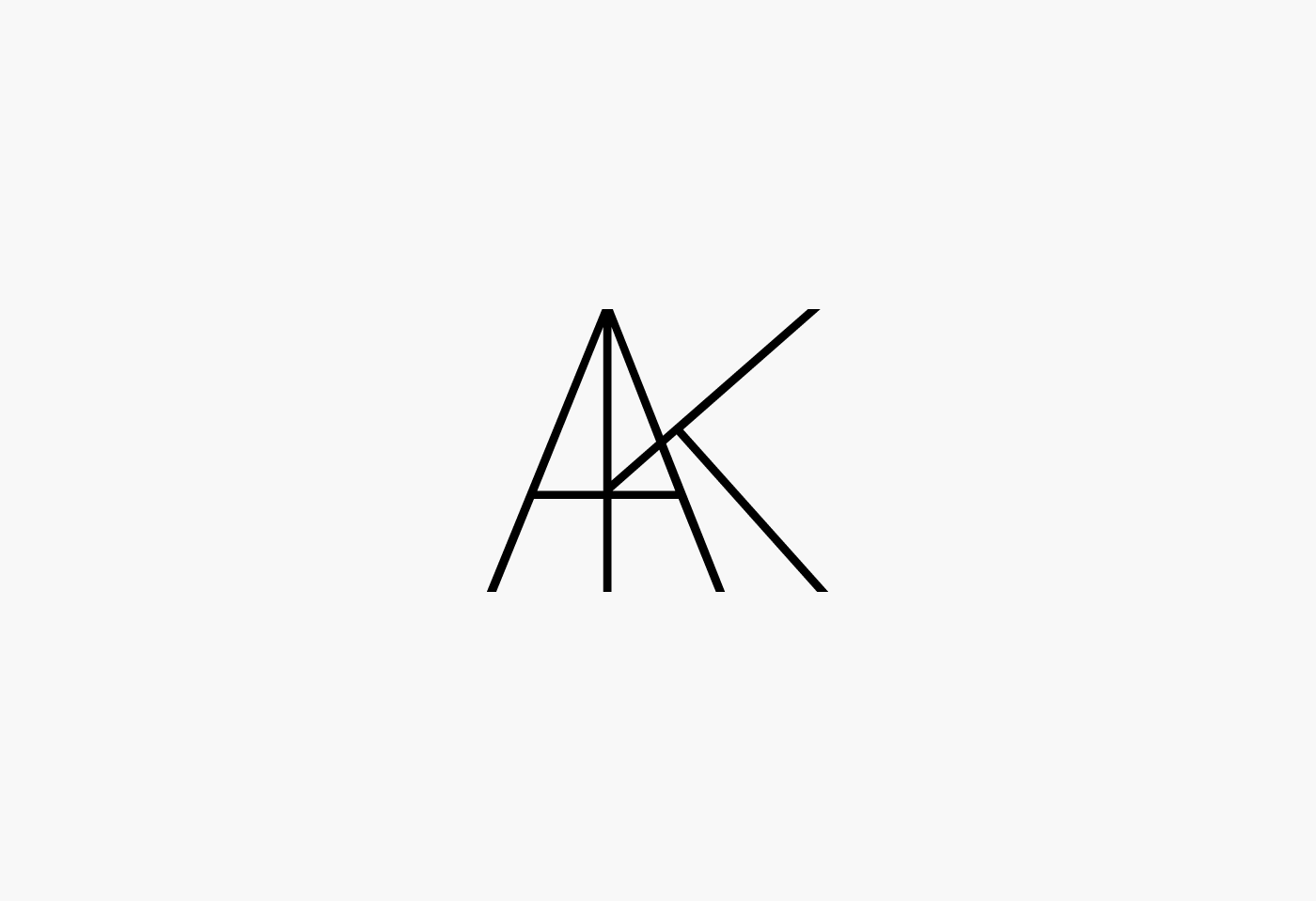
The icon for the logo was built with the two initials letters A and K from the name Akiko Kikuta. The association of both letters represents the marketing relation between both cities, Paris and Tokyo. A stands for paris. K stands for Tokyo. The merging of both letters into one icon symbolize the commercial association of both cities. Associated together the symbol represents as well the Eiffel Tower and the Tokyo Tower. Two symbols of the cities.


Client: Akiko Kikuta Ltd.
Work: Visual Identity, Brand Identity, Graphic Design
© 2015 Eric Giet Design. All rights reserved.
www.ericgietdesign.com
Work: Visual Identity, Brand Identity, Graphic Design
© 2015 Eric Giet Design. All rights reserved.
www.ericgietdesign.com


