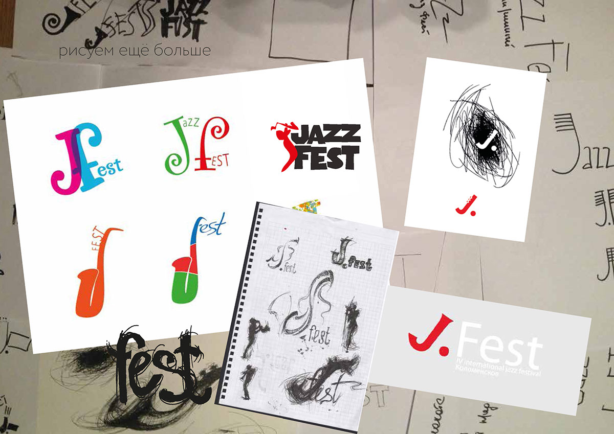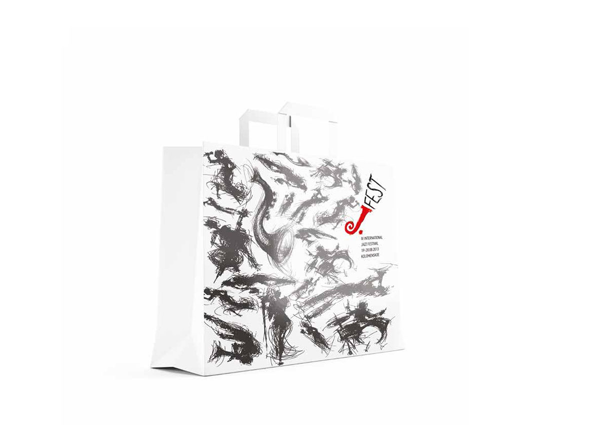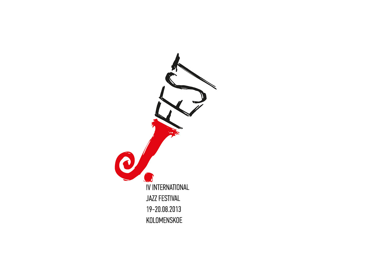
As part of the educational process, we created a corporate identity project for a jazz festival.
We asked ourselves: "What is jazz like?"
Calm or crazy, romantic or funny, feminine or rude ... and decided that the main thing is emotions.
It is necessary to make a symbol that includes all this and can take any form. To create an image that will always be different, like jazz, but at the same time will be united by a common idea.
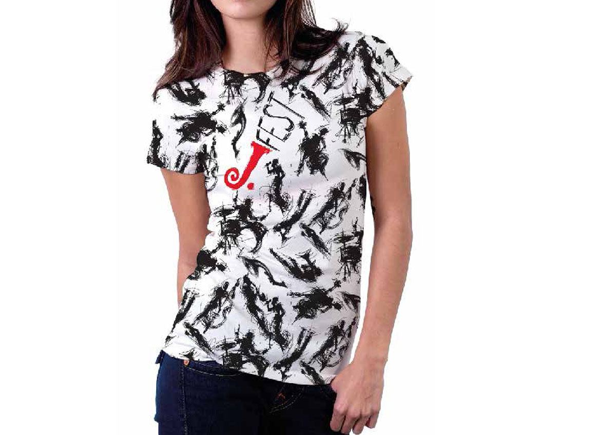
Jazz is movement and improvisation.
As Wassily Kandinsky wrote: "A geometric line is an invisible object. It is a trace of a moving point, that is, its product. It arose out of motion - namely, as a result of the destruction of the highest, self-contained rest of the point. Here there was a leap from statics into dynamics."
Line is dynamics! Therefore, we took and built a sign and an illustrative row on one line only.
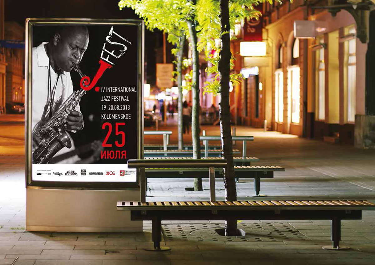
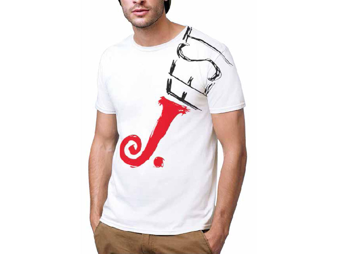
And we chose 2 colors. Classic black: stylish, calm and full of mysteries. And red: a symbol of beauty and love, joy and life at the same time, belligerent, aggressive and attracting attention.
We asked ourselves: "What is jazz like?"
Calm or crazy, romantic or funny, feminine or rude ... and decided that the main thing is emotions.
It is necessary to make a symbol that includes all this and can take any form. To create an image that will always be different, like jazz, but at the same time will be united by a common idea.
Jazz is movement and improvisation.
As Wassily Kandinsky wrote: "A geometric line is an invisible object. It is a trace of a moving point, that is, its product. It arose out of motion - namely, as a result of the destruction of the highest, self-contained rest of the point. Here there was a leap from statics into dynamics."
Line is dynamics! Therefore, we took and built a sign and an illustrative row on one line only.
And we chose 2 colors. Classic black: stylish, calm and full of mysteries. And red: a symbol of beauty and love, joy and life at the same time, belligerent, aggressive and attracting attention.