


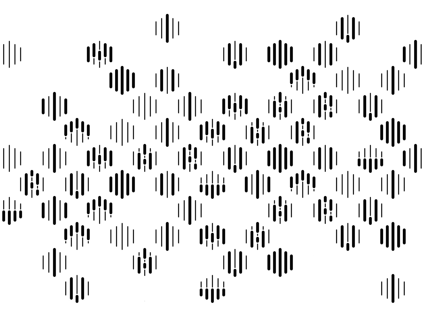
I N T R O D U C T I O N / Maru means “perfection” in Japanese and the architectural firm that took their name from, is out to do nothing less than that. Having patents around the globe, Maru gave us a new perspective on how we look at the buildings we spend most of our lives in. Ultimately, this notion reflected on the branding work as well. We wanted to create a look that is modular, simple and applicable to be able live up to it’s name. Below is the early explorations on the relationship between the grid and the elements that live on that grid. Recommended soundtrack as you go through the work - Everything in it's right place - Radiohead

A L P H A B E T A N D N U M B E R S / After settling down the 5 piece isometric grid, we realised that we can create legible numbers and the whole alphabet within the system. That of course, gives room for further personalisation and customisation of stationary assets like business cards and name plates as you’ll see as you move further on.


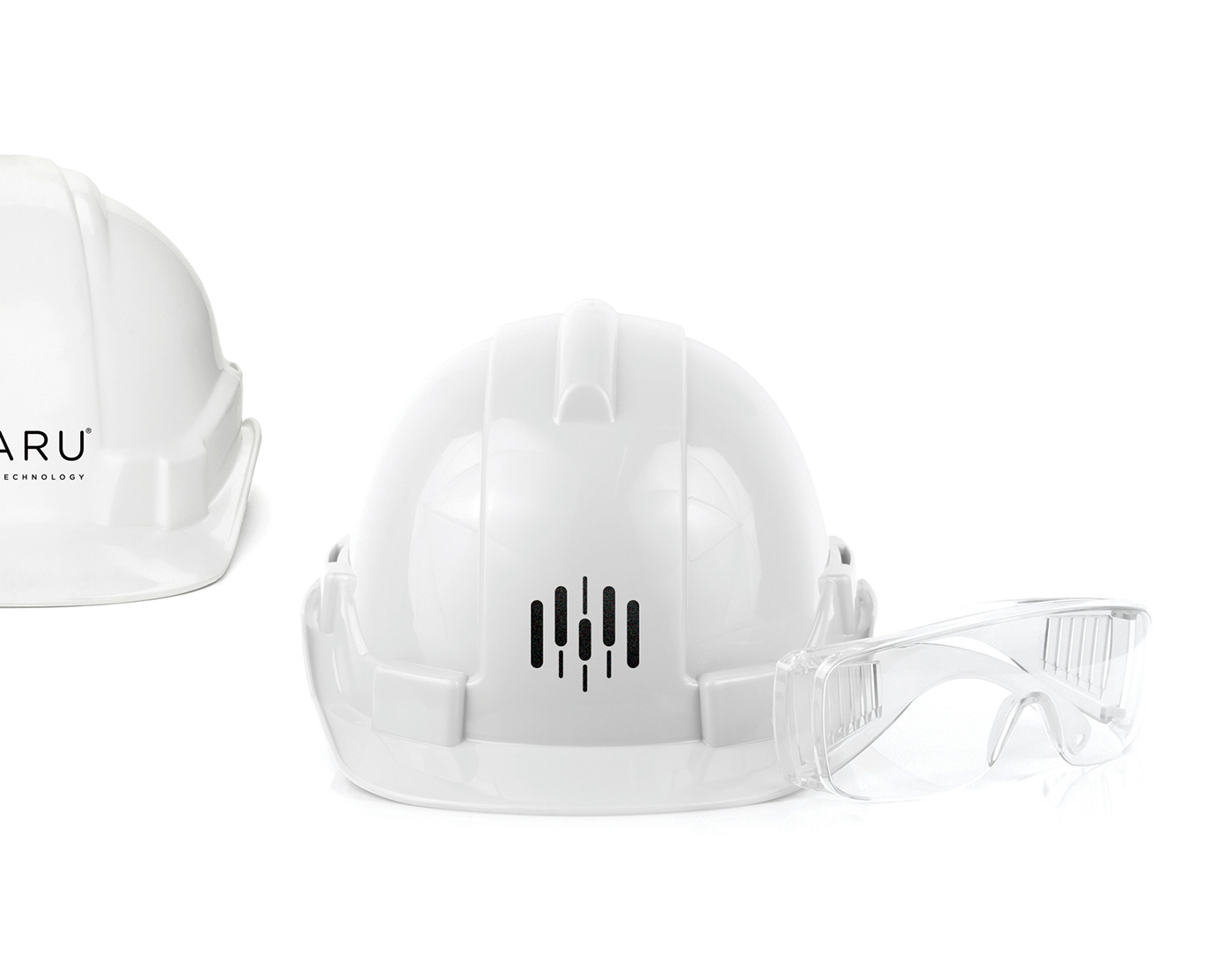


Mockup design by - Damjan Stankovic


C R E D I T S
Agency: Ogilvy & Mather Istanbul
Executive Creative Director: Selim Ünlüsoy
Art Director: Mehmet Demirel
Business Director: Murat Derman
Account Executive: Gizem Piroğlu
Producer: Fulya Akay
Director: Baran Baran
Producer: Ali Devrim Şengel
App Developer: Onur Acun
Strategic Planning Director: Pelin Aydın
Typographer: Taner Ardalı
Producer: Hakan Pamukçu


