RIK Co. - Graphic Design Studio
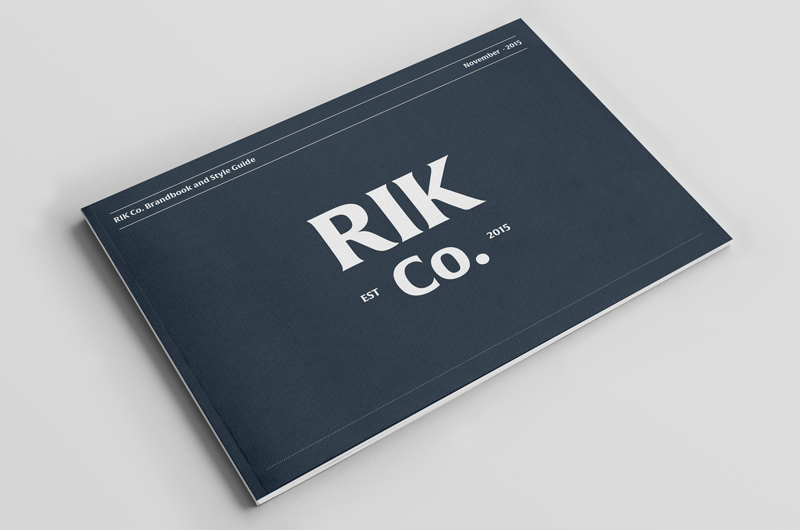
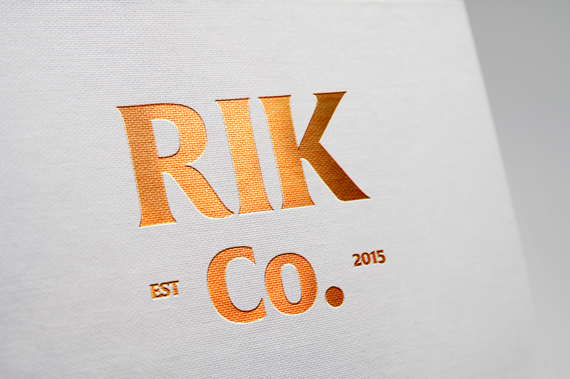
The brand was created linked to the classical and first logotypes of the turn of the past century. The neutral personality uses serene and cordial colors ally to a composed typography with the objective to create a better harmony.
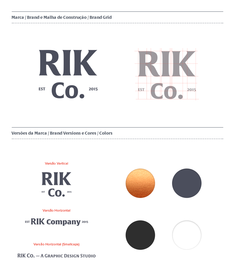
The typography was personalized from Alverata, making the principal logotype of the brand and, combined to the clear Proxima Nova, expresses two principals: First, show the honest intentions of the brand to provide quality design services with visual harmony and great disposition of visual elements. Second, give a touch of nostalgia, customarily related to small companies from the beginning of the modern age.
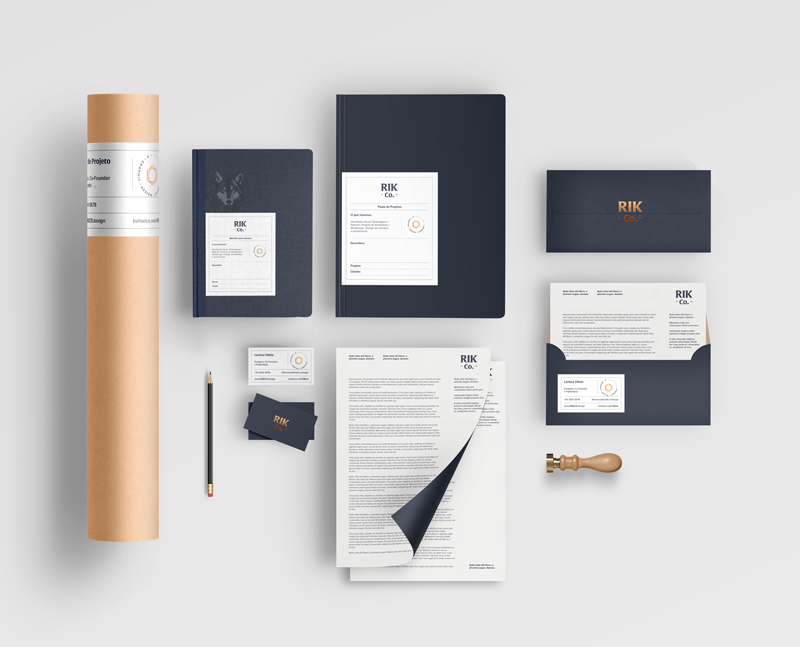
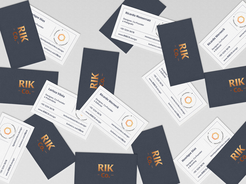
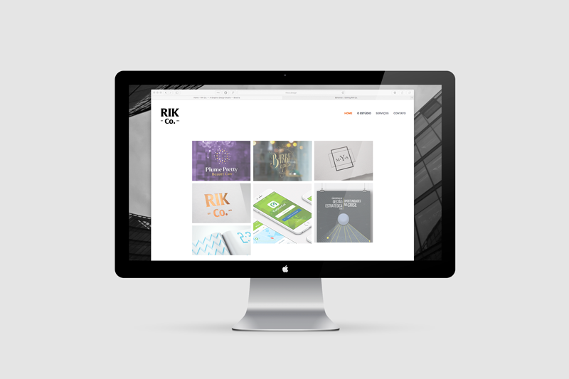
The identity, within its pillars, look for good applications of the brand, uses specials papers and highlight its composition towards others elements. The formal stationery uses visible graphic tables to organize its elements without fully locking them.
A marca foi criada como um projeto ligado às referências clássicas, das primeiras marcas elaboradas da virada do século passado. A personalidade neutra usando uma paleta de cores serenas e cordiais fazem composição a uma tipografia harmoniosamente dentro do contexto em que são apresentados.
A tipografia personalizada da Alverata desenhada no logotipo principal da marca e sua combinação com a formal Proxima Nova representam dois princípios: primeiro, de mostrar intenções honestas da marca em fornecer serviços de design de qualidade e uma boa harmonia visual, além de organização dos seus elementos. E segundo, ele mostra um toque de nostalgia que se relaciona às especialidades típicas de pequenas empresas do início da era moderna.
A identidade, em seus pilares, demonstra sempre uma boa aplicação, usa papéis especiais e aplica sua marca sempre de maneira a destacar sua composição aos outros elementos. Sua papelaria formal usa referência a tabelas, de modo a organizar seus elementos, mas não a mantê-los totalmente presos.