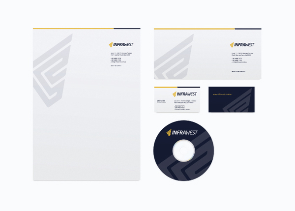
Identity for a new entrant to the Infrastructure Services Sector - Infrawest. The Infrastructure sector is a highly competitive but niche sector, with only a few major companies sharing a slice of the largest infrastructure projects.
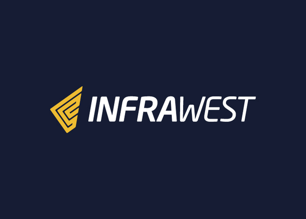
The logotype was created to compliment the symbol, its forms purposely solid yet not overpowering with a slight italic bias to achieve a sense of forward movement, symbolising the core service offering of Infrawest being Infrastructure Services (the building of Roads, Bridges, Rail, etc).
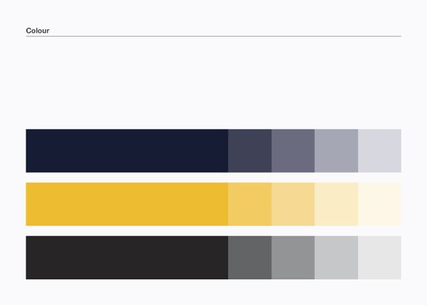
The colours of the brand further reinforce the message and meaning. A deep blue/grey has been specifically selected as the primary brand colour. The colour takes its inspiration from the colour of the base ingredients in Bitumen. The burnt yellow is representative of the roadbase materials and yellow is also typically used to represent progressive thinking.
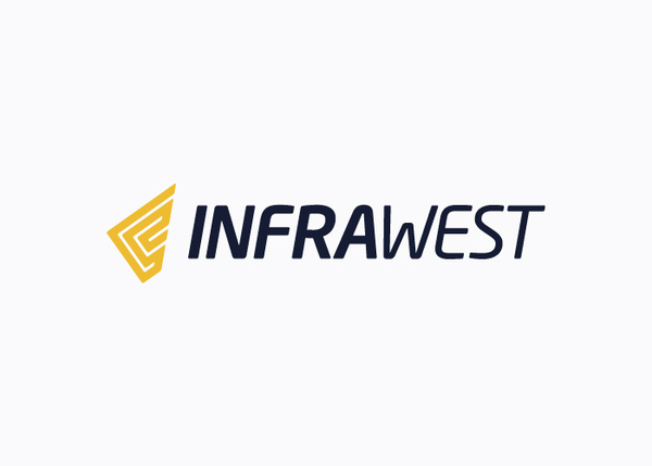
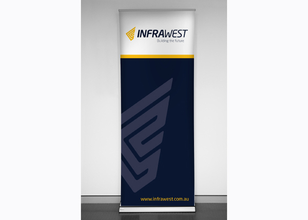
After receiving the initial brief identity brief, we established the core objective of the identity should be to position Infrawest on a par with the product sector’s other major players. We identified several key elements which have been successfully integrated into the brandmark that symbolize; partnerships, solidarity, Western Australia, road networks and movement.
The core idea for the logo came quickly: the symbols base form being the iconic and recognisable shape of the State of Western Australia.
The logotype was created to compliment the symbol, its forms purposely solid yet not overpowering with a slight italic bias to achieve a sense of forward movement, symbolising the core service offering of Infrawest being Infrastructure Services (the building of Roads, Bridges, Rail, etc).
The colours of the brand further reinforce the message and meaning. A deep blue/grey has been specifically selected as the primary brand colour. The colour takes its inspiration from the colour of the base ingredients in Bitumen. The burnt yellow is representative of the roadbase materials and yellow is also typically used to represent progressive thinking.