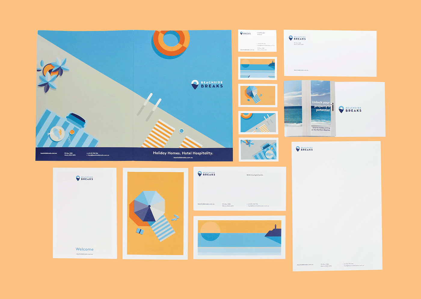
Beachside Breaks
Sydney is experiencing a strong hotel boom, but the short-term holiday rental industry is growing at almost double its rate. A new market now exists for hotel luxury in more livable spaces. Experts in short-term letting, Beachside Breaks make the process easy for owners and guests — taking care of all the little things for homeowners, and making the little things matter for an international guestlist. We were challenged with designing a brand identity that captured Sydney’s unique coastal lifestyle and explained this new accommodation concept. Visit our project case study for more information.


Nice and breezy
During a brand workshop, we confirmed the need for a sophisticated, minimal look — complementing rather than overwhelming the architectural photography used to promote the individuality of each property. Stark, geometric shapes were used for the brand architecture, in a restricted colour palette inspired from Manly Beach.

Dawn to dusk
The brand story began with a simple logo, melding a location pin with an ocean sunrise. A suite of illustrations captured summertime indulgences, extending the holiday imagery through to balmy summer nights.
Holiday Homes, Hotel Hospitality
We coined the slogan ‘Holiday Homes, Hotel Hospitality’ and developed a full suite of marketing tools including direct mail promotions, advertising, social media and a website. The fresh design has resonated with the market with the first rounds of marketing resulting in the company’s rapid growth to an impressive portfolio of properties. In 2017, the project was awarded a Design and Design International Award.