
Re-Design of Android Instagram
I re-designed the Android Instagram app, according to Google's Material Design principles, so that the app better respects and adheres to the uniqueness of the Android environment and its users, rather than merely being an adaptation of the iPhone version. The rationale behind this re-design is more than ensuring visual consistency for aesthetic reasons, it is also about creating a consistent experience for Android users, which increases ease of navigation and use.
01. User Testing

02. Job Stories

03. Lo-Fi Mockups

04. Grids and Guidelines

05. Colour Palette and Product Icon

06. Hi-Fi Mockups
Feed

Old: The navigation bar is placed at the bottom of the screen, except for the messaging function that is placed in the top right corner.
The icons used seem to belong more to the Apple environment than Android.
New: The re-designed app has a new navigational system, which adheres to Google’s material design guidelines. The bottom navigation bar was replaced with an extended app bar and a nav side bar. It is an extended app bar to accommodate the floating action button. From the user testing and job stories, it was revealed that functions that enables users to produce and consume content must be given primary emphasis. Thus, the feed is still the first screen that users see, search is always available on the app bar so that content can be found and adding photos has been converted to a floating action button. Notifications, or activity, are clearly visible on the app bar. Icons were changed to Android-familiar ones. The colour scheme was altered to one recommended by material design.
Zoom Photo

Old: The image in the feed remains unresponsive when tapped by the user. There is no option to see the full-size image and zoom.
New: When you tap the image, it responds by displaying its full size. The background is greyed out to indicate that the background is not active. The image can zoomed in and out using pinching finger gestures. The user can return to the feed by tapping the back button.
Add Likes to Collections

Old: The only option available to the user is to like a photo that he or she sees in the feed.
New: When the user likes a photo, a pop-up menu allows the user to search among his or her collections to find the desired collection (if there are many to choose from), add the photo to one of the most recently used collections, create a new collection or not add the photo to any collection.
Navigation
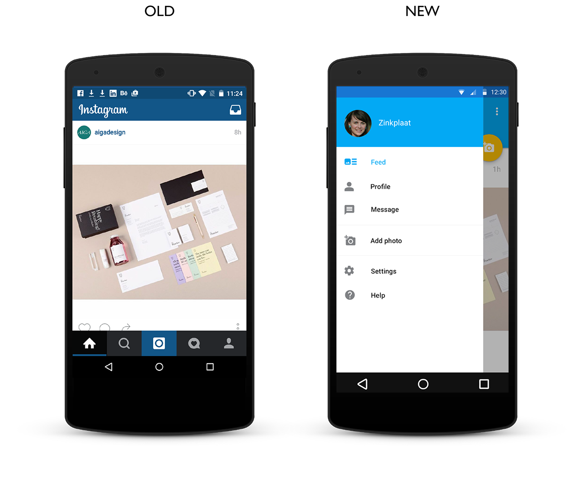
Old: The navigation bar is placed at the bottom of the screen, except for the messaging function that is placed in the top right corner. The icons used seem to belong more to the Apple environment than Android.
New: Side nav bar makes is an unobtrusive way to navigate when there are too many elements to display on the app bar or when one wants to avoid nested navigation. The messaging function was moved to the side bar, because in line with the job stories, it did not seem as a primary function in the app. The icons were changed to better suit the Android environment and communicate function. The ‘add photo’ function was also added to the side bar, so that it is always available to producer users. The feed is the default screen as it is the main means for users, especially consumer users, to consume content.
Notifications

Old: The navigation bar is placed at the bottom of the screen, except for the messaging function that is placed in the top right corner. The icons used seem to belong more to the Apple environment than Android.
New: All activity was moved to notifications, which are linked to the right side bar, so that it is clear that notifications are awaiting the user. Minimal changes were made to the activity function. It was re-designed using the material design baseline grid. Accept and reject icons were added to the Follow requests, so that it is no longer necessary to go one level deeper to accept or reject.
Profile

Old: View options have been designated two tabs in the tab bar, which appears redundant. Statistics regarding photos, followers and following seem to be static text, but are actually tappable and lead to more information.
New: View options are only given one tab (views alternate between list and grid by clicking the view icon on the tab bar), followers/following are given a tab bar (followers and following alternate by clicking the follow icon on the tab bar)
Profile of Other Users

Old: Rectangular follow button to follow another user
New: Floating action button changes to add user when viewing other user's profile


