
This display font was originally designed for a university project over 10 years ago. I stumbled across the designs after routing through boxes of old work in the attic and decided to finally work them up.
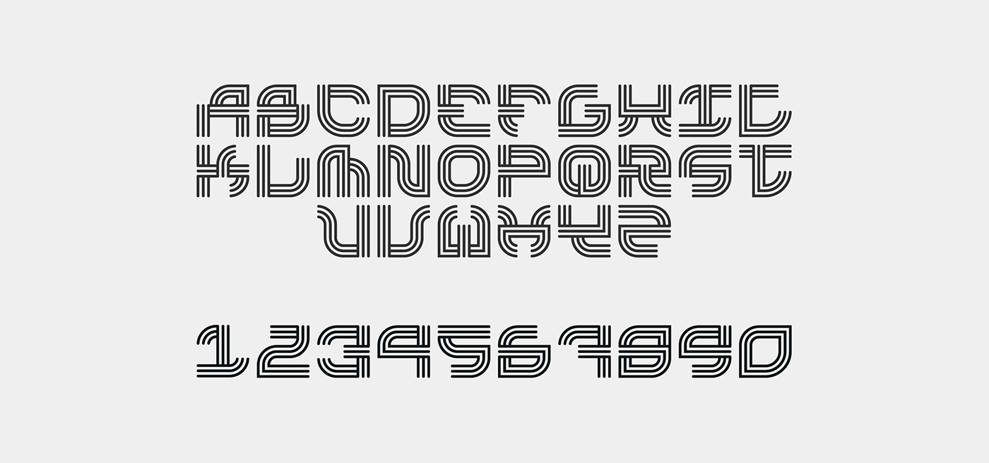
The Tokyo font is designed to embody the aesthetics of Kanji crossed with neon signs that litter the Tokyo Metropolis. Each character sits in a perfect square which makes it easy and fun to stack and mix around


© Copyright Nathan Miller 2015/2016.


