
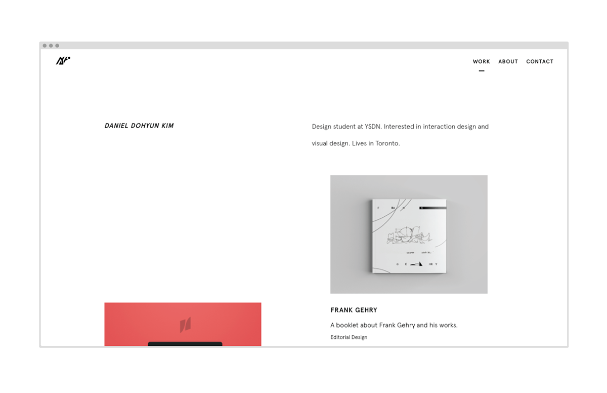
김도현 / Ahto Design
-
1
5
-
The goal was to design a logo that is creative, unique and personal.
Since I was born and raised in Korea, I decided to incorporate Hangul (Korean Alphabet) to my logo.
- -
English alphabets are written sequentially, however, Hangul letters are grouped into blocks.
For example, my birth name is 김도현 (Kim Do-Hyun). If I were to write my name sequentially, it would look like this:
ㄱ ㅣ ㅁ ㄷ ㅗ ㅎ ㅕ ㄴ.
This is where I got the idea from. I decided to eliminate vowels and final consonants and just work with initial consonants.

- - -
I refined it by adding thicker weights, skewing and using more white space.
My nickname is Ahto Design in online design community, therefore I wanted my logo to represent not just my birth name, but also my nickname. I refined it further by adding a little segment of a vowel in the second initial.
It is also easily recognizable in all sizes and works well with any colour combinations.


x


