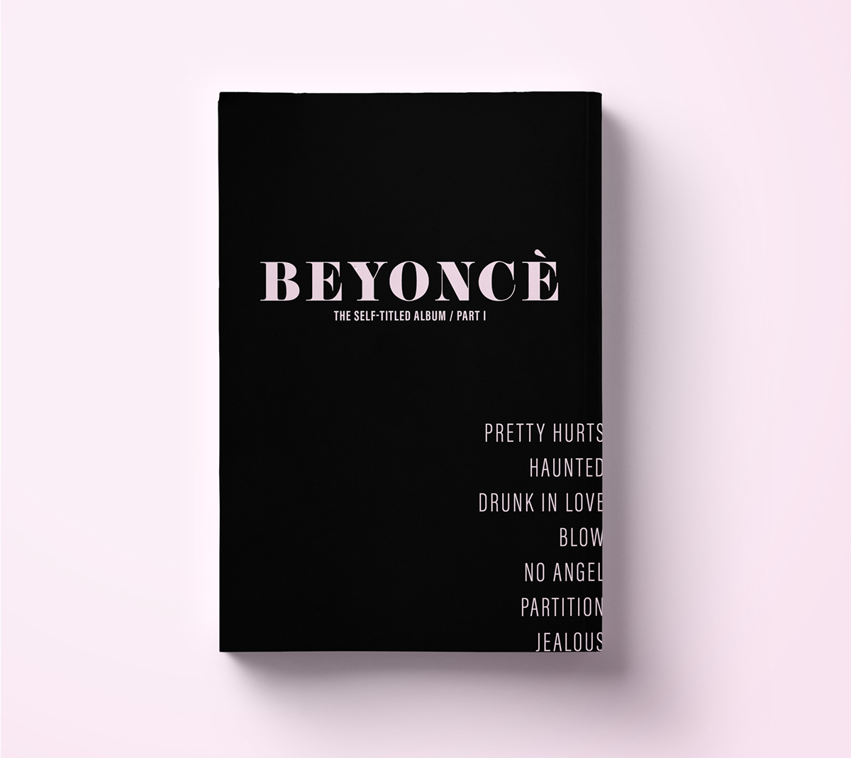
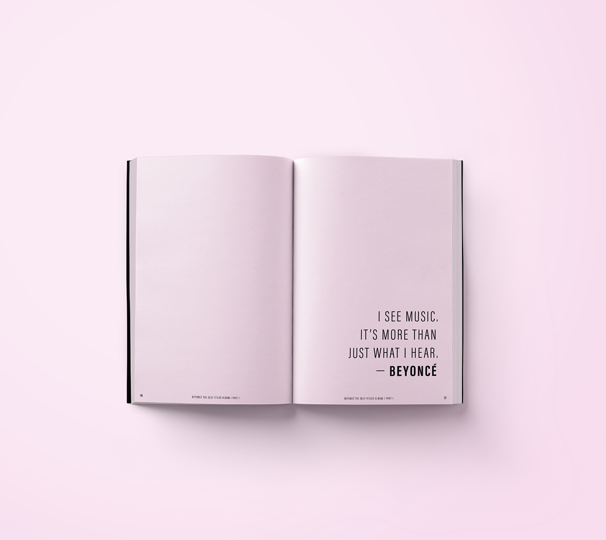
Beyoncé’s self-titled album that dropped on one unsuspecting night in 2013, has revolutionized the music industry. It showed that a pop singer can also be a bold artist and entrepreneur. The whole album took the “rules” of pop music and threw them out the door. The design, obviously, needed to be a bit edgy with a dash of elegance. So I took the visual style Beyoncé defined for this album (light pink and black color palette with condensed sans-serif typography) and expanded upon it to showcase the feminine and complex side of the album. Different typographic styles were also defined for the varied types of vocals in the songs.
Deliverables: Chapbook
Skills: Editorial Design, Typography
Documents: Process PDF