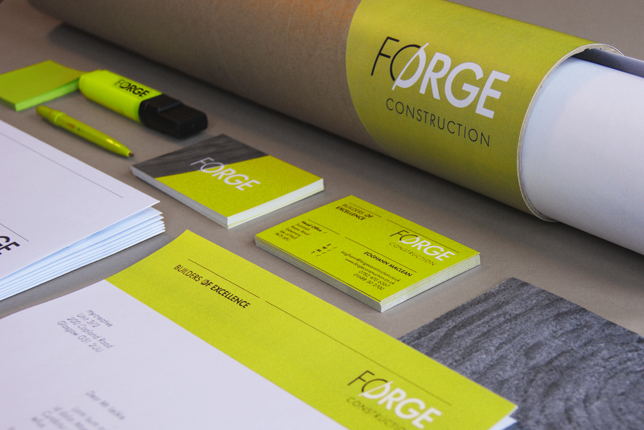
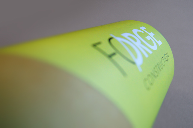
FØRGE CONSTRUCTION
— Brand & Identity
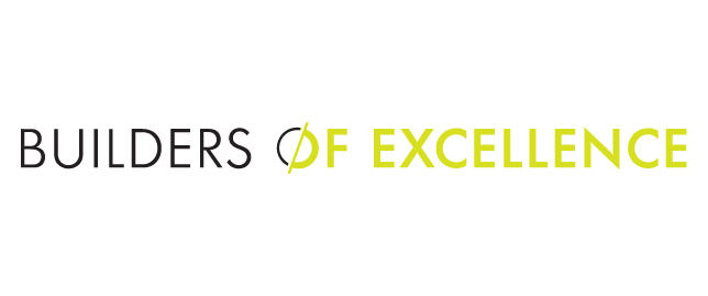
Builders of excellence — Are a core team of craftsmen that pride themselves on the quality of their work. The guys needed a name and brand that would communicate those values. FØRGE was then born.
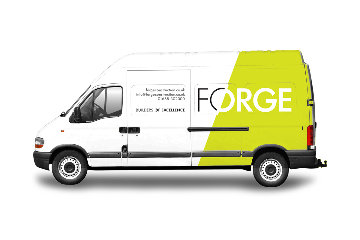
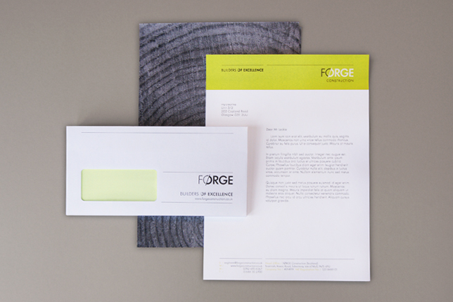
We conceived the name, identity system, positioning and brand strategy for them. After research sessions we looked into Vøland the Norse god of the smiths, who was renowned for his skill in forging any object. This gave us a interesting platform to work from.
The identity takes ownership of the Norwegian ‘Ø’ letter form as a way of representing the transformation from raw materials to crafted products. This is also visualized in the rest of the lettering as the weight looks to be carved away into a more elegant structure. Or perhaps a before and after shot.
— Brand & Identity
Builders of excellence — Are a core team of craftsmen that pride themselves on the quality of their work. The guys needed a name and brand that would communicate those values. FØRGE was then born.
We conceived the name, identity system, positioning and brand strategy for them. After research sessions we looked into Vøland the Norse god of the smiths, who was renowned for his skill in forging any object. This gave us a interesting platform to work from.
The identity takes ownership of the Norwegian ‘Ø’ letter form as a way of representing the transformation from raw materials to crafted products. This is also visualized in the rest of the lettering as the weight looks to be carved away into a more elegant structure. Or perhaps a before and after shot.