Interaction DesignE-book: Britain Reborn
I pitched in for an interactive e-book design project for Mr. L.K Sharma. The book was called 'Britain Reborn'. The book is a creative non-fiction on the theme of the Anglo-Indian encounter and the Indian diaspora in Britain. The work is hard to categorise in terms of genre but it is not a narrative.
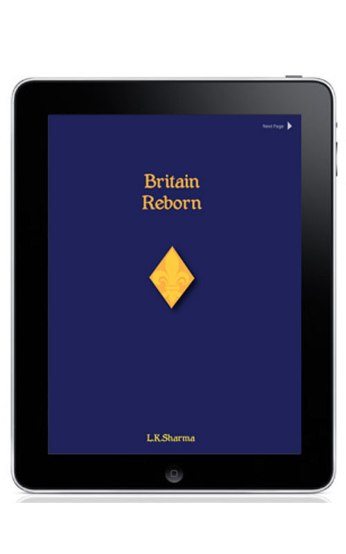
After reading the book, I realised that the book is witty and uses intelligent humour that can be enjoyed only by a person who is aware of incidents and people mentioned in the book.Therefore, I chose to give the book an overall smart and sophisticated look.
I chose the fleur-di-lis as a motif on the cover. The fleur-di-lis is a famous European motif.
Since I personally love reading hard bound books, I chose to keep the design very clean with emphasis on the text, to keep the design as close to a hard-bound book as possible.
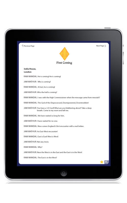
One can turn to the next page from the top right corner since that is usually how one tends to turn the page of a book.
One can tap on the star at the bottom right corner of the page to bookmark the page.

When one taps on the arrow on the bottom right corner of the page (as seen in the above frame), this window pops open with different tabs.
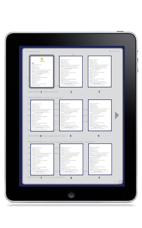
This is how the page looks when one taps on 'Thumbnails' . There are thumbnails for each page along with the page number so one has to tap on the thumbnail of the page that he/she wants to navigate to.

When one taps on the 'Bookmark' tab, the page zooms-out to show the book marked pages on the left. In order to navigate to a particular page, one has to tap on the bookmark of that particular page.
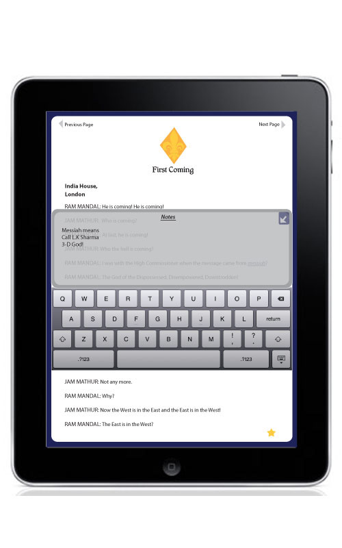
One of the reasons why one likes reading a hard bound book is that one can scribble notes or highlight his/her favourite line on the page. This is why I included an option of writing Notes. When one taps on this particular tab, this window (as seen above) opens up. Using the keyboard one can write and save notes on that particular page.

I also included the option of an audio book in my design. It is particularly aimed at visually challenged people. This is why I designed the tabs to be placed in the centre so that it is easy for them to locate. Also, the tabs are intentionally designed to be big in size so that it is easy for them to tap. The option for Audio is placed in the right bottom corner (as seen in the third frame of the project) so that it can be located easily and it is for the same reason that the Back to the e-book option is placed right there (as seen above)

