
After attending the actual Snowball Derby this past week, it dawned on me that the most striking element of the original logo is the big bold number signifying the edition of the event and the quirky, seemingly random, font sizing of the words "Snowball Derby." I played around a bit and decided to keep the FAST logo large, the edition bold and gold, and to focus on the styling of the lettering.
I feel really good about this rendition. It holds true to the design concepts of other FAST logos, pays homage to the original Snowball Derby logo, and has it's own unique style.
Full article about this project found on http://danielvining.com/blog-1/2015/12/8/1st-annual-fast-snowball-derby

First ad for the FAST Snowball Derby. Posted to http://facebook.com/fastsimracing

Second Ad in this series leading up to the FAST Snowball Derby. Posted on http://facebook.com/fastsimracing
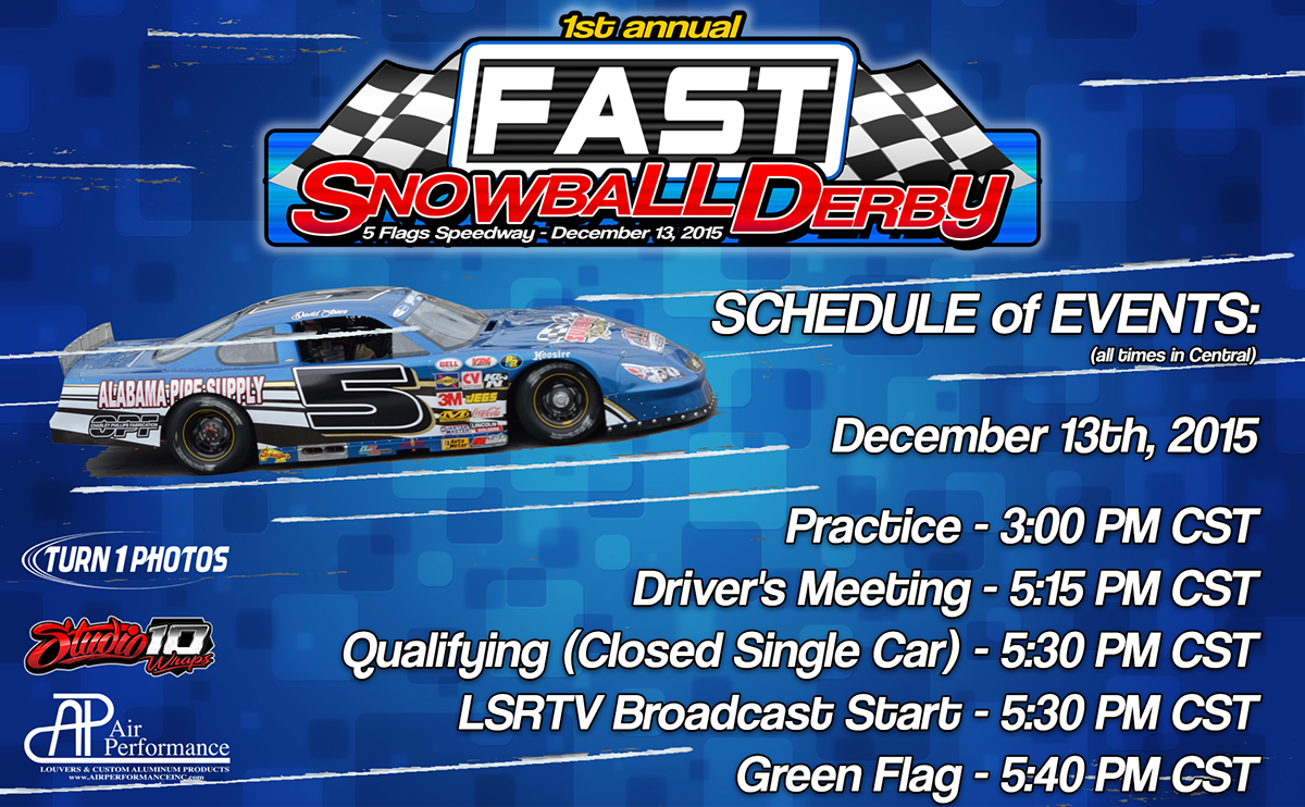
Ad number three for the FAST Snowball Derby. This one focuses on the Event Schedule. Same concept, just moving things around a little to mix it up some. Posted on http://facebook.com/fastsimracing.
