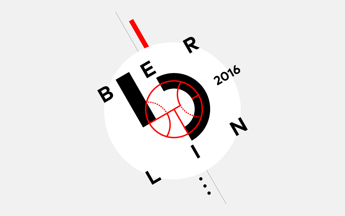
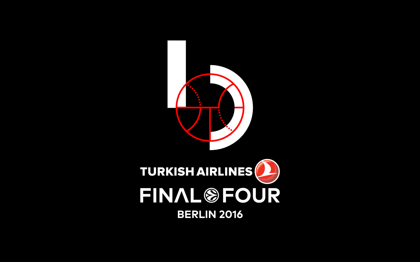


Euroleague Basketball Final Four 2016
The new logo having drawn inspiration from the Bauhaus movement, bears its basic characteristics,
such as simplicity and functionality, giving great emphasis on geometrical forms and colour while rejecting
any decorative element as redundant. The work of both Joost Schmidt (1893-1948) and Herbert Bayer (1900-1985)
can also be considered as points of reference; more specifically, the latter’s designs concerning the Universal Alphabet font and the initial letter “b”. At the same time, the ball as well as the court’s floor plan acted as the main elements
in the creation of a solid logotype, depicting both basketball and Berlin. As Euroleague Basketball mentioned
in its official opening presentation, the logotype manages to merge the soul of basketball and the city of Berlin,
combining them in perfect harmony under the principles of Bauhaus, which acted as a pioneering movement setting
the basic rules and patterns for modern design.
See more at semiotikdesign.com

