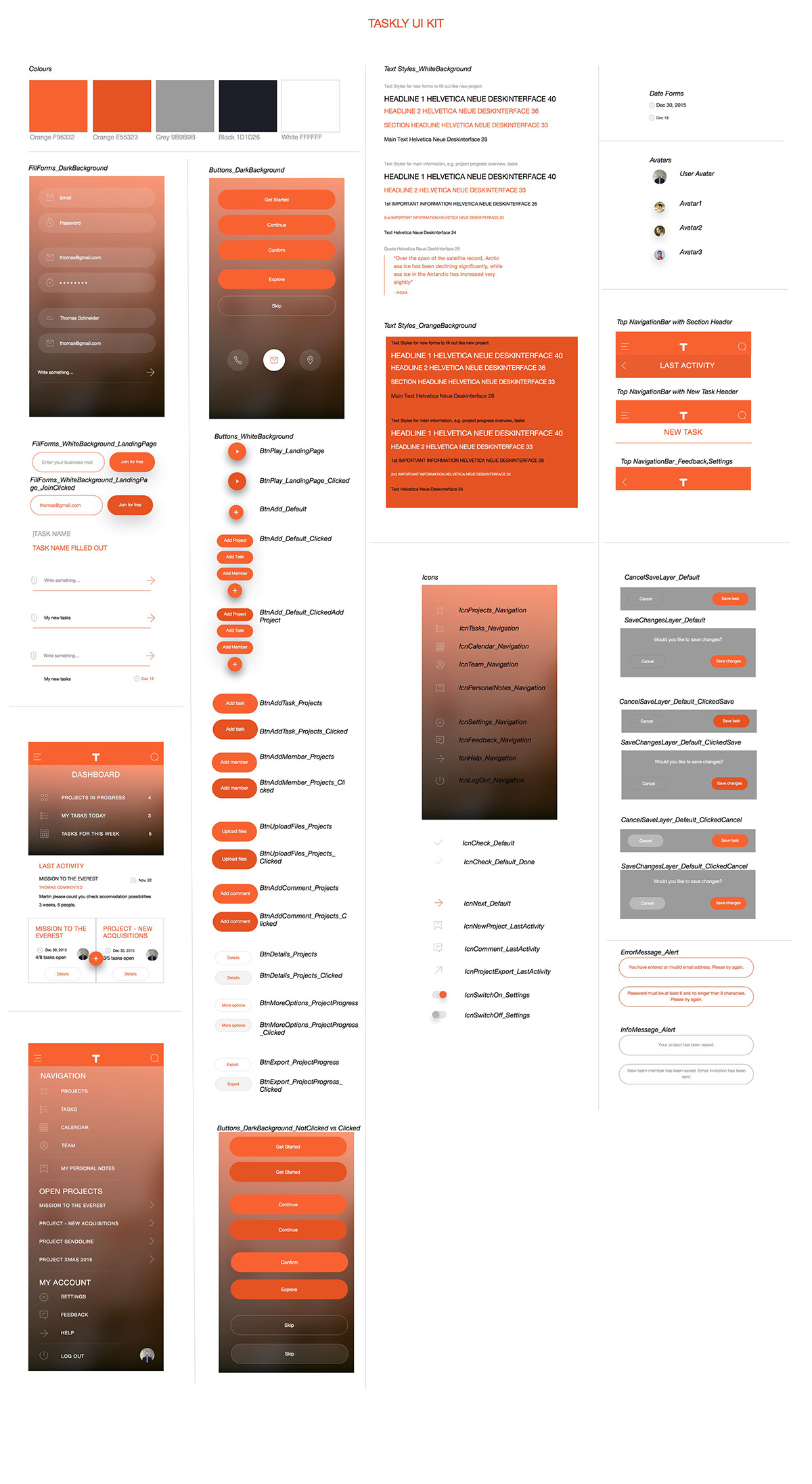
Choosing the “right” color palette when creating a website is one of the most difficult tasks you are asked to do as a UX designer. The reason it is so difficult is because there is really no right or wrong color combination, it is simply based on our own personal taste with no formula for success.
Important points for visual design:
- natural color palettes
- strong contrast helps
- keep your color palette simple
- your target group - Old vs Young people, Women vs Men
- nations and colors
- color meanings
For TASKLY project management webapp I decided to use orange, white, black and grey. Main color is orange and here is short explanation why:
The colour orange radiates warmth and happiness, combining the physical energy and stimulation of red with the cheerfulness of yellow.
Orange relates to 'gut reaction' or our good instincts, as opposed to the physical reaction of red or the mental reaction of yellow.
Orange offers emotional strength in difficult times. It helps us to bounce back from disappointments and despair, assisting in recovery from grief.
Orange brings spontaneity and a positive outlook on life and is a great colour to use during tough economic times, keeping us motivated and helping us to look on the bright side of life.
With its enthusiasm for life, the colour orange relates to adventure and risk-taking, inspiring physical confidence, competition and independence. Those inspired by orange are always on the go!
In relation to the meaning of colours, orange is extroverted and uninhibited, often encouraging exhibitionism or, at the very least, showing-off! The colour orange relates to social communication, stimulating two way conversations. A warm and inviting colour, it is both physically and mentally stimulating, so it gets people thinking and talking!
Orange aids in the assimilation of new ideas and frees the spirit of its limitations, giving us the freedom to be ourselves. At the same time it encourages self-respect and respect of others.
Orange is probably the most rejected and under-used colour of our time. However, young people do respond well to it as it has a degree of youthful impulsiveness to it.
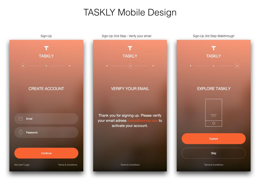
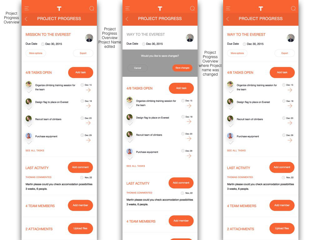
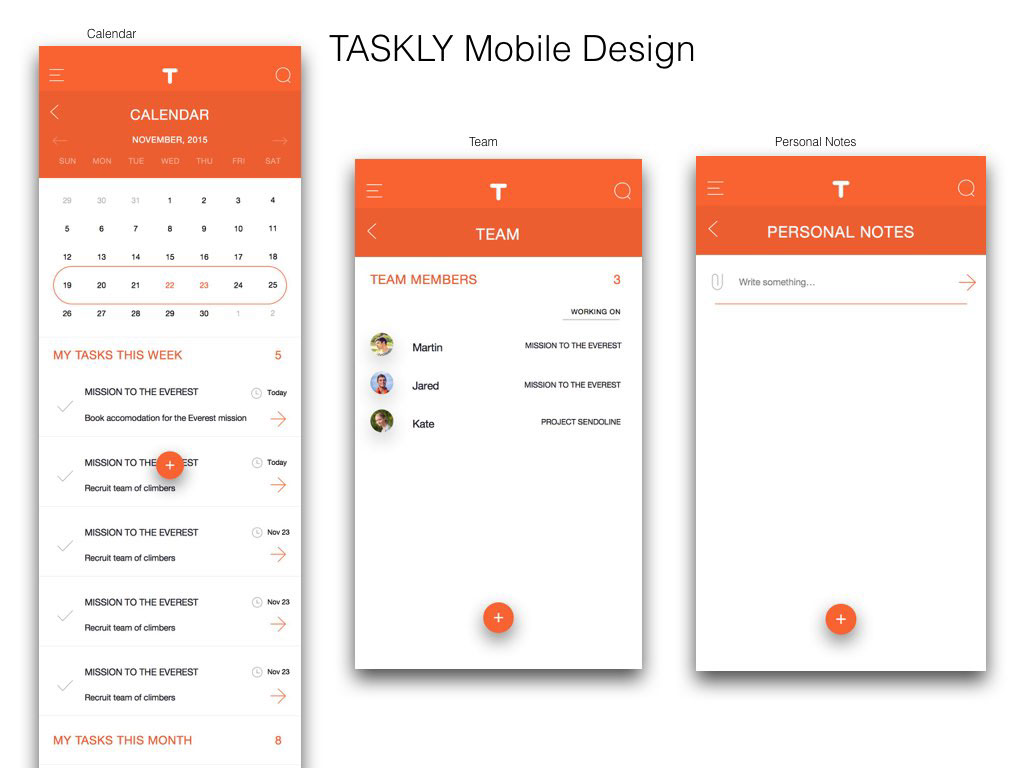
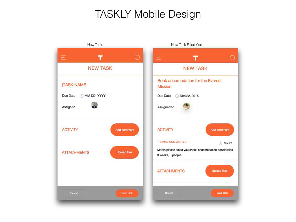
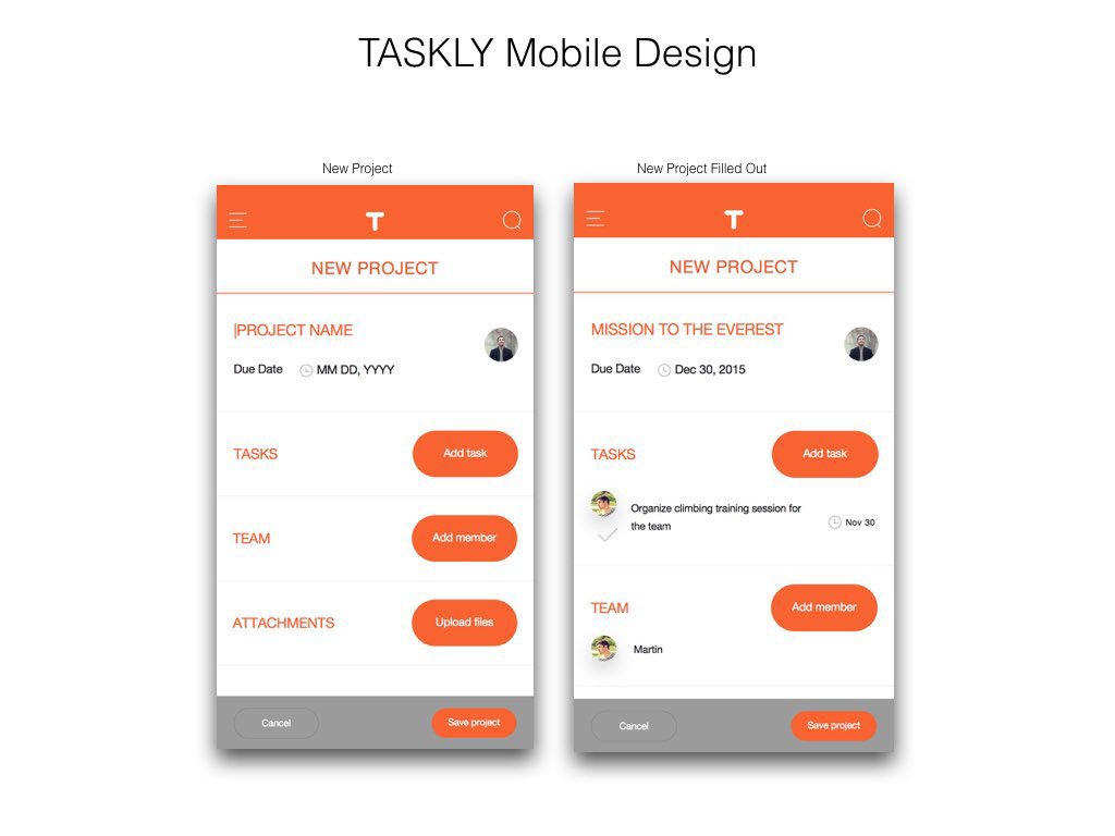
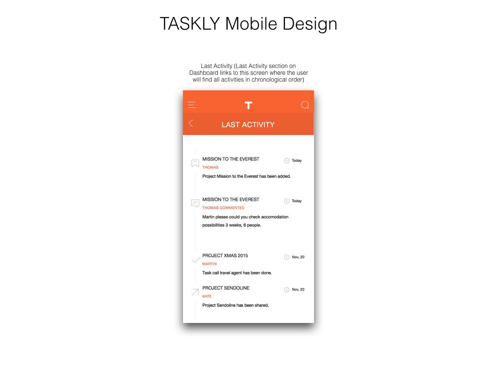
Please have a look now on TASKLY Mobile Design: