
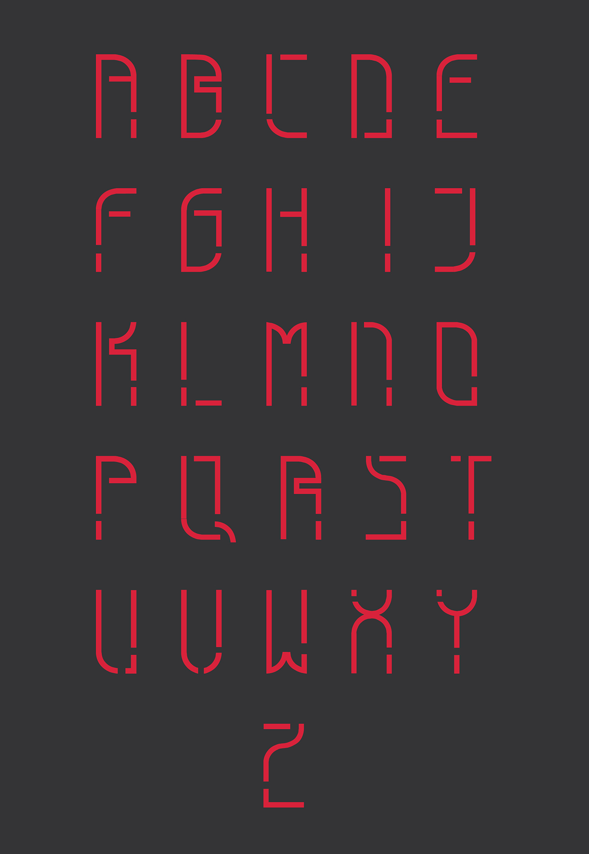
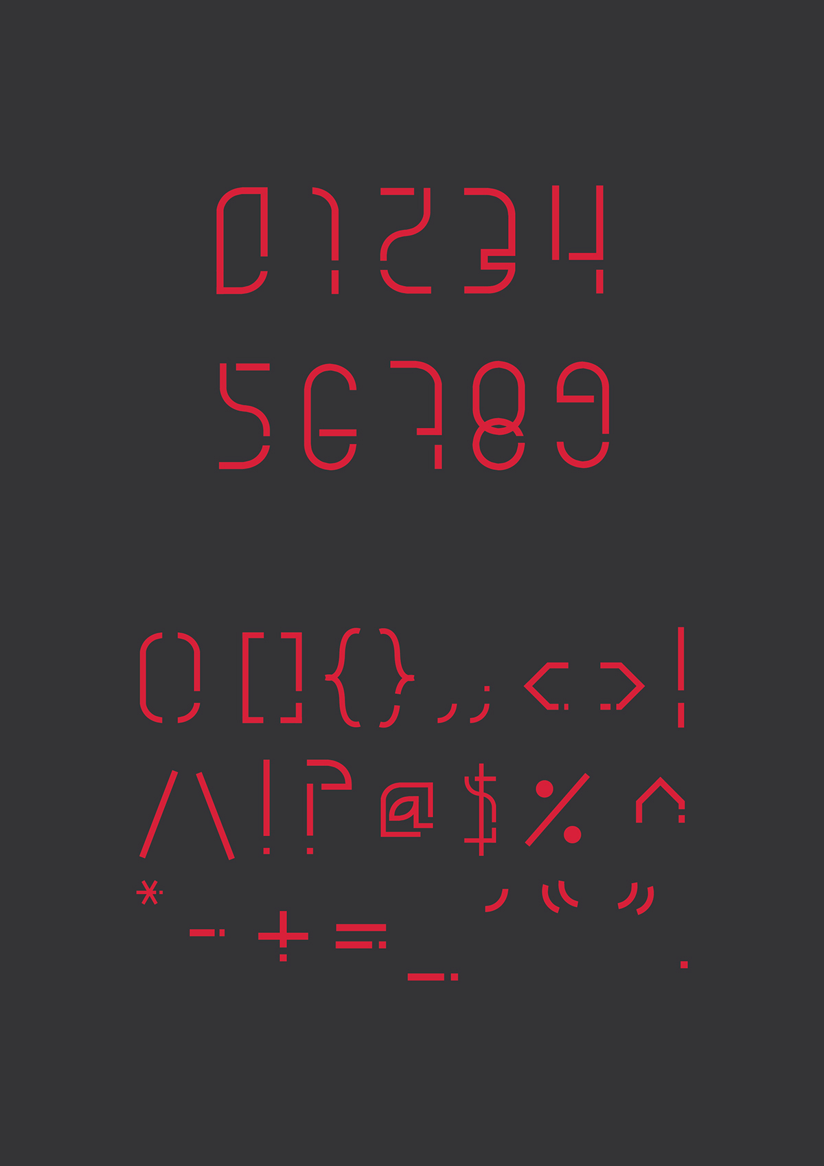
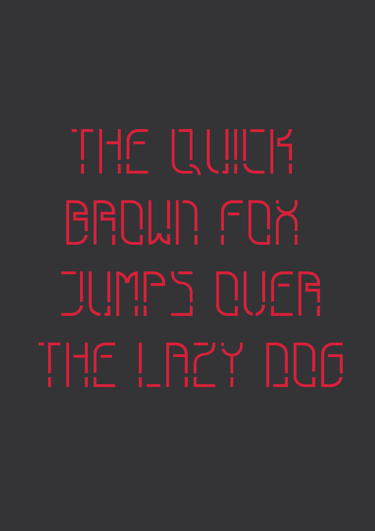
The concept is based on my personality but also at the same time, resemble forms based in the digital world. This instigated me to link it to work for technology rather having it just for traditional print based products such as books. For this type, no diagonal lines were used to create the alphabets and numbers, but exceptions had to be made for special characters to ensure that they are clear to understand. The thickness of the type has been kept constant throughout. Furthermore, to ease the readability, the kerning was adjusted appropriately especially for letters such as ‘i’ where the width is less when compared to other letters.


