
ekoBrachia
Product design, Illustration, Packaging
Designed in 2013
*****
CLIENT: Brachia p.z.
Product design, Illustration, Packaging
Designed in 2013
*****
CLIENT: Brachia p.z.
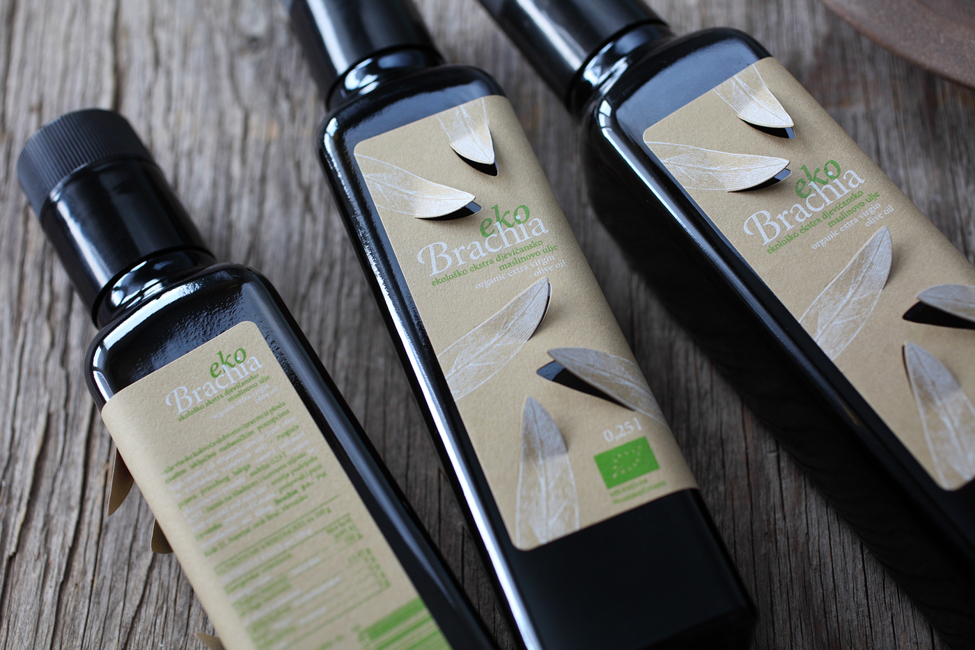
ekoBrachia - organic extra virgin olive oil, a special edition of Brachia premium olive oil product line, high in quality and with organic origin.
The identity of the product is based on simplified elements of Brachia identity, using only two colors (white and green), together with the color of paper. The basic element is the artwork of olive leaves (part of Brachia visual identity), produced by cutting the label to let them "come out" from flat surface into the surrounding area and so become three-dimensional - from ekoBrachia comes natural / organic olive.
The label is screen printed on 100 % recycled paper (Keaykolour Camel), with illustrations of olive leaves that are lifted from the label in the surrounding area, making the otherwise flat label spacious (2D to 3D).
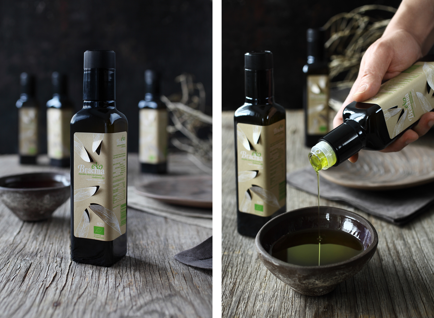
Particularly good effect is achieved on the shelf, where arranging a greater number of bottles in a line results with a larger number of lifted leaves giving an impression of playfulness, emphasizing the element of naturalness.
*****
DESIGN STUDIO: Design Bureau Izvorka Juric
DESIGN: Izvorka Jurić
PHOTOGRAPHY: Maja Danica Pečanić


AWARDS AND HONORS:
_ internacional design award QuadAward, Quadaward UG, 2014, D
_ part of “Exhibition of Croatian Design 13/14”, Croatian Designers Society, 2014, CRO
_ finalist CroPak 2014, 2014, CRO
_ published on Packaging of the World, 2014, Internacional
_ part of “Retrospective ZzID 2009-2013″, Design Center at the Croatian Chamber of Commerce, 2014, CRO
_ published on Vizkultura, 2014, CRO


