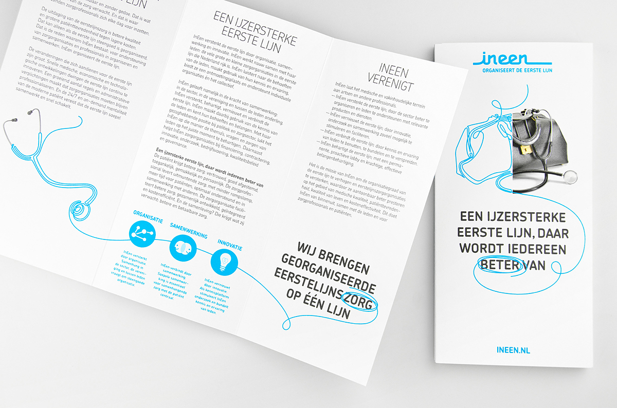
Health care is changing at an increasing pace. The Dutch government wants to avoid secondary care treatments if they can be fulfilled as well — or better — by primary care providers such as general practitioners, physiotherapists, optometrists and dieticians. InEen strengthens primary care by organizing this ‘line of health care’, connecting and encouraging collaboration between members and representing their interests in government. Taken By Storm drew a literal line for InEen’s identity, creating a powerful yet simple communicative style, in collaboration with Roos & Van de Werk.
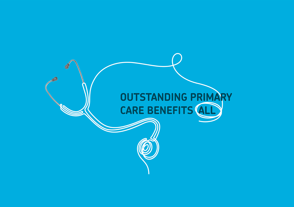
We drew the name as a no-nonsense word mark, underlining their commitment to resolute action. In applications, a single flowing line completes half of a photograph, symbolising the abstract matter the organisation deals with and the connection to the daily practice of its members. We combined this visual language with compelling statements, manifesting the brand story and the values of InEen.
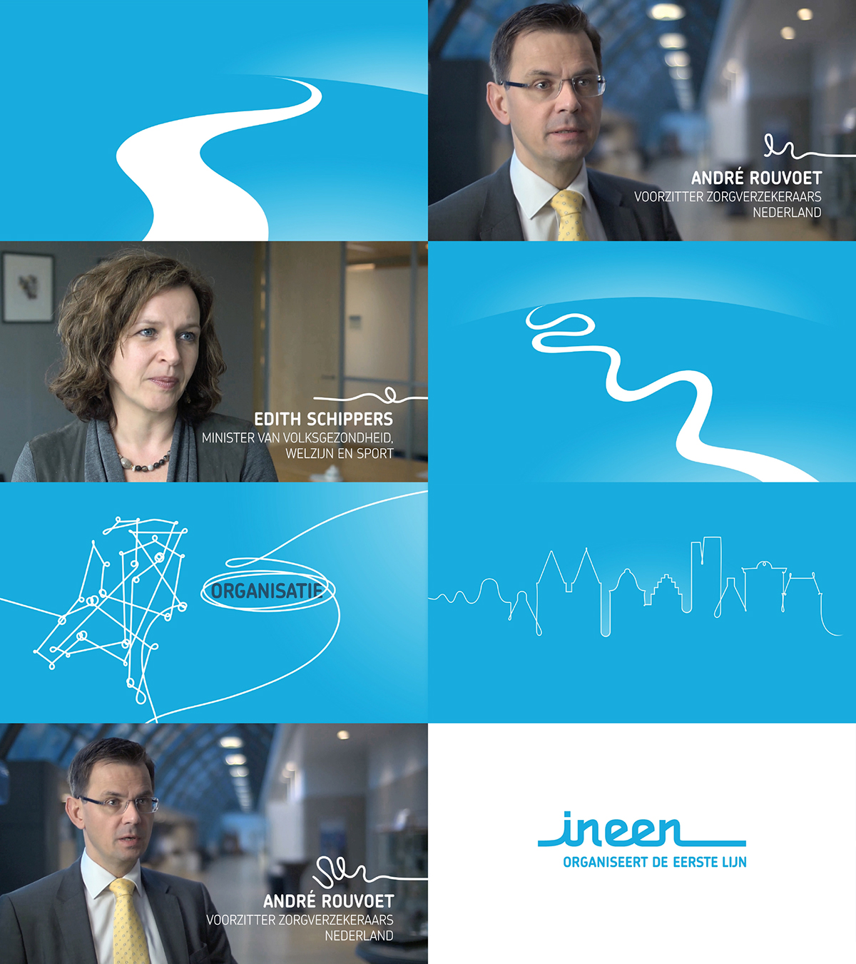
We developed a range of applications, not in the least an introduction film (see below). The manual we created is used daily by InEen and its suppliers to develop new applications and keep all communications on-brand: outstanding care that benefits InEen.