

In this project I am going take you through my usual process of creating a custom logotype for a client. Article is originaly written for Abduzeedo. I post work in progress on Dribbble and tweet about it on Twitter.
Introduction
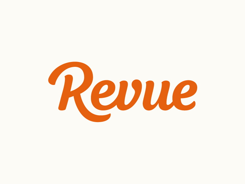
Revue is the easiest tool to create a weekly email newsletter. You focus on curation, we'll make sure it looks good.
Revue is a new tool that creates newsletters within a few clicks. The tool can be used to gather existing content, order it, add some personal words and send out the resulting ready designed newsletter to subscribers. Revue can be used by everyone; from families, starters and start-ups to companies who already have a subscriber database. A Revue account includes a predesigned landing page with signup form that can be shared to reach out and boost the number of subscribers. Existing subscribers can be imported from several sources including MailChimp.
Revue is a new tool that creates newsletters within a few clicks. The tool can be used to gather existing content, order it, add some personal words and send out the resulting ready designed newsletter to subscribers. Revue can be used by everyone; from families, starters and start-ups to companies who already have a subscriber database. A Revue account includes a predesigned landing page with signup form that can be shared to reach out and boost the number of subscribers. Existing subscribers can be imported from several sources including MailChimp.
Get to know the Brand
On before hand I always ask a few question to the client in terms of; what they do, their goals, target-audience, keywords, direction of style for the logo specifically and a few reference images. All these questions come in handy when starting your inspiration journey.
Their goal is to build a brand with Revue in the future and are searching for a simple and clean custom type, friendly and approachable for consumers as well as the business market. Yet simple it need to have it's own identity and stand out from other competitors. For alternate standalone use on smaller sizes they also needed a distinctive "R" icon.
Keywords: Personal, Elegant, Clean, Modern, Simple, Professional, Strong, Warm, Classic, Friendly.
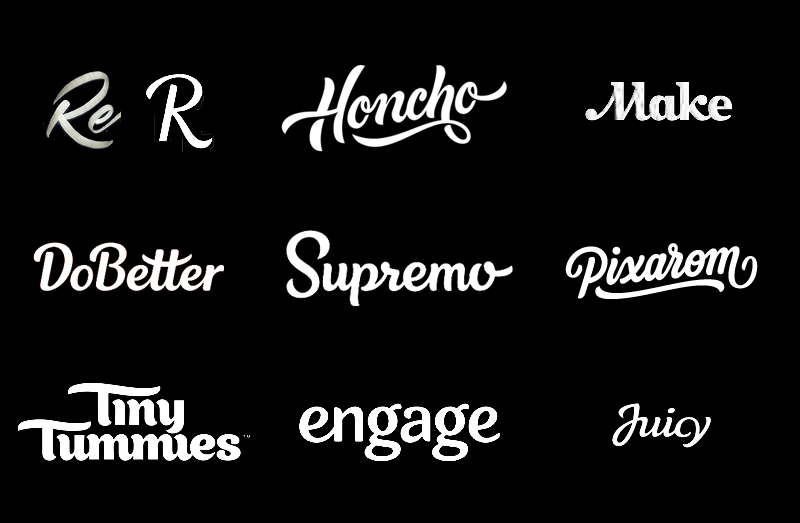
Next to the description and keywords the client also wanted to explore certain other styles based on reference of my previous work, like; Brthrs, Stencil, Painterly, Craft. Not all of these examples have the right specification in relation to the description and keywords but it is good to explore other possibilities.
Their goal is to build a brand with Revue in the future and are searching for a simple and clean custom type, friendly and approachable for consumers as well as the business market. Yet simple it need to have it's own identity and stand out from other competitors. For alternate standalone use on smaller sizes they also needed a distinctive "R" icon.
Keywords: Personal, Elegant, Clean, Modern, Simple, Professional, Strong, Warm, Classic, Friendly.
Next to the description and keywords the client also wanted to explore certain other styles based on reference of my previous work, like; Brthrs, Stencil, Painterly, Craft. Not all of these examples have the right specification in relation to the description and keywords but it is good to explore other possibilities.
Research and Inspiration
All received information is a good starting point for beginning the research, which I'd like to start creating a small mood board of logo styles I personally find a good fit and inspirational letterforms I may end up using.
Examples are found using; Google and Pinterest by searching "custom logotype Elegant", "logo lettering friendly" for example.
Sketching
Partly thanks to doing research I have a strong idea for direction in mind which I'm going to visually develop in the sketch phase. This phase primary focuses on; sizes, letterforms and connection options. Usually with the letter connection part I run into problems, in this particular case I see the "v-u" connection could be a problem and read as a "r". Other than that, I didn't see any big problems on before hand.

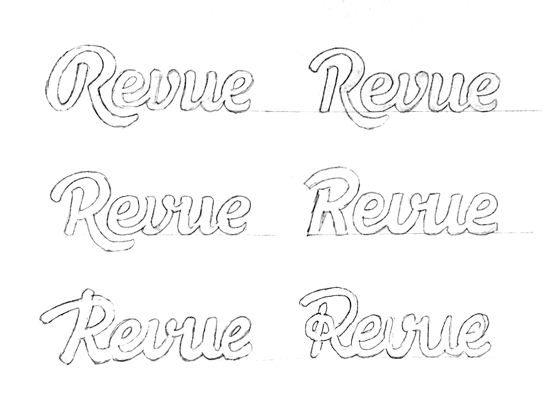
At this point the client will get involved. It would be a waste of time to fully develop a logo without consulting the clients preference. At first the client liked the right middle option most but after a quick digital transfer and mock up on the website we both agreed the middle left one was the best option and suited the description best. As I already mentioned above, the "v-u" is a problem, the legibility was way better disconnecting the "v-u".
Concept Development
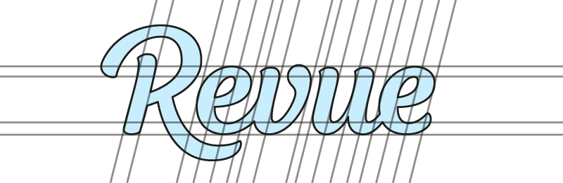
It is time to transfer the raw sketch work into an usable detailed sketch for digitalizing. Vectorizing the raw sketch work is also an option but I like to do as less digital work as possible.

The notes above the sketch are handy to keep track on the points of interest while redrawing.
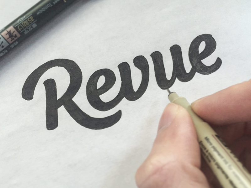
As you see the redrawing turned out a bit better detailed as the initial sketch work. Still room to improve but we take care of that while vectorizing.

Digitalizing and Revisions
I am here working with 0 and 90 degree bezier handles method, there is a excellent tutorial about that method over at AGCS by Dave Coleman.
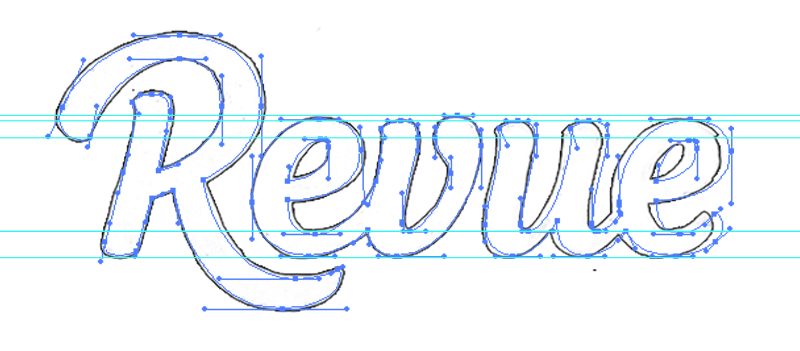
As I mentioned earlier, the detailed sketch iteration had room for improvement. In above shown picture, the layered vector WIP is shown on top of the scanned detailed sketch. The revisions I made are foremost; width/size adjustments, kerning and consistent tails/connections/slants.
A quick tip: I always found it very helpful to send a concept to another "lettering" designer to gain other insights and feedback.
A quick tip: I always found it very helpful to send a concept to another "lettering" designer to gain other insights and feedback.

Alternate version
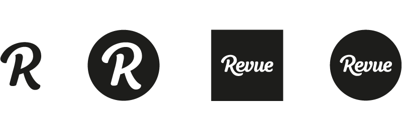
Now the full logotype has been created, we still need an alternate initial "R" icon for smaller sizes usage. Goal was to maintain the character of the "R".
I Sketched out two ideas, one based on the existing "R" which was good but not that ideal for usage without the circle. The second one has a cut off leg, we both agreed this was the best option as it was usable with and without a circle and maintained the character of the "R".
I Sketched out two ideas, one based on the existing "R" which was good but not that ideal for usage without the circle. The second one has a cut off leg, we both agreed this was the best option as it was usable with and without a circle and maintained the character of the "R".

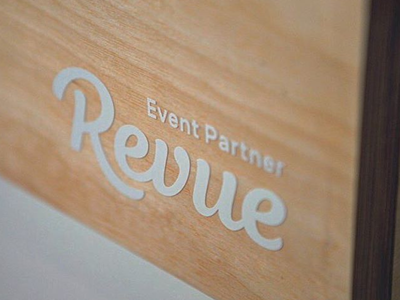
The stand alone "R" was only for the smallest usage scenarios. The word Revue itself is not that long, so it is suitable for profile pictures like Twitter and Facebook.
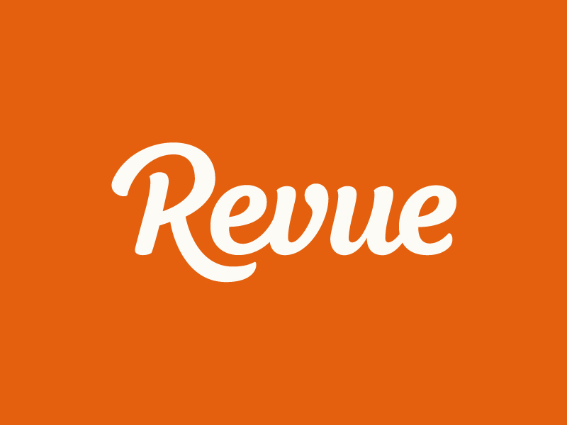
The Final result
From the first mail contact till the final result it took me around 40 hours to complete. The new logo for Revue is now ready for actual use and I'm very happy about the final result. I hope this insight in my process has been helpful. I'm open for feedback to improve future articles of this kind. Thanks for reading!

Client Testimonial
Martijn de Kuiper (Founder Revue)
getrevue.co
"I was surprised how well Paul managed to capture our feelings in to a logo. It totally matched our wishes and went beyond our expectations. Paul is super talented and I'd recommend him to everybody who's looking for a new (custom type) logo."
getrevue.co
"I was surprised how well Paul managed to capture our feelings in to a logo. It totally matched our wishes and went beyond our expectations. Paul is super talented and I'd recommend him to everybody who's looking for a new (custom type) logo."


