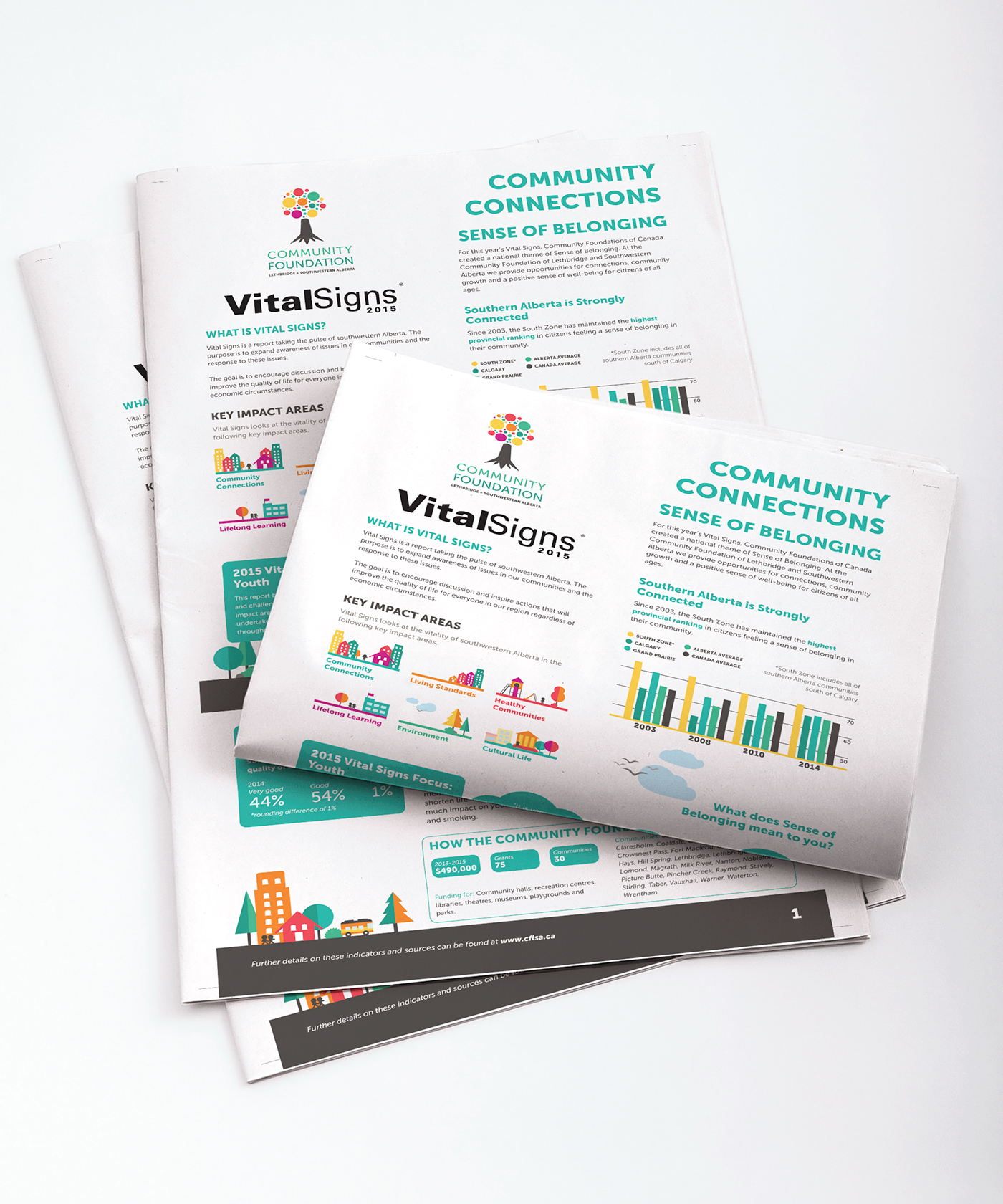
Vital Signs 2015
Colour, shape, simplicity. Those three factors combined can reinvent how a person views a traditional editorial, creating an informational package that not only compels the reader to look closer, but follows a unique rebrand forging its own way in an area that typically lacks design diversity. Designing the Vital Signs 2015 editorial for the southwestern Alberta region had many challenges. The first major publication to feature the new brand commissioned by the Community Foundation of Lethbridge and Southwestern Alberta, it was a flagship for building interest in the brand and raising community knowledge by providing information on trends and issues in southwestern Alberta communities.
Based off of the branding developed by Media32, Vital Signs 2015 incorporated a wide range of colours and flat-style illustrations to display community information and facts. The concept behind the delivery was to create an informative package that was educational and engaging, in a newspaper format. Maintaining simplicity was vital, ensuring that the illustrations did not visually pollute the statistics and other information. With the opportunity of creating a fresh and unique editorial, I created a package aimed at connecting with people in the community through the use of colour and illustration to convey an easy to follow story throughout the paper.