

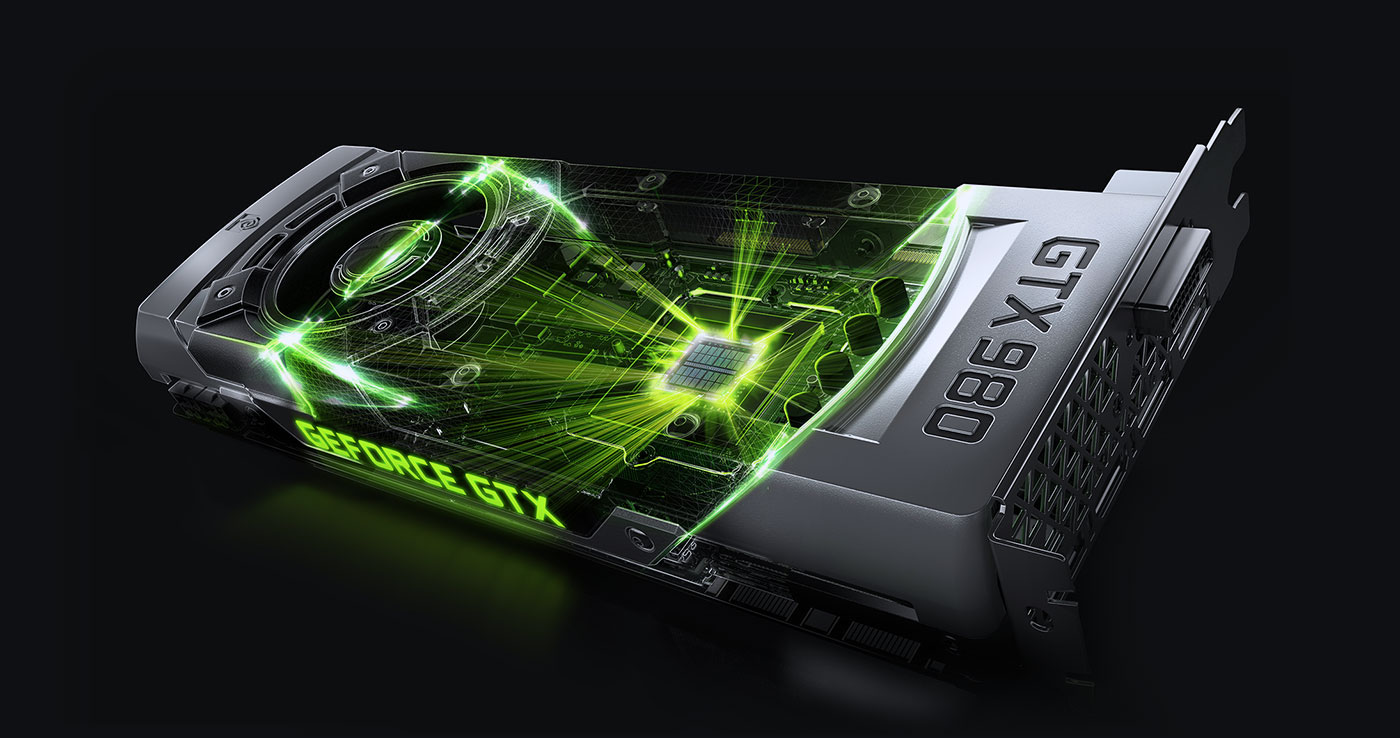
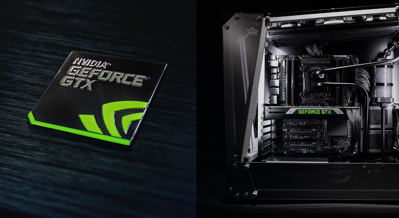
GeForce GTX \\ Creating the Brand
THE STORY
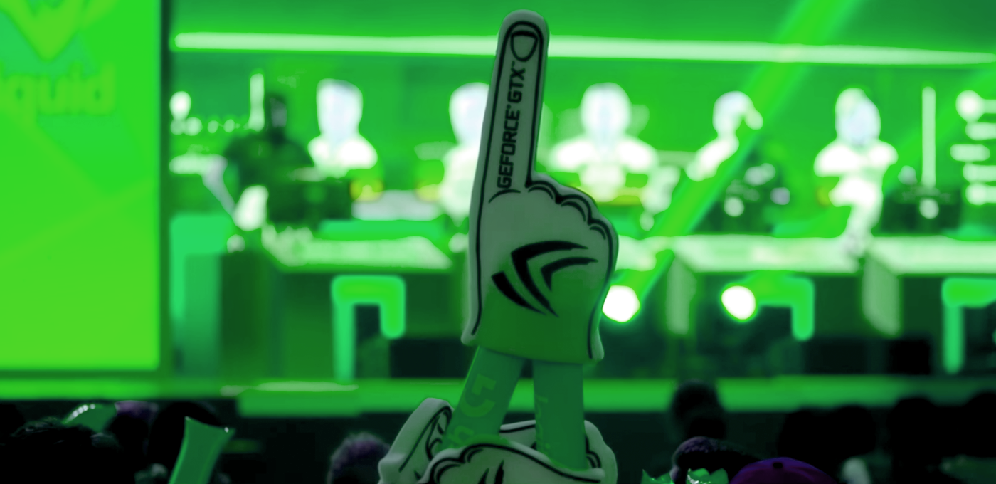
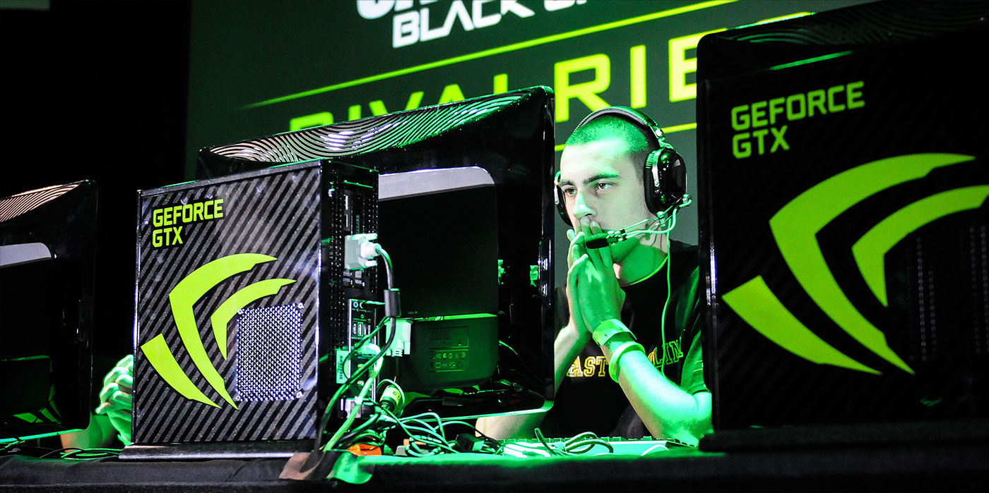
GeForce GTX has been the dominant brand for passionate PC gamers who desire the most advanced, highest performing visual muscle for their favorite games. The perfect tool to escape to fantastic rich new realities, and beat out their competition in an arms race won on adrenaline and frames per second.
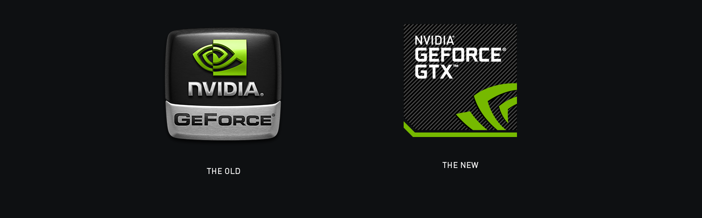
In early 2013, we began a process to shift perception of the company from one that simply makes the chip behind games (GPUs), and re-introduce ourselves a platform that is simply the best gaming experience on the planet. From hardware to software—soup to nuts.
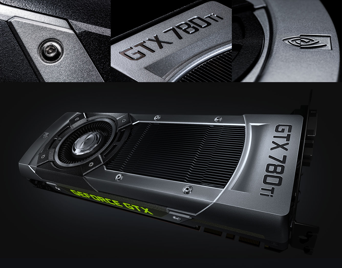
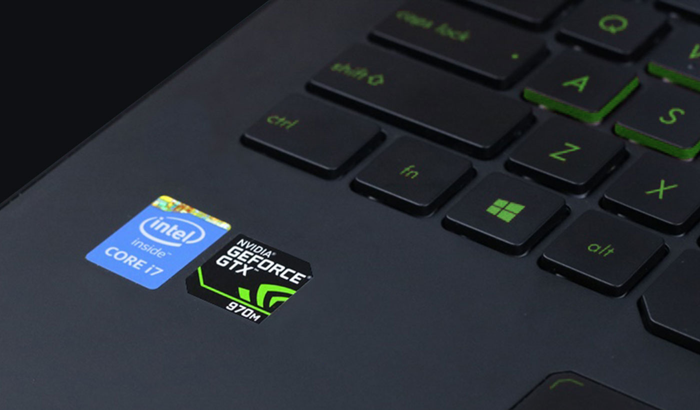
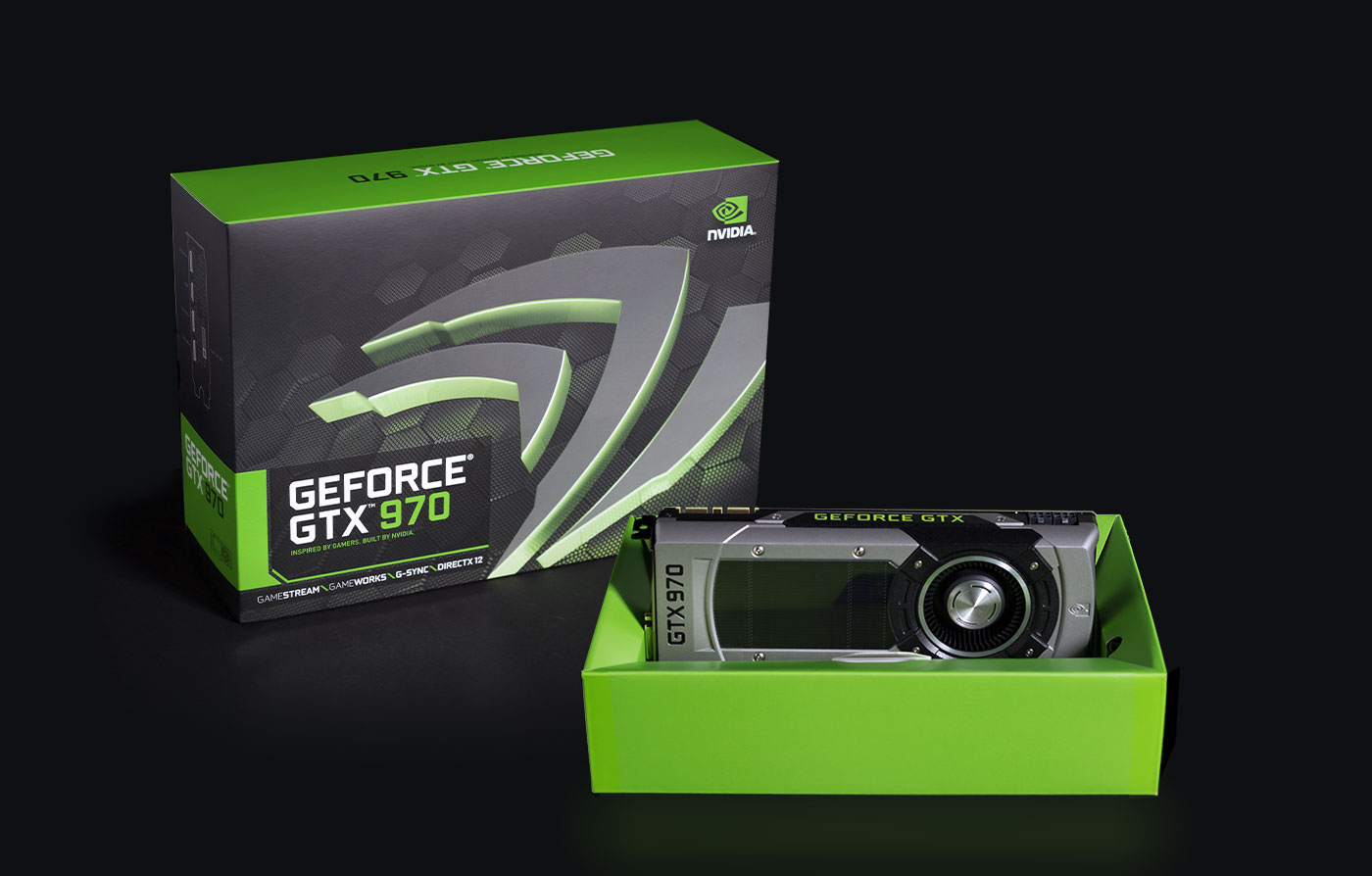
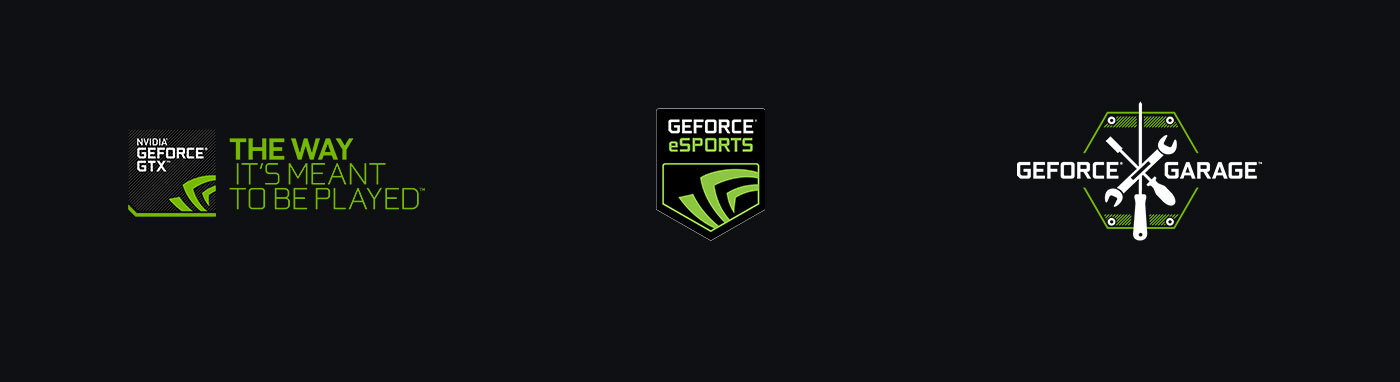
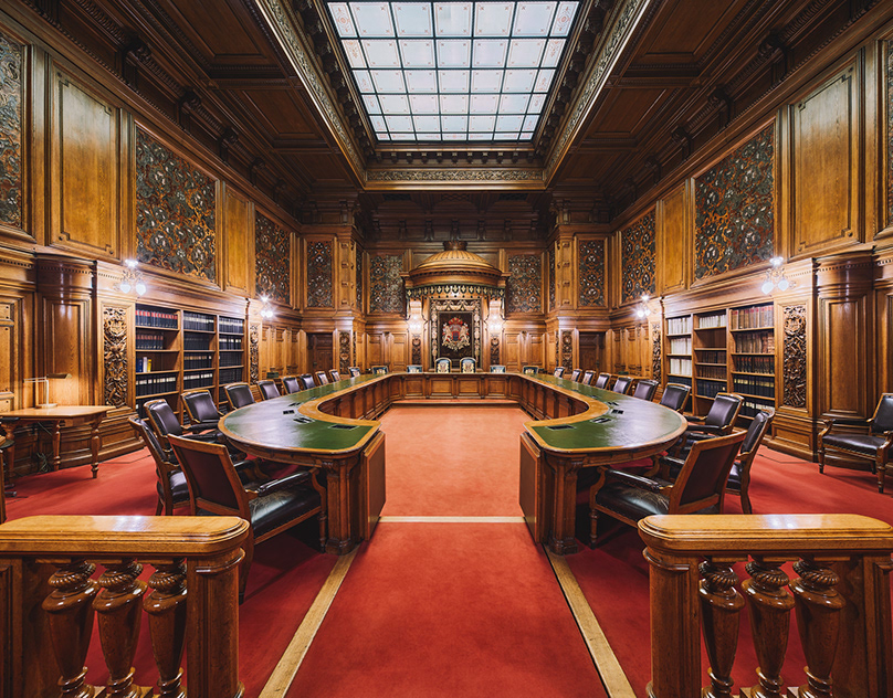
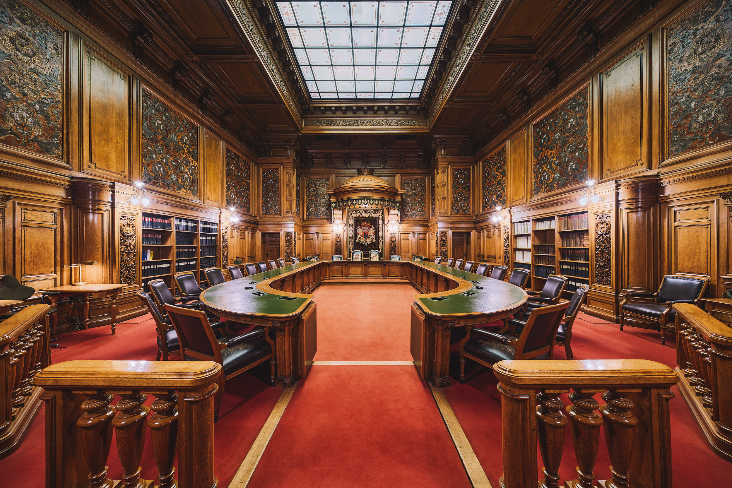
Inspired by automotive, aerospace, and military—a new visual language was established. Pulling away from bubbly 3D shapes and superfluous dimensionality, and welcoming harder, sharper, geometric forms. These new shapes and language were introduced across every touch point—logo, typography, packaging, stickers on notebooks and desktop systems, industrial design, and campaigns to name a few.
This language continues to live onward, through steady evolution seen in the latest GeForce GTX 10 Series "Pascal" products, campaigns, and packaging.
A NEW FONT
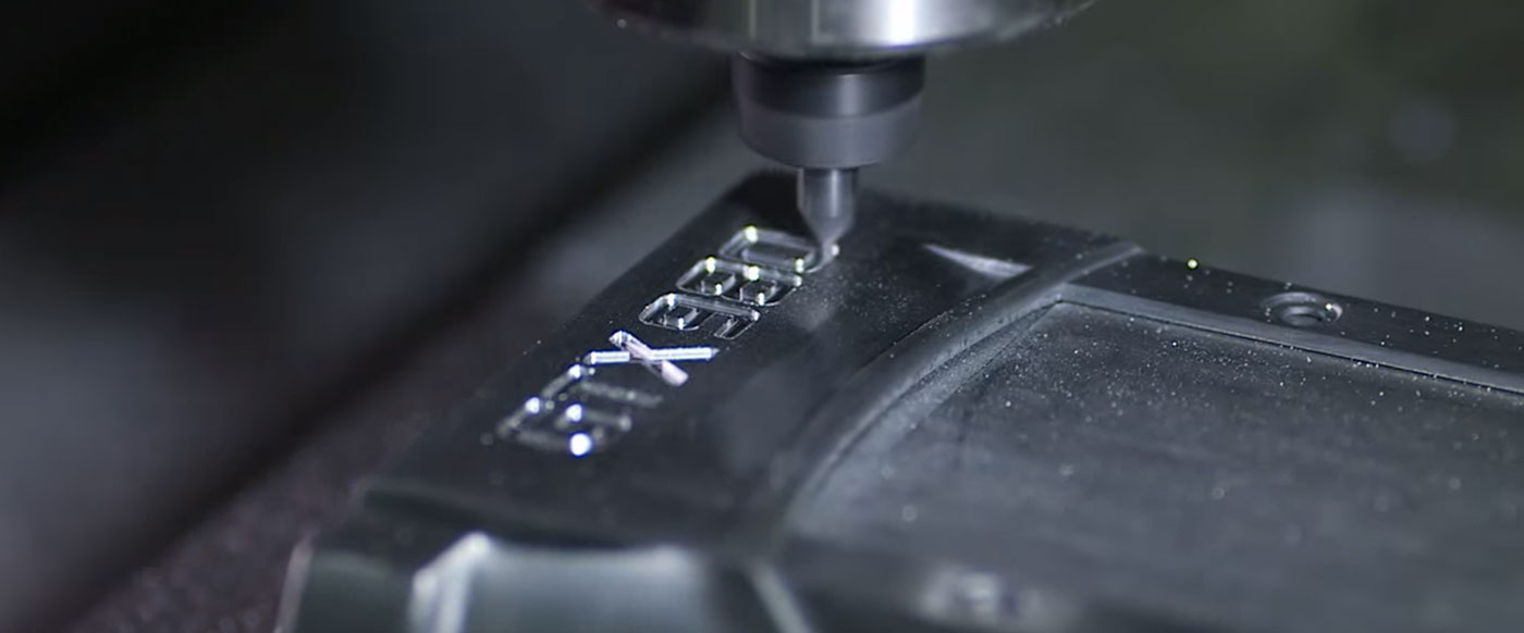
A bespoke typeface was designed in collaboration with the talented Timerman Design in New York, including Cyrillic and a custom angled "G" glyph, designed to complement the angle introduced in the logo. Bringing with it a more squared and narrow proportion than its predecessor, plus a touch of rounding for easy readability at smaller sizes.