About this project
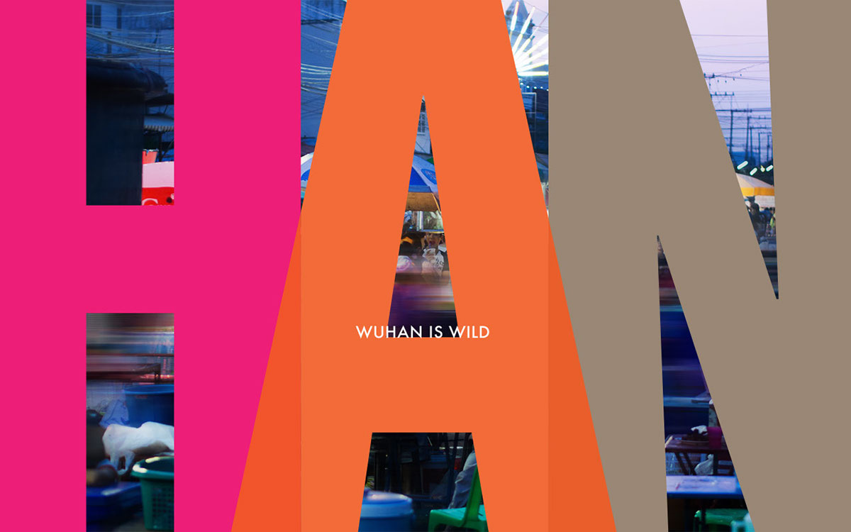
Between 2013 & 2014 Zhengbang was engaged to submit solutions for the City of Wuhan Logo design. This was my submission which ultimately became one of the 3 solutions chosen for public voting.
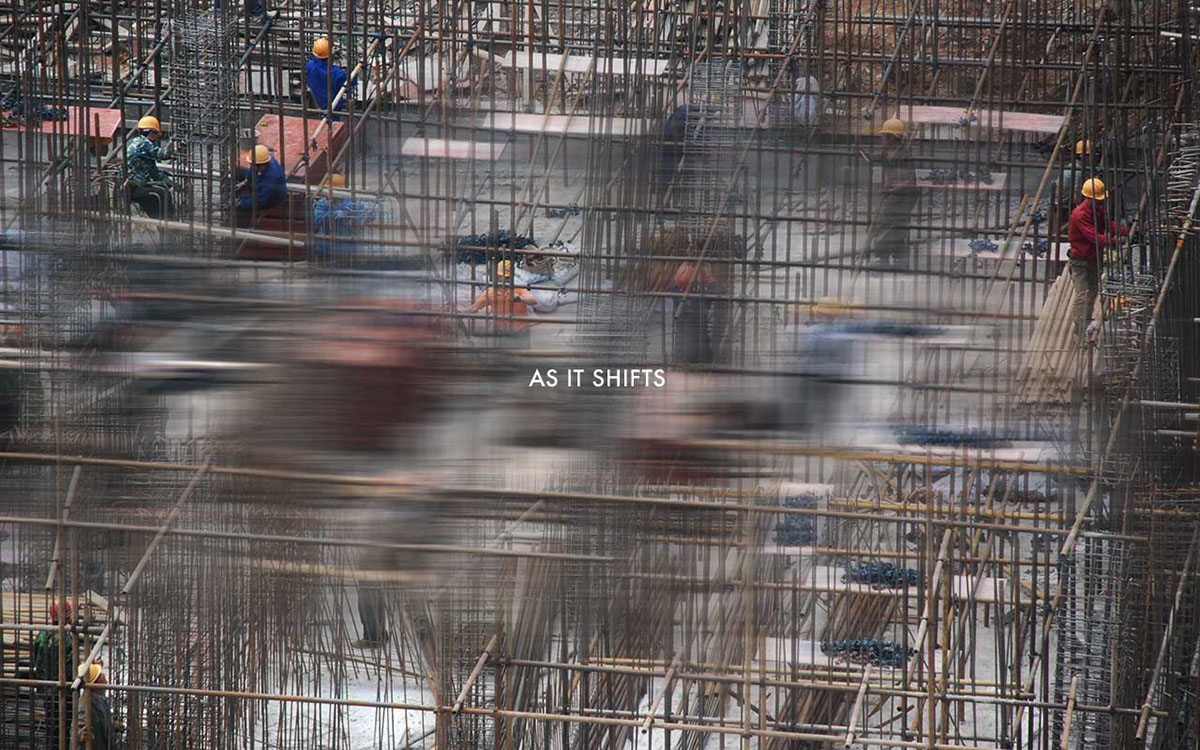
Wuhan is a city on the rise. As it shifts from developing to developed, it finds itself at the right moment to tell its story and define its future. The personality and momentum of the city is succinctly captured by its slogan: "Wuhan, different everyday"
The logo for wuhan represents the dynamic transformation of the city and future ambition by the use of bright colors overlaping each other, reflecting a vibrant, dynamic and confident city. The "big" personality of Wuhan is expresssed through the bold typeface, composed tightly together.
Photographic credit - Girl looking up:
"Wuhan / 武汉 | pure fun / 玩儿" by Tauno Tõhk / 陶诺, used under CC BY / Slightly desaturated & altered color balance from original