PROJECT.
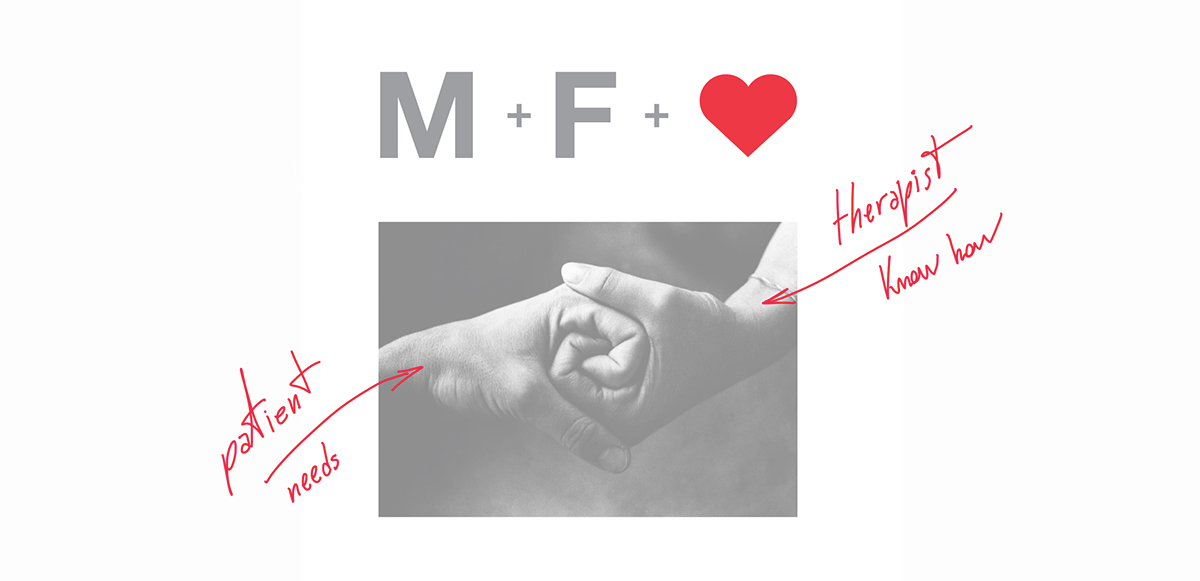
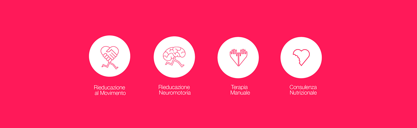
The brand study, focused on the relationship between therapist and patient. We had path several ways until arriving at the conclusion that the most effective was to link the image of this brand not only to the good and to the physical well-being but also love for their profession and then to their patients. Other result that we tried to achieve is to be reassuring and professional. The color choice is red, it was decided to break with all shades of green widely used in 'field physiotherapy studios. A very bright red that turns into shades of magenta, to make it less serious, foregone and more modern than the classic carmine that can be find in the hospital symbols.
The brand study, focused on the relationship between therapist and patient. We had path several ways until arriving at the conclusion that the most effective was to link the image of this brand not only to the good and to the physical well-being but also love for their profession and then to their patients. Other result that we tried to achieve is to be reassuring and professional. The color choice is red, it was decided to break with all shades of green widely used in 'field physiotherapy studios. A very bright red that turns into shades of magenta, to make it less serious, foregone and more modern than the classic carmine that can be find in the hospital symbols.
PROGETTO.
Lo studio del marchio, si è incentrato sul rapporto tra terapista e paziente. Abbiamo percorso diverse strade fno ad arrivare alla conclusione che la più efficacie fosse quella di legare l’immagine di questo marchio non solo al bene ed al benessere fsico ma anche all’amore per la propria professione e quindi per i propri pazienti. Altro risultato che si è cercato di ottenere è quello di farlo essere rassicurante e professionale. Il colore è rosso, si è voluto staccare con tutte le tonalità di verde molto usate nell’ambito fsioterapico. Un rosso molto acceso che vira verso tonalità di magenta in quantità importanti, per renderlo meno scontato e più moderno, rispetto al classico rosso carminio che si può trovare nei simboli ospedalieri.
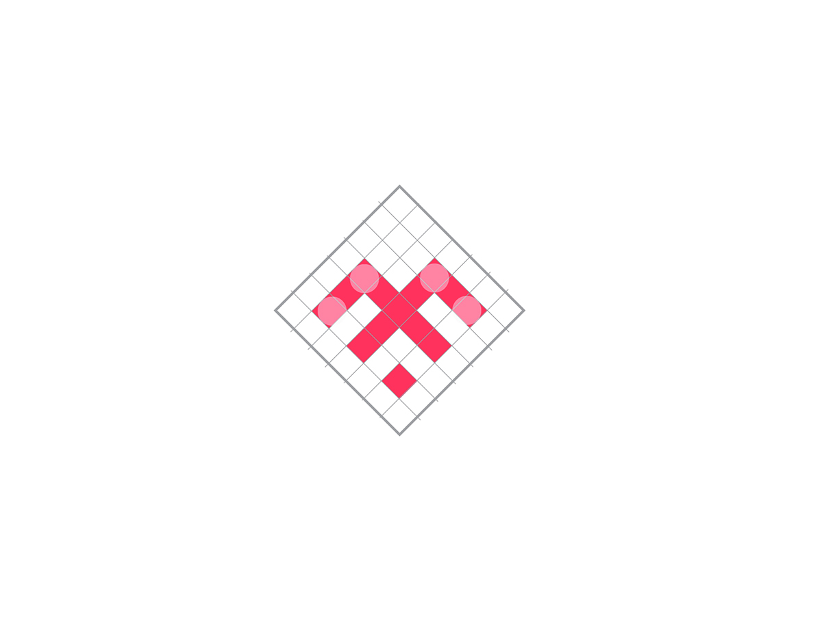
LOGO CONCEPT


-
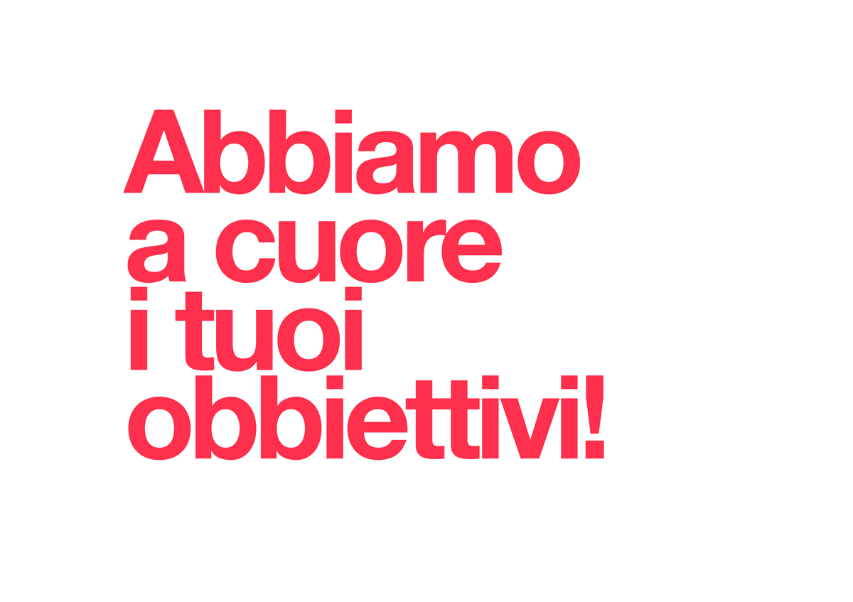
PAYOFF:
We care about your goals!
In Italian lenguage, the word "cuore" have a double meaning, like "heart", but in this case also "care-love". So, the reference to the logo concept is clear! ;)


Grazie!

codorostudio.com


