Grey Springs makes educational games for children of the ages of 1- 7. They wanted to attempt a change in their UI in order to make their already existing games more engaging for children and less stressful in terms of navigation/instructions for the game. They wanted minimal but impactful change.
APPROACH:
1. STUDY EXISTING SCREENS
2. SECONDARY RESEARCH ON CHILDREN APPS / APP USAGE BEHAVIOUR
3. NATURALISTIC OBSERVATION
4.ONE ON ONE INTERVIEWS
KEY INSIGHTS:
A) LESS IS MORE : For a kid lesser the interactions/complications on the app the better the app.
B) DOUBLE THE FUN, DOUBLE THE ENGAGEMENT: The more fun ways an instruction is relayed to a kid the more the engagement.
PROPOSAL:
a) PART 1:
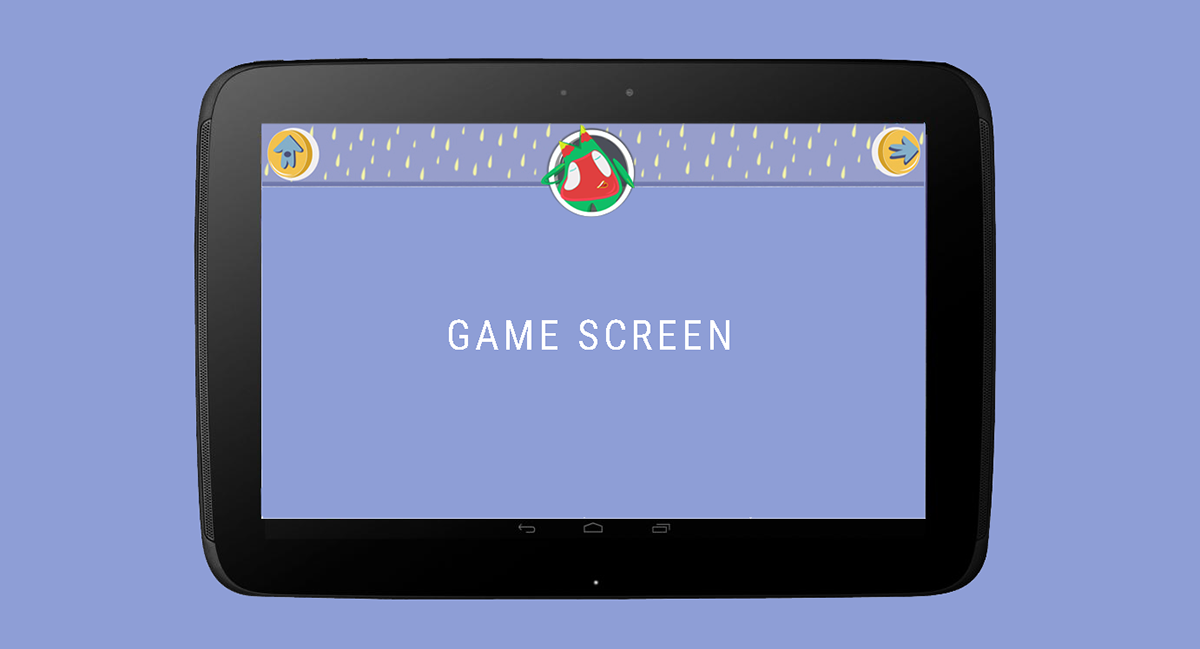
1. Limiting the number of interactions to Home and Next buttons. Home leads to the main page where the user can pick a game. Next leads to another challenge of the previously chosen game.
2. Introduction of a character/assistant in the game that would provide helpful hints/give instructions.
initial layout explorations:


final layout:

Fig: This low-fi proto demonstrates the layout , along with the character in the centre. Pictorial and audio hints are given to users by the character on being tapped instead of text. eg: game hint: " Find the ladybirds in the picture below"
CHARACTER DESIGN:
Apps like Monument Valley, Cut the Rope, Limbo and Alto's Journey etc were studied for their character design.
Key qualities of the character were defined, which were:
1. Non -threatening
2. Approachable
3. Pleasant
4. Happy to help, always
5. Supportive
SOME INITIAL EXPLORATIONS


SHORTLISTED CHARACTERS:
Around 10 characters were explored from which two were shortlisted
a) BEKU:


b) MINKI (FINALISED CHARACTER)


Fig: Above: Character sketch exploration and character expression sheet.
Below: Character colour exploration and character turn around


[NOTE: FOR FINAL RENDERS SCROLL TO FINAL VISUALS SECTION]
PROPOSAL:
b) PART 2:
To create an exciting/engaging user experience it was decided that MINKI would react to every interaction/non-interaction by the user with the game. A few basic expressions were explored.


Fig 1: Expression: Happy:
When user taps on MINKI or starts a game.
Fig 2: Expression: "Danc-ey" :
When user taps on MINKI or is waiting for the game to load


Fig 3: Expression: Overjoyed:
When user gets a five star (maximum reward in the game)
Fig 4: Expression: Excited:
When user gets the right answer


Fig 5: Expression: Sad:
When user gets the wrong answer
Fig 6: Expression: Thinking : When user take a long time to answer or choose an answer


Fig 7: Expression: " I have something to say"
When system intends to prompt a hint to the user. In such a situation user taps on MINKI and a hint is provided.
Fig 8: Expression: "Shook"
When user looses interest in the game and tries other random things that are not intended in the game play.
FINAL VISUALS:
MINKI


BUTTONS
Home and Next


CIRCULAR CONTAINERS FOR MINKI


UI ELEMENTS ON GAME SCREEN