


–


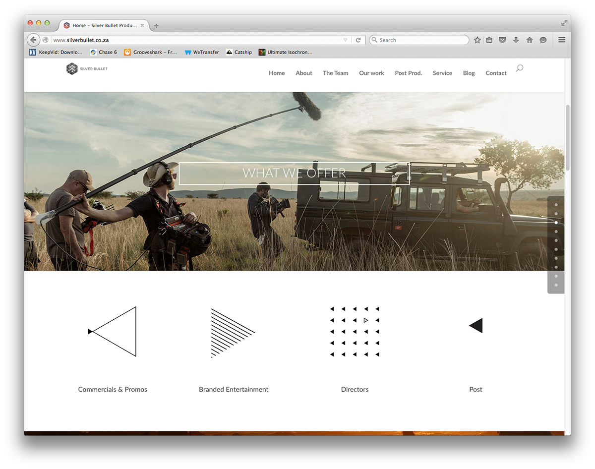


Silver Bullet wanted a rebrand from their existing bullet-shaped logo to something more conceptual, that would bring across the meaning of the phrase 'silver bullet' and also hint toward their new business focus which is 'content creation'. We had to stay away from cliche Vampire and Werewolf references and were asked to look for some way of creating a typographic monogram treatment that would bring the idea of 'an immediate and final solution to a complex problem'. Our client who has a great eye for design and understanding of the creative process, was looking for something with a geometric feel that possibly incorporated a double meaning or 'visual ambiguity'.
Our final product uses an arrangement of triangles, which represent video content 'play buttons', which make up the 'S' and the 'B' of Silver Bullet. Part of the project was also front-end design for their website, and email signature templates. We also designed some illustrations using the triangle icon, to represent different aspects of the business, as well as offered some ideas for creating interesting art by commissioning illustrators to create triangle shaped illustrations, and also proposed creating optical illusion 3D point of view murals for their office interior.
Creative Directors: Glynn Venter & Francois de Villiers. Graphic Designers: Michael Thomson, Joné Groenewald.


