So I was flying somewhere one day... And I noticed a Mercedes campaign on a billboard... The aqua highlights and sky... the immaculate car... The level of detail gone to by the retoucher... it was floorless... And I thought how could I apply something with a deep feeling like this that could incorporate a similar colour grade and yet have it's own timelessness and meaning to me?
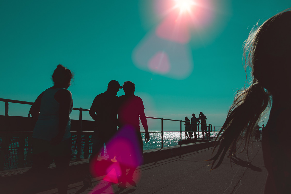
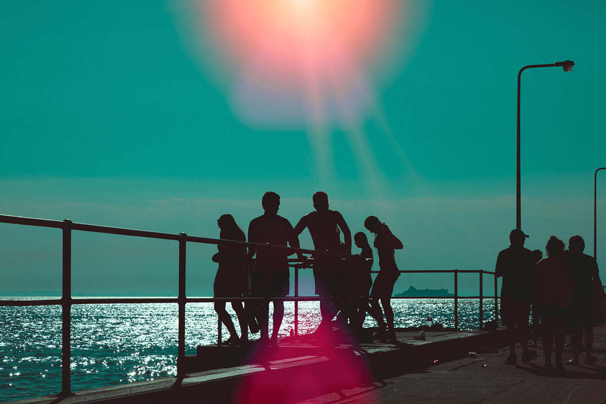
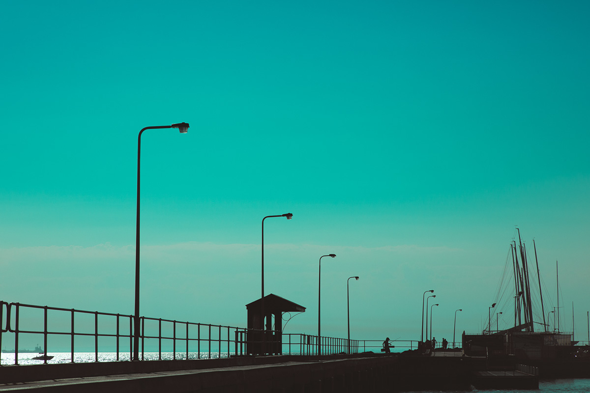
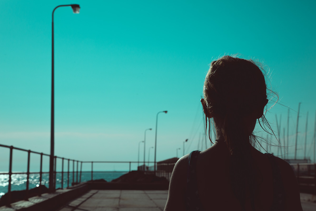
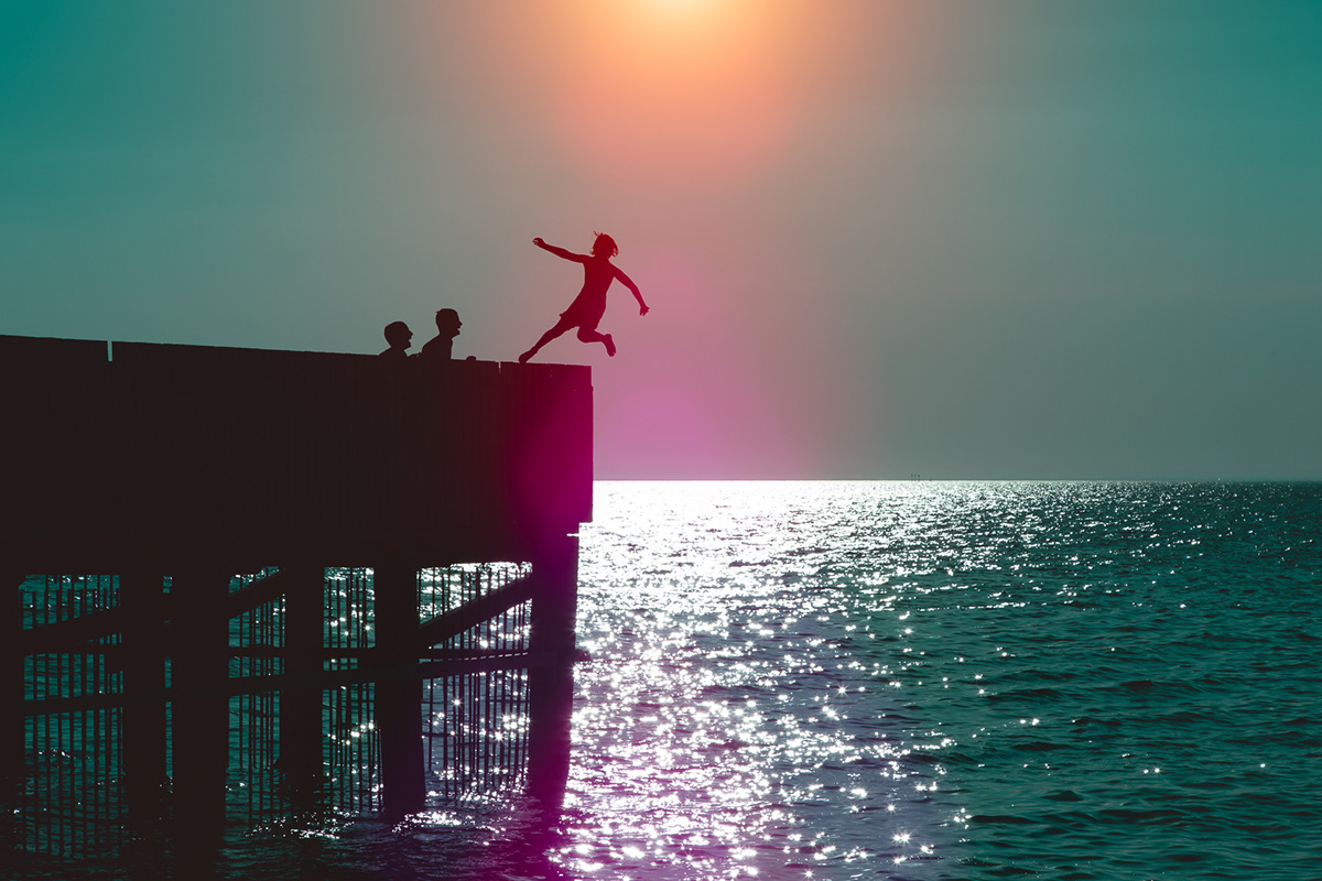
I spent a day photographing my two kids Matilda & Finley at Brighton Pier in Melbourne. The vision was strong and I new exactly what I was after. Most of these shots were shot very nuetral. Not much colour very gray and shot into the sun. It's a technique my Dad taught me called "Contrejour" which means "against the light" or "silhouettes" as most people would be able to understand better.
The lower levels of these images have been completely stripped in photoshop and have been filled with a chocolate underlay to complement the aqua highlights and I've augmented the natural sunlight with some peachy purple and pink flares to offset the colour grade. All these colours are complementary however I do know that the essence of these images is in the emotion, action and detail of the people that are captured in them.
I love this series... I hope you do too.