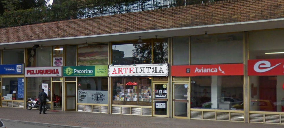
ArteLetra is the leading independent bookstore in Bogotá. Opened in 2003, it starts as book store and coffee shop, but in all this years the books were taking their place on the tables, chairs, walls, roof, stairs... If you have been in Paris, you'll recall the "chaos" of the french book stores when you're in ArteLetra. Its owners, Adriana Laganis and Nicolás Mejía, are running this last bastion of culture in the capital city of Colombia. When you're searching for any book you want, you can relax yourself hearing some Mahler, Vivaldi, Brahms or Tchaikovsky pieces.
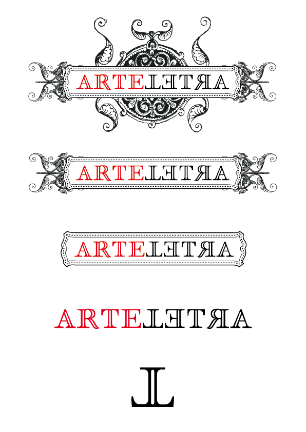
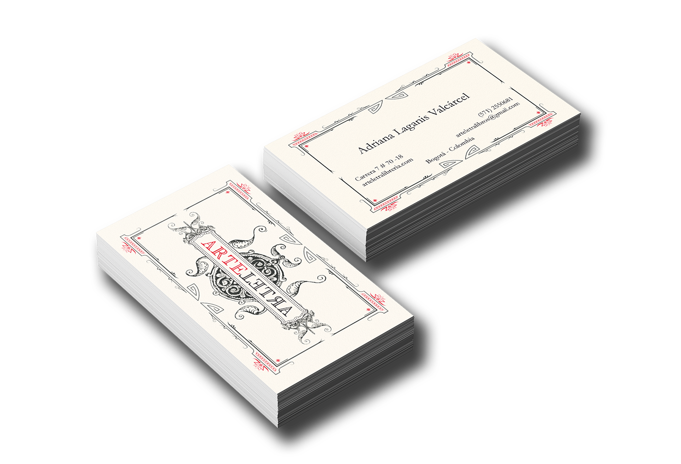
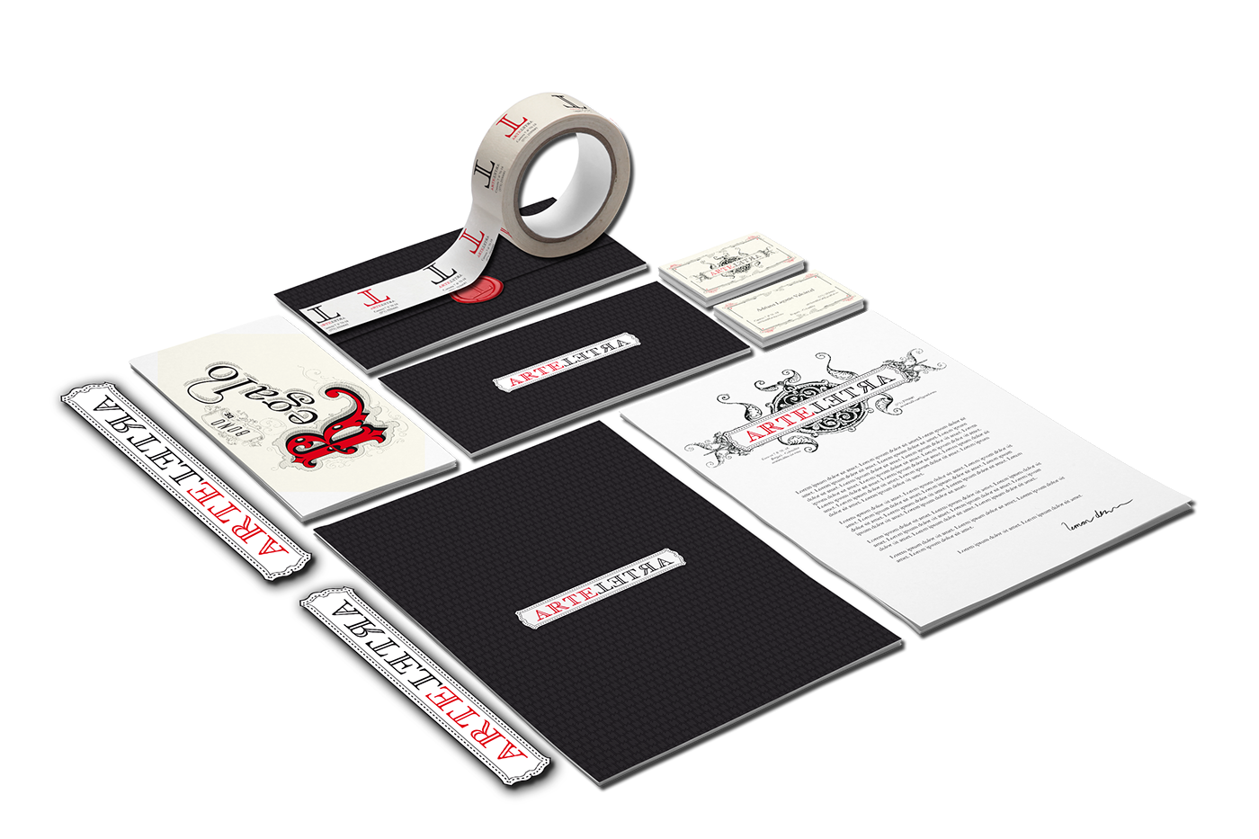
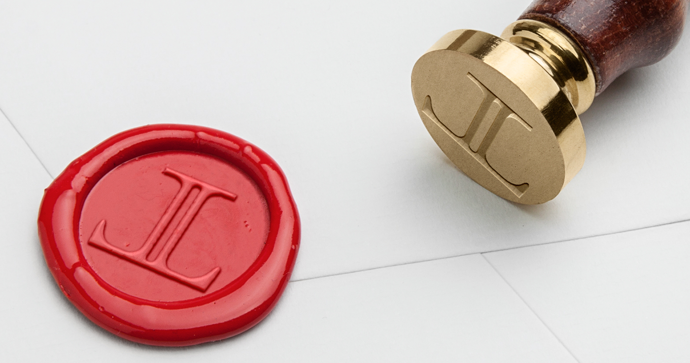
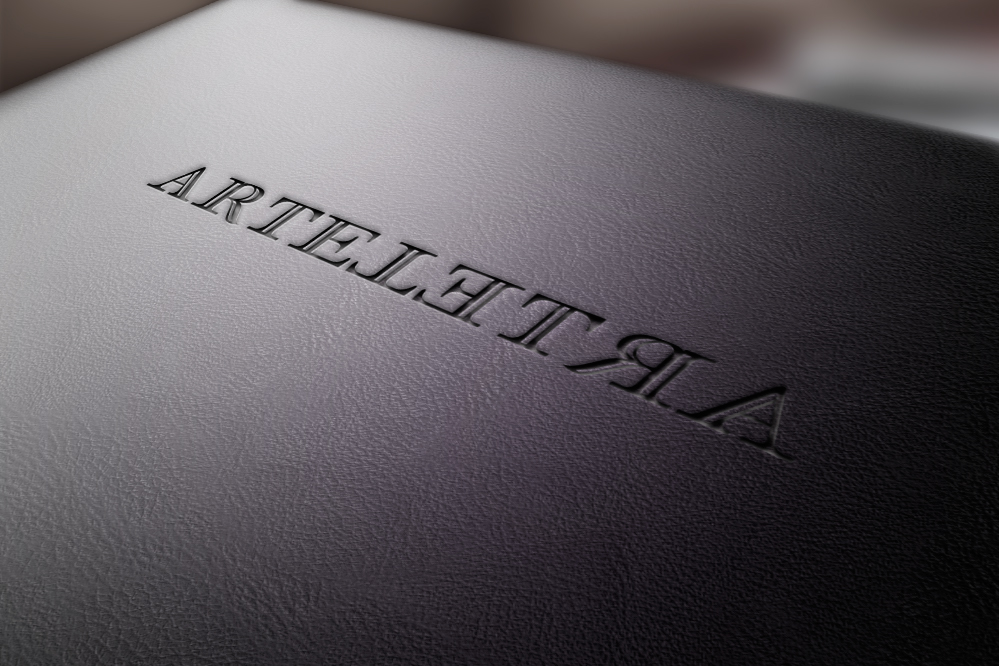
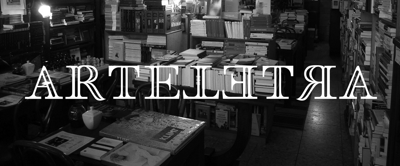
The new brand work recalls for the old type styles in editorial design; all the aknowledgement contained in an old book reborns in the logo. The word ArteLetra (ArtLetter in english) is a palindrome, a word or quote you can read in any reading orientation. Keeping this on mind, I start designing a new font style using some typographic catalogues from the XVII century. The result is a double-legged capital L and the last 4 gliphs were inverted to maximize the visual dimension of the palindrome. All the project was really influenced by the classic graphic arts: typography, lithography and letter pressing.
For the logo work, I created 5 shapes; from a baroque and ornamented one to the minimalism of the double-legged L.
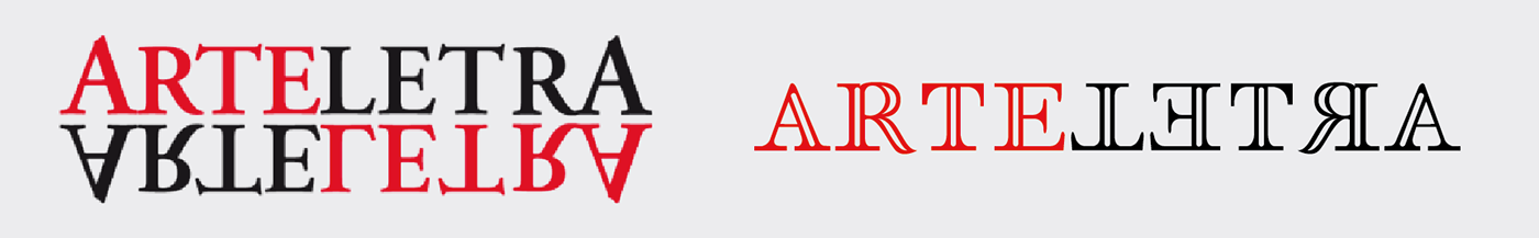
Previous logo vs. new artwork