Design Team
Designers: Donn Koh, Alec Wong
Designed in May 2014. Launched in Sept 2014.
Please do not reproduce in any form or post on blogs without the expressed written consent from STUCK.
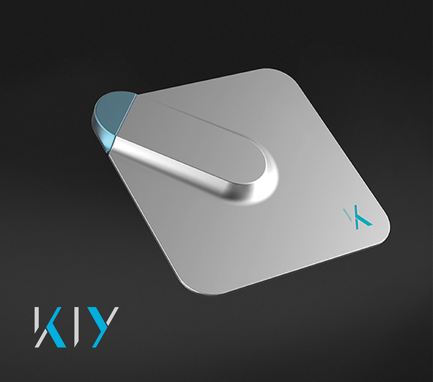
KIY
Conveying Encryption Tech
Logo / Branding / Identity / Packaging
Keep-It-Yourself
FAST tasked us with the creation of the brand identity design for the new incarnation of their security device, moving from what used to be a rugged, military-oriented flavour of EasySafe to the consumer-oriented, modern, friendly product branding of KIY (Keep-It-Yourself).
The unique strength of KIY’s offering was that their security products, besides being hardware-based, function on a patented system which totally excludes the involvement of any additional persons in the end-to-end process of protecting your data.
And although the system is so secure that the engineering geniuses at FAST itself are unable to access your data, the patented recovery system ensures that your data is safe and accessible even if you forget your own password or lose your hardware. Only the user himself is involved at all stages, even in recovery.
To emphasise this key difference, FAST wanted their new brand visuals to help bring the tagline “Keep It Yourself”, to the forefront.
Moving from the Military to Consumers
While the technology of FAST has its military legacy, the new incarnation as KIY - intended for the everyday consumer - means the visual branding has to shift for the new target audience.
With KIY, FAST is making available its military-grade data protection, to serve the increasing number of everyday users who store sensitive personal data on cloud storage services. This means that the visual branding has to convey a sense of approachable simplicity for the lay consumer.
With KIY, FAST is making available its military-grade data protection, to serve the increasing number of everyday users who store sensitive personal data on cloud storage services. This means that the visual branding has to convey a sense of approachable simplicity for the lay consumer.

Our Goal
Our goal was thus to compose a logo that would magnify the tagline, and imbue KIY branding with a sense of what the technology does - giving a nuance of security, high-tech encryption, protection, while still remaining simple, modern and approachable for the everyday consumer.

The Inspiration
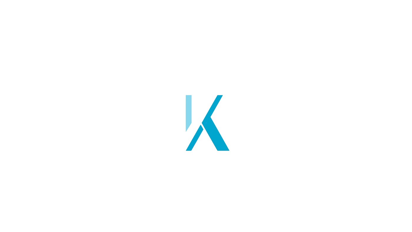
The KIY logotype drew inspiration from the image of hieroglyphics symbols which have a cryptic visual feel, giving a notion of the digital encryption of data into protected formats. We’ve also leveraged of the potentials of the letters of K, I and Y - with their related diagonals and verticals - to create a logo that had a feeling of being constructed out of similar modular elements, like digital bits and bytes or like LED-fonts.
For a stronger play on the KIY words, and to afford a reduced version of the logo, the single letter ‘K’ is designed to also contain the letters ‘I’ and‘Y’ in its letterform. The outcome of the modularisation and clean strokes is a simple and approachable look, with a feeling of conciseness that exudes a modern, high-tech feel, while bringing emphasis to the K-I-Y Keep-It-Yourself tagline.
For a stronger play on the KIY words, and to afford a reduced version of the logo, the single letter ‘K’ is designed to also contain the letters ‘I’ and‘Y’ in its letterform. The outcome of the modularisation and clean strokes is a simple and approachable look, with a feeling of conciseness that exudes a modern, high-tech feel, while bringing emphasis to the K-I-Y Keep-It-Yourself tagline.


