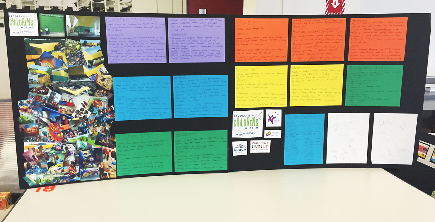
Rebrand of Brooklyn Children's Museum in Brooklyn, New York. The museum itself stands out among various brick buildings by bringing a burst of energy that automatically draws the attention of anyone walking by. I wanted to show this through my design.
I strove to design an aesthetically sophisticated mark and identity system without removing the essence of play and fun from it. Its major audience is children but I wanted to attract parents as well through the stark contrasts between the trustworthy and unmoving "K" and the addition of a dynamic element that really gives the viewer the notion of play.
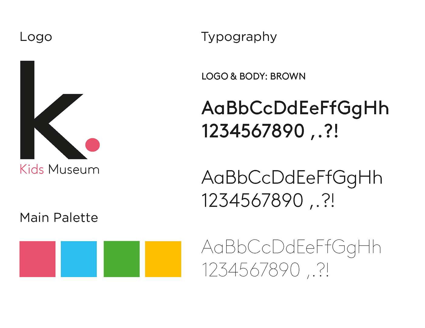
The logo itself is designed to juxtapose the architectural "K" with the addition of the spherical "ball", symbolizing a space for fun in a non-stop busy city environment. Each element is carefully thought out with the use of grid structures. The colour palette consists of the most animated colours that children adore.
APPLICATIONS
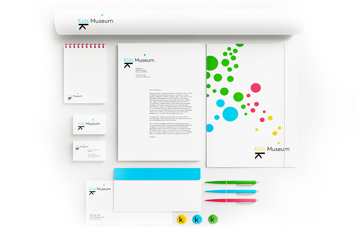
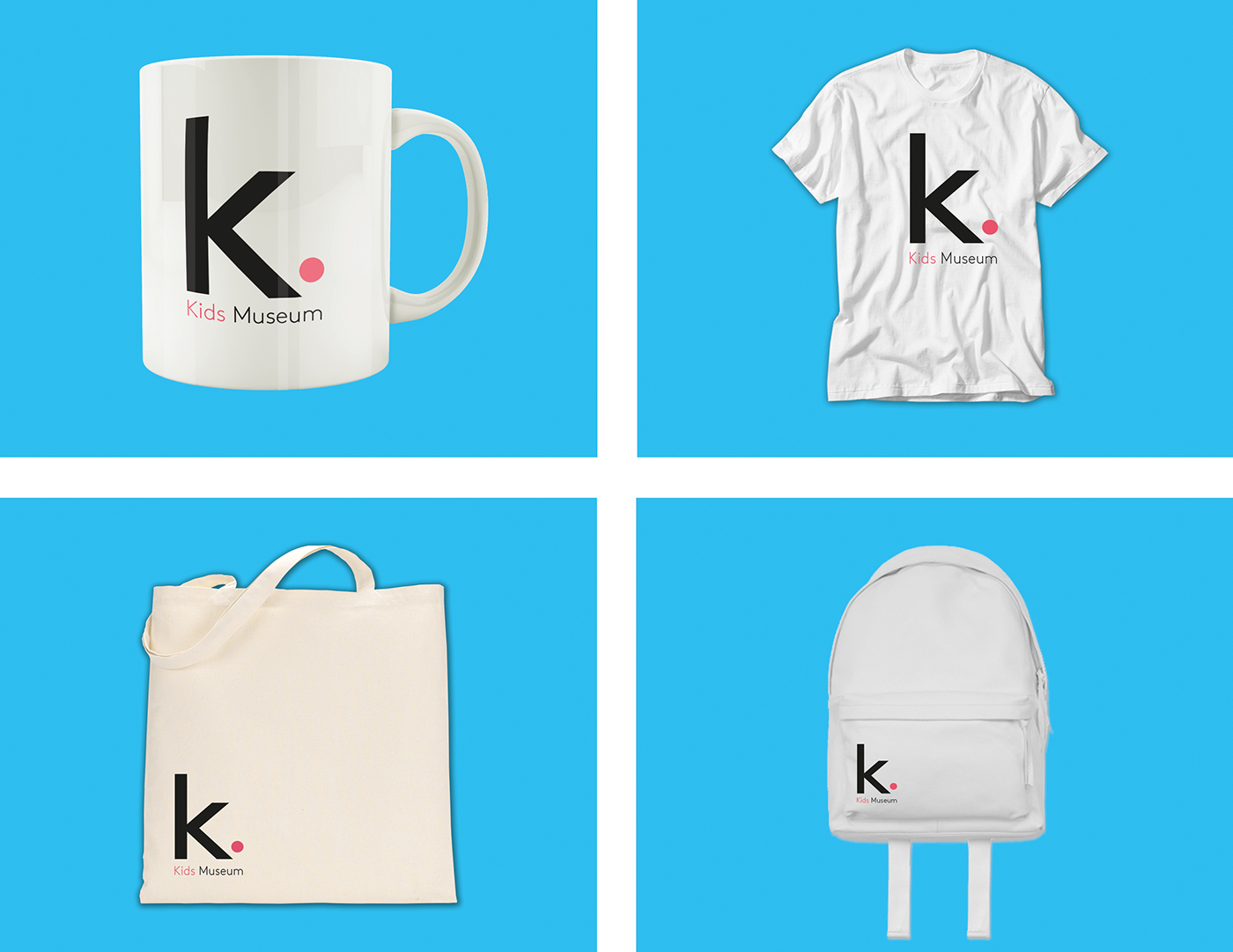
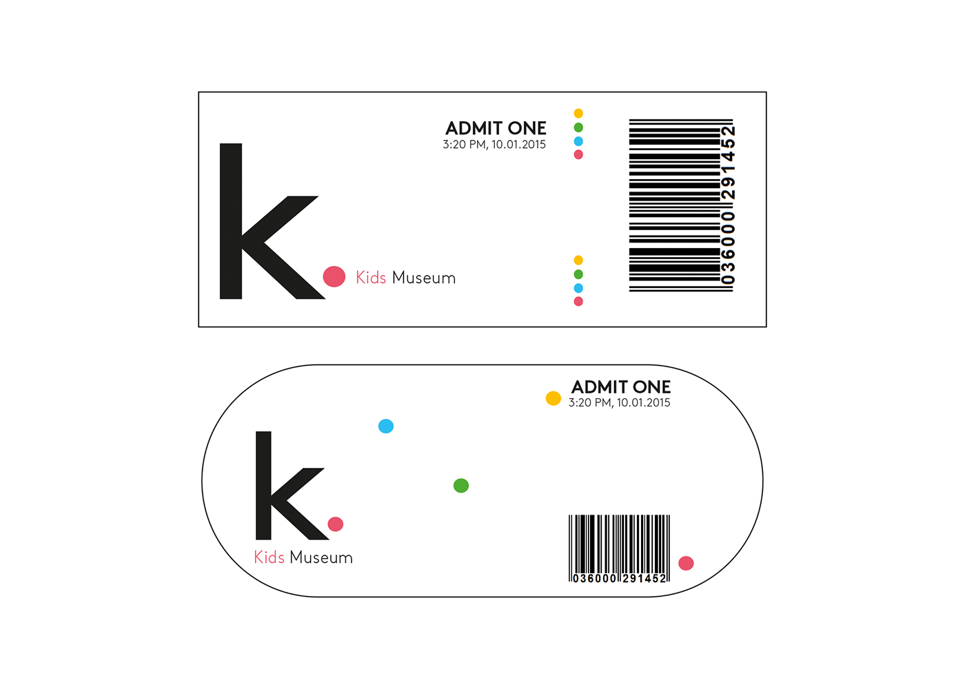
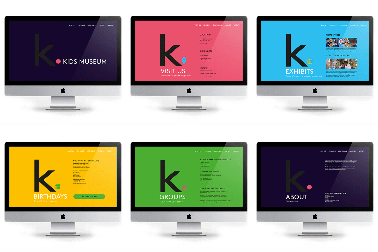
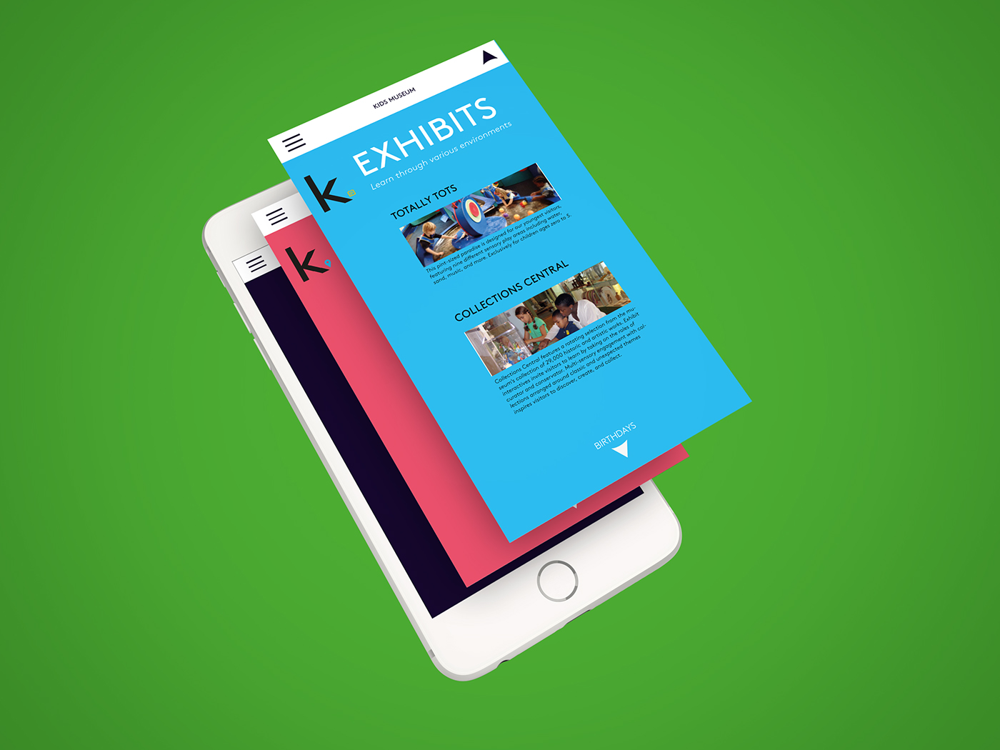
Stationery, merchandise, museum tickets, website, phone application and a video advert.

ALTERNATIVE STATIONERY
PROCESS
