

Harris Jewellers
A jewelry company since 1977, established in South Africa. Using old traditional methods of trade and manufacturing. The values of the company is trading honestly and providing quality crafted products for the satisfaction of the consumer. Owner and founder does not believe in contemporary advertising and marketing strategies.
The Problem:
The look and feel of the company does not attract his desired target market.
“Middle class people feel scared walking into the store because it seems as if they cannot afford my products”.
Desired Target Market:
Middle class consumers earning between 5 000 – 15 000 ZAR and upward
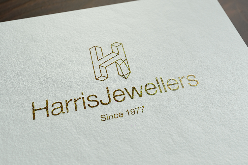
Logo Design
The redesigned logo is slick. It’s thin sanserif typeface explains what the company is and communicates its heritage with the year of establishment. This communicates trust to consumers. The logo icon “H” is crafted with line and plays with the eye to create an illusionary effect, this communicates the type of design and craft they manufacture with their products. The right leg of the “H” icon is a crafted diamond shape leg that furthur comminucates the companies craft and the adaptation to custom made craft. To express the high quality products and elegance for the desired target market, the logo is completed with a glitter gold foiling that adds affordable class for slick middle class consumers.

Packaging Design + Stationary
The packaging is designed in a way that continuously keeps the same look and feel as the other elements in the rebrand and strategy. The wedding ring box is designed using the same geometric shape of the logo icon (right leg of the “H” icon). To keep the classic traditional means of craft the material used in an off white wood and the pillow holding the ring in the same pink/salmon colour.


Relaunch Strategy
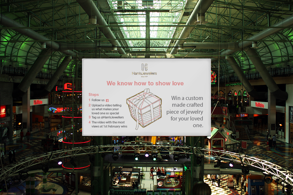
To relaunch the brand, I have designed and online contest using Facebook as a platform for consumers to participate. The contest requires participants to upload a video of themselves telling Harris Jewelers 1. Who is special to them, 2. And why this person is special to them. The participant with the most views will win a custom made crafted piece of jewelry for their loved one they entered into the contest. The contest will run from 1st January 2016 till 14th February, on Valentines day, where the winners will be announced on their Facebook page.
This strategy enables the brand to expand with their new look and feel as contestants will feel obligated to share their video. This will increase their chances winning and in essence will expand Harris Jewellers as a brand.
This strategy enables the brand to expand with their new look and feel as contestants will feel obligated to share their video. This will increase their chances winning and in essence will expand Harris Jewellers as a brand.

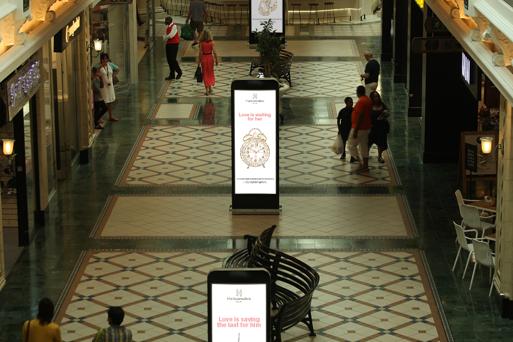

Installation
In order to advertise the contest, an installation will hang in the middle of Canal Walk. The design will explain the contest and have step by step instructions for how it works. This placement is important as it is right next to the food court and can be seen from both the ground and first floor, from all sides. Along the aisles of Canal Walk, there will be a series of four posters that will lead to the installation on all floors.
Poster Design
The poster design is clean and slick. Keeping the foiling consistent through the brand. A pink/salmon colour is introduced to keep the brand fresh and modernised. The concept of the series of posters is the connecting the brand Harris Jewellers with the knowledge of what love is, and this is sacrifice. Using relatable scenerios too communicate this to consumers “Love is.. waiting for her; saving the last piece for him'' etc. To help push the concept and it’s relation to a brand, a series of illustrations has been achieved. Each poster having an Illustration that relates to the communication of love. The illustration style is hand rendered linework with detail to push the communication of craft. The illustrations have been foiled with the same glitter gold as the logo design. Each illustration has a geometric shape that forms a design for potential jewelry designs. This is related to the right leg of the “H” in the logo design. Each poster will advertise the contest and call consumer to follow the Harris Jewellers Facebook page.


The rebrand and strategy is exciting a fresh. It communicates to the target audience, making it seem more relatable with the poster designs and color choices. The look and feel is soft and calming opposed to the heavey and dark look and feel of the original branding.
Thank you so much for taking the time to view my work


